SwiftUI was meant to be a game changer in the user interface implementation process. And even though it still lacks of some features, it allows to create UIs much faster comparing to UIKit or AppKit. Built-in views that would otherwise require significant effort and number of lines to create manually, enable us to achieve beautiful results within seconds.
This post is dedicated to such a SwiftUI view; a view that is usually overlooked until one actually needs it, and that is the DisclosureGroup. As Apple’s official documentation states, a disclosure group is:
A view that shows or hides another content view, based on the state of a disclosure control.
What makes the disclosure group distinguishable is a disclosure button, which expands or collapses (reveals or hides) the view’s contents when tapped or clicked. Along with the button there is also a label; usually a text description that describes the contents of the disclosure group. But it’s also possible to use any SwiftUI view as a label; more about that next.
Practically speaking now, the simplest way to present a disclosure group is the following:
|
1 2 3 4 5 |
DisclosureGroup(“Tap to show”) { disclosureGroupContent() } |
The “Tap to show” string is the disclosure group’s label, while its content is a custom SwiftUI view. In fact, disclosureGroupContent() is a method marked with the @ViewBuilder attribute, and implements the following view:
|
1 2 3 4 5 6 7 8 9 10 11 12 13 14 |
@ViewBuilder func disclosureGroupContent() -> some View { HStack { Text(“Hello world!”) .italic() .padding(.leading) .foregroundColor(.white) Spacer() } .background(Color.blue) } |
When the disclosure group expands, it looks like the following:

There may be times that we want to programmatically control the expanded state of the disclosure group. Or, looking from the opposite point of view, to know if the user has expanded or collapsed the view. In such cases, there is another initializer to use that accepts the binding value of a @State property, and it actually stores the expanded state of the view.
In order to make use of it, we firstly need a state property similar to the next one:
|
1 2 3 |
@State private var isExpanded = false |
Then, we can pass its binding value as the second argument to the following initializer of the disclosure group:
|
1 2 3 4 5 6 |
DisclosureGroup(“Tap to open”, isExpanded: $isExpanded) { disclosureGroupContent() } |
With the isExpanded state property being available in the view, we can go one step further, and actually determine when the disclosure view is expanded or collapsed. That might be useful in certain cases, and we can achieve it using the .onChange() view modifier:
|
1 2 3 4 5 6 7 8 9 10 11 12 |
VStack { DisclosureGroup(“Tap to open”, isExpanded: $isExpanded) { disclosureGroupContent() } } .padding(.horizontal) .onChange(of: isExpanded) { _ in // Do something when the isExpanded value gets changed. } |
In addition to all that, we can be based on isExpanded and change the disclosure group’s label text conditionally. In the following code segment, the displayed text is updated according to the isExpanded value:
|
1 2 3 4 5 6 |
DisclosureGroup(!isExpanded ? “Tap to show” : “Tap to hide”, isExpanded: $isExpanded) { disclosureGroupContent() } |
I mentioned at the beginning of the post that besides simple text, it’s also possible to use custom SwiftUI views as labels for the disclosure group. As it happens with most of the native SwiftUI views, there is another initializer that allows us to do that.
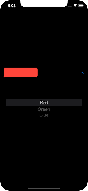
The following code demonstrates a disclosure group which displays a colored rounded rectangle as its label. When expanded, it presents a picker in order to choose a different color:
|
1 2 3 4 5 6 7 8 9 10 11 12 13 |
DisclosureGroup { Picker(“Favorite Color”, selection: $selectedColorTag) { Text(“Red”).tag(0) Text(“Green”).tag(1) Text(“Blue”).tag(2) } } label: { RoundedRectangle(cornerRadius: 8) .fill(getMatchingColor()) .frame(width: 150, height: 40) } |
Providing a binding value for the expanded state of the view is possible in this case too; we can optionally pass it as the first argument in the initializer:
|
1 2 3 4 5 6 7 |
DisclosureGroup(isExpanded: $isExpanded) { // Content… } label: { // Label… } |
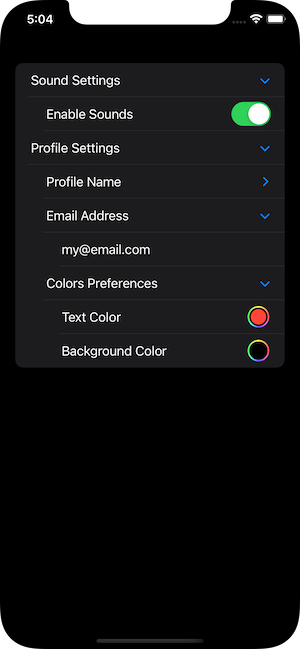
A disclosure group can contain other disclosure groups as nested views. As a result, they constitute a great choice in order to put together related options when displaying preferences or settings.
The following example shows exactly that. Inside a SwiftUI Form view, there are five disclosure groups in total, but just the two of them are top level views. The rest of them are nested under the “Profile Settings” group:
|
1 2 3 4 5 6 7 8 9 10 11 12 13 14 15 16 17 18 19 20 21 22 23 24 25 26 27 28 29 30 31 32 33 |
struct SettingsView: View { @State private var soundOn = true @State private var nickname = “Somebody” @State private var email = “my@email.com” @State private var foreColor = Color.red @State private var bgColor = Color.black var body: some View { Form { DisclosureGroup(“Sound Settings”) { Toggle(“Enable Sounds”, isOn: $soundOn) } DisclosureGroup(“Profile Settings”) { DisclosureGroup(“Profile Name”) { TextField(“Nickname”, text: $nickname) } DisclosureGroup(“Email Address”) { TextField(“Email”, text: $email) } DisclosureGroup(“Colors Preferences”) { ColorPicker(“Text Color”, selection: $foreColor) ColorPicker(“Background Color”, selection: $bgColor) } } } } } |
Conclusion
To sum up, disclosure group is a handy SwiftUI view that provides useful functionality in many cases. It’s not hard to implement it, and in this post I demonstrated various ways on how to do it. From the non-programming point of view, users meet a familiar view that already know how to manipulate, instantly realizing that there is related functionality grouped together under one control. I hoped you liked this quick tutorial, and if so, feel free to share it! Thanks for reading!