View modifiers exist in SwiftUI in order to help us change the appearance and behavior of views easily. In the long list of them some work with particular views only and some other are intended to be used with any view. There are also quite common modifiers that we access often, while on the other edge there are less known ones existing for specific purposes.
Such a lesser common modifier is the onHover(_:). Its name suggests its purpose, which is no other than letting us know when a hover event occurs on a view. It’s mostly useful in macOS applications, where the mouse cursor can go over the area occupied by a view.
To get to know this modifier, let’s go through a small sample application.
The demo app
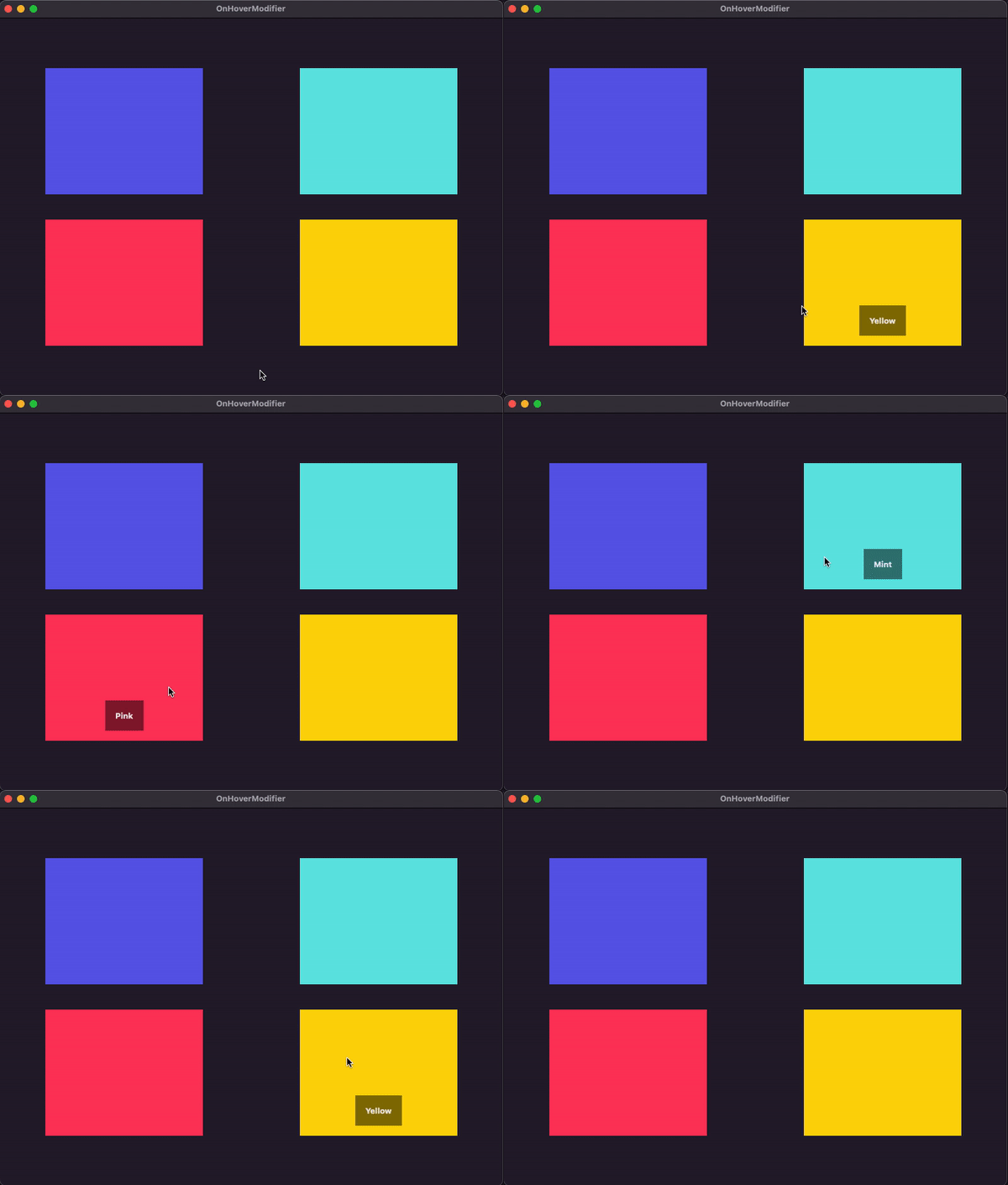
The goal in this post is to build the following macOS application. It displays a few color views, presenting each color name when the mouse is above the matching view.

We’ll get started with the following custom type that stores a color’s data, as well as a hovered state; an indication whether a hover event has taken place in the respective view (that we’ll define in a while):
|
1 2 3 4 5 6 7 |
struct NamedColor: Hashable { var color: NSColor = .clear var name: String = “” var isHovered = false } |
In addition, we’ll also implement the following ObservableObject type. It declares and initializes a NamedColors array marked with the @Published keyword so it can be used properly in SwiftUI part. A few sample NamedColor instances are appended to it in the init() method as shown next :
|
1 2 3 4 5 6 7 8 9 10 11 12 13 14 |
class Colors: ObservableObject { @Published var items = [NamedColor]() init() { items = [ NamedColor(color: .systemIndigo, name: “Indigo”), NamedColor(color: .systemMint, name: “Mint”), NamedColor(color: .systemPink, name: “Pink”), NamedColor(color: .systemYellow, name: “Yellow”) ] } } |
Going to the SwiftUI view part now, we’ll declare the following @StateObject property initializing a Colors instance:
|
1 2 3 4 5 6 7 8 9 |
struct ContentView: View { @StateObject private var colors = Colors() var body: some View { … } } |
With that in place, time to add the view contents. Using a LazyVGrid and a ForEach container we’ll layout four color views using the items array in Colors type as datasource. We’ll also add the code that displays each color name, but this will be included in a condition; color name will appear if only the mouse cursor is above the respective color view:
|
1 2 3 4 5 6 7 8 9 10 11 12 13 14 15 16 17 18 19 20 21 |
var body: some View { LazyVGrid(columns: [GridItem(.flexible()), GridItem(.flexible())], spacing: 40) { ForEach(0..<colors.items.count, id: \.self) { index in ZStack(alignment: .bottom) { Color(colors.items[index].color) if colors.items[index].isHovered { Text(colors.items[index].name) .bold() .padding() .background(.black.opacity(0.5)) .padding(.bottom) } } .frame(width: 250, height: 200) } } .frame(width: 800, height: 600) } |
The sample app is now ready, but no color names show up when moving the mouse above each color. Time to make that happen and use the onHover(_:) view modifier.
Detecting and reacting to hover events
The view that we want to observe for hover events is the Color view shown first in the ZStack above:
|
1 2 3 |
Color(colors.items[index].color) |
This is exactly where we’ll append the onHover(_:) view modifier like so:
|
1 2 3 4 5 6 |
Color(colors.items[index].color) .onHover { isAbove in } |
The isAbove parameter in the modifier’s closure (which can be named as you prefer) is a Bool value that becomes true when the mouse is above the view, and it changes to false when it’s not.
There is just one thing to do in the closure’s body, and that is to update the value of the isHovered property of the current color item object according to isAbove value:
|
1 2 3 4 5 |
.onHover { isAbove in colors.items[index].isHovered = isAbove } |
When isAbove is true, the isHovered will be true as well, and of course, it will become false when isAbove also becomes false. Changes to the value of the isHovered property of any color item object will cause SwiftUI to re-render its contents, and subsequently to show or hide a name color if necessary.
The above is the last addition in the sample app demonstrated here, so if we run it we’ll get the results shown previously in the beginning:

Conclusion
Although not so common, the onHover(_:) view modifier in SwiftUI can help react on hover events when needed. As you can see, it’s pretty straightforward to use it and to implement any custom logic in its closure’s body. The small sample app in this post gave you a taste of that modifier, which I hope you found useful and you’re now ready to use in your own projects.
Thanks for reading! ????????