Apps are not monochrome, and one particular color with special meaning is the accent color that an app displays. We meet it mainly in primary actions, buttons, tabs, navigation bar elements, toolbars and other places, while it often works much like a visual signature. When trying to make our apps appealing to users, it seems suitable sometimes to provide various accent colors that users can choose from. So, in a settings view, they can personalize the app with the accent color of their preference and change its appearance as they like.
Doing so might sound interesting, but how do we manage it in SwiftUI? In this post I’m sharing with you the recipe I follow in the apps I’m making.
Getting started with the accent colors
Managing multiple accent colors is a process based on three pillars:
- The existence of a collection containing the available accent colors.
- The use of the SwiftUI environment to make the selected accent color available to the views.
- The persistent storage of the active accent color, or more precisely, an index pointing to it in the colors collection.
We’ll explore each one of these points, starting with the first one here. The initial and obvious move is to define the colors we’ll provide to users. We can do that purely programmatically, or we can get started with the Assets catalog where it’s easier to create color sets. For the purposes of this demonstration, here are the colors I chose to use:
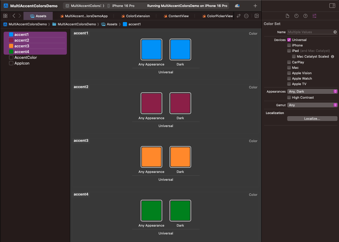
All of them are existing colors in the Crayons collection that you can find if you open the Color panel. In real projects, define them as you see that fits the best; use hex codes, RGB values, or the Color panel. The point is to create the colors, and the Attributes inspector will help you on that.
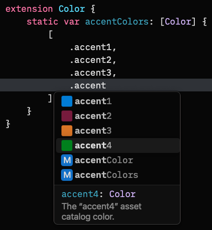
Additionally, make sure you name color sets properly. In the above screenshot, for instance, I set four colors and named them from “accent1” to “accent4”. Names are important, as we’re going to use them right next programmatically.
With the colors in place and properly named, the next step is to implement a Color extension, preferably in a new file. In it, we’ll define an array which will contain the colors created right before. Note that the array will be marked as static, practically meaning that we’ll be able to access it without creating a Color instance:
|
1 2 3 4 5 6 7 8 9 10 11 12 |
extension Color { static var accentColors: [Color] { [ .accent1, .accent2, .accent3, .accent4 ] } } |
By the time a color is created in the Assets catalog, it becomes instantly available for suggestion by Xcode using the dot syntax. The Color type before each color in the above snippet is implied.
Adding a custom accent color to SwiftUI environment
The custom accent color selected by users will live in the SwiftUI environment, so it’s easily accessible by any view. To make that possible, we need to declare a new environment value by extending the EnvironmentValues type this time. Using the @Entry macro we can easily set the following new environment value:
|
1 2 3 4 5 |
extension EnvironmentValues { @Entry var customAccent: Color = .accent1 } |
Every custom environment value needs an initial value, and for convenience we set the first custom color we created earlier. In fact, we can set any color, even a transparent color with the .clear value, as the customAccent will get its actual value right next.
The above EnvironmentValues extension can be added either to a new file, or in the main App file (the one that contains the WindowGroup instance).
The accent color index
At this point we have a collection of colors and a Color instance as an environment value, and now we have to make the connection between these two. The customAccent value will keep the accent color that users select, so we need to store persistently that selection and assign it to customAccent.
However, instead of storing an actual color, we’ll save an index pointing to the selected color in the colors collection. And we’ll do that for two reasons:
- The user defaults property list is a perfect place to keep the selected color, and storing a
Colorinstance is not supported directly. We would need to convert it into aDataobject first, and back toColoron load. That’s unnecessary trouble. On the other hand, storingIntvalues is supported out of the box. - Even if it was possible to natively store a
Colorinstance,Intwill always be a more lightweight value.
So, in the main App file struct we’ll add the next declaration of the selectedAccentIndex. We mark it with the @AppStorage attribute to let SwiftUI handle the saving and loading from the user defaults automatically without any further effort on our side:
|
1 2 3 4 5 6 7 8 |
@main struct MultiAccentColorsDemoApp: App { @AppStorage(“selectedAccentIndex”) var selectedAccentIndex = 0 … } |
You can read more about the @AppStorage property wrapper in this older post.
The initial, default value we assign to selectedAccentIndex is 0; it points to the first custom accent color.
Previously we defined the customAccent environment value, which, however, doesn’t exist yet in the environment of the SwiftUI views. Fixing that is the last configuration step remaining to be done.
We’ll apply the environment(_:_) modifier on the top-level view of the app, pushing the customAccent to the environment and specifying its value at the same time:
|
1 2 3 4 5 6 7 8 9 10 11 12 13 14 15 16 |
@main struct MultiAccentColorsDemoApp: App { @AppStorage(“selectedAccentIndex”) var selectedAccentIndex = 0 var body: some Scene { WindowGroup { ContentView() .environment( \.customAccent, .accentColors[selectedAccentIndex] ) } } } |
See that we access the customAccent as a key path, and we specify the selected color with the selectedAccentIndex given as index in the accentColors array. Note that the selectedAccentIndex is loaded from user defaults on app launch, but as it doesn’t exist there initially, the first accent color (at index 0) is assigned to customAccent.
The good news with the above addition is that, whenever the value of the selectedAccentIndex changes because the user chose a different accent color, the customAccent will be updated automatically. Since it’s an environment value, the change will be reflected to the views, and in every single place the customAccent is used.
Using the custom accent color
All the setup we need is in place now, so let’s see how to use customAccent. In the view or views where we are about to show it, we have to access it in the SwiftUI environment first:
|
1 2 3 4 5 6 7 8 9 |
struct ContentView: View { @Environment(\.customAccent) private var customAccent var body: some View { … } } |
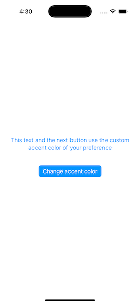
Now that the custom accent color is available, we can go ahead and use it anywhere we need it. In the following example, customAccent is applied as the foreground style in the Text view, and as a tint color to the button:
|
1 2 3 4 5 6 7 8 9 10 11 12 13 14 15 16 17 18 |
struct ContentView: View { @Environment(\.customAccent) private var customAccent var body: some View { VStack(spacing: 40) { Text(“This text and the next button use the custom accent color of your preference”) .foregroundStyle(customAccent) .multilineTextAlignment(.center) Button(“Change accent color”) { } .buttonStyle(.borderedProminent) .tint(customAccent) } .padding() } } |
See that we simply pass the customAccent as argument whenever needed, like in .tint(customAccent).
Selecting a different accent color
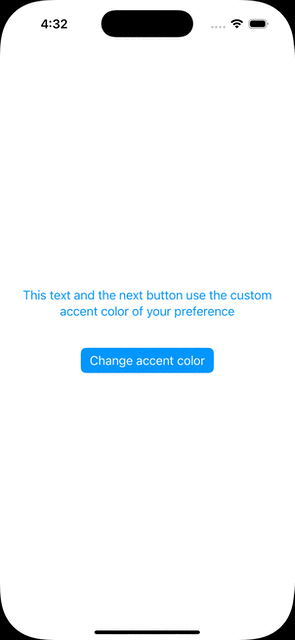
When an app provides multiple custom accent colors to choose from, then there should be a settings screen where users can make their choice. To demonstrate that in this post, we’ll simply present a sheet with the available colors. Upon selection, the customAccent color will be updated accordingly, and as a result all visual elements using it will change color as well.
We’ll display the sheet as a result to pressing the button you see in the last code snippet:
|
1 2 3 4 5 |
Button(“Change accent color”) { showColorPicker = true } |
We also need to declare the showColorPicker property, as it currently does not exist in the view:
|
1 2 3 |
@State private var showColorPicker = false |
We can now present the sheet:
|
1 2 3 4 5 6 7 8 9 10 11 12 13 14 15 16 |
struct ContentView: View { @Environment(\.customAccent) private var customAccent @State private var showColorPicker = false var body: some View { VStack(spacing: 40) { … } .sheet(isPresented: $showColorPicker) { ColorPickerView() .presentationDetents([.height(200)]) } } } |
Right next it’s the ColorPickerView implementation:
|
1 2 3 4 5 6 7 8 9 10 11 12 13 14 15 16 17 18 19 20 21 22 23 24 25 |
struct ColorPickerView: View { @AppStorage(“selectedAccentIndex”) var selectedAccentIndex = 0 @Environment(\.dismiss) private var dismiss var body: some View { VStack { List { ForEach(Color.accentColors, id: \.self) { color in Button { selectedAccentIndex = Color.accentColors.firstIndex(of: color) ?? 0 dismiss() } label: { RoundedRectangle(cornerRadius: 5) .fill(color) .frame(width: 100, height: 28) } } } .listStyle(.inset) .scrollDisabled(true) } } } |
The view presents all available custom accent colors using a ForEach container in a List. Each item in the ForEach is a button, and each button’s label shows a different color using a rounded rectangle.
The interesting part in the previous code is the first line in the button’s action closure:
|
1 2 3 |
selectedAccentIndex = Color.accentColors.firstIndex(of: color) ?? 0 |
Here, we set the selectedAccentIndex value based on the selected color. In particular, selectedAccentIndex gets as value the index of the color in the accentColors array. The firstIndex(of:) method returns an optional value, so the fallback is to set the zero index in that case (“?? 0“).
Notice that there’s nothing else we need to do; by updating the selectedAccentIndex value, the customAccent color will change automatically to the proper color. SwiftUI handles everything under the hood because selectedAccentIndex property is marked with the @AppStorage property wrapper and any change to the property’s state is observed instantly. Subsequently, the environment(_:_:) modifier we applied previously on the ContentView updates the customAccent value.
Now the demo is complete, so when a different color is selected, the interface is updated properly.
Wrapping up
There are definitely more than one way to allow multiple accent color selection. However, the method presented in this post is tested and proved to work. As demonstrated, there are three main steps to make in order to show and select different custom accent colors. It doesn’t take long to set up everything, while SwiftUI does its magic behind the scenes. I hope you found this post useful, thanks for reading!