Buttons are probably one of the most used views in SwiftUI, and they offer great flexibility regarding the content they can display as a label; from text and images, up to mixed and composite views.
In this post I’m going to show you how to deal with image buttons, meaning buttons that show just an image as their label, but beyond the basics. Particularly, I’ll demonstrate how to create buttons displaying an image that gets changed on press events. In addition, I’ll also present a technique on how to get rid of the default highlight overlay so images on buttons look clean when pressed.
Before I get started, I’d suggest to take a look at this post where I’m talking about how to handle press and release events. There, I’m creating a custom view modifier that makes it dealing with those two events really easy, and it’s something that I’m going to put in motion also in this post.
Before we get started, right next you can see what your goal is here; to create a button that will be altering its image when pressed, and that image will remain clear without being highlighted.
A Basic Image Button
Creating an image button in SwiftUI is quite straightforward. The following snippet presents the required code to make one. Notice that we’re providing an Image view as the button’s label, passing the name of an actual image in the Assets catalog as argument to it.
|
1 2 3 4 5 6 7 8 |
Button(action: { // Do something… }, label: { Image(“download”) }) .frame(width: 100, height: 100) |
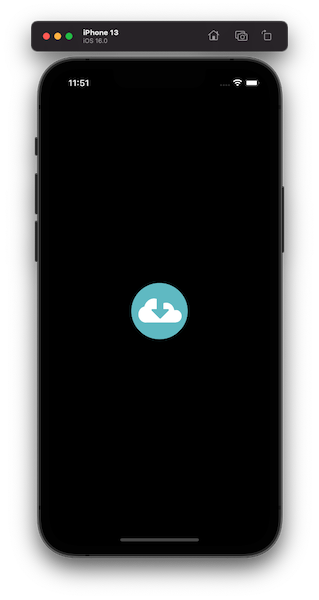
Here’s what is rendered for the above:
If we try it out, the result will be this:
See that the default highlight is too intense, and that’s not always a desirable effect. There’s an easy way to reduce it, and that is by changing the button style to plain with the .buttonStyle(_:) modifier:
|
1 2 3 4 5 6 7 8 9 10 11 |
var body: some View { Button(action: { // Do something… }, label: { Image(“download”) }) .buttonStyle(.plain) .frame(width: 100, height: 100) } |
Highlight is milder now, but still present. Generally speaking, it’s usually good to have it as it visually indicates that the button is pressed and there is reaction to user’s action. However, given that we’re going to show different images on press and release, that effect is something we most probably don’t want to have. We’ll deal with it later.
Switching Images On Press
Let’s make things more interesting now, and let’s update the code as necessary in order to display different images in normal and pressed states.
The first thing I’m going to do is to get the custom view modifier and the accompanying view extension as demonstrated in this post. Both will allow me to handle the press and release events on the button easily. However, using specifically those is optional. You can achieve the exact same results simply by following the steps required to detect press actions, also as described on that post.
So, in a new Swift file let’s paste the custom modifier and the view extension shown next:
|
1 2 3 4 5 6 7 8 9 10 11 12 13 14 15 16 17 18 19 20 21 22 23 24 25 26 27 28 29 30 |
struct PressActions: ViewModifier { var onPress: () -> Void var onRelease: () -> Void func body(content: Content) -> some View { content .simultaneousGesture( DragGesture(minimumDistance: 0) .onChanged({ _ in onPress() }) .onEnded({ _ in onRelease() }) ) } } extension View { func pressAction(onPress: @escaping (() -> Void), onRelease: @escaping (() -> Void)) -> some View { modifier(PressActions(onPress: { onPress() }, onRelease: { onRelease() })) } } |
Back to the button implementation, we can now detect and react to press and release events as shown right next in the highlighted lines:
|
1 2 3 4 5 6 7 8 9 10 11 12 13 14 15 16 |
Button(action: { // Do something… }, label: { Image(“download”) }) .buttonStyle(.plain) .pressAction { } onRelease: { } .frame(width: 100, height: 100) |
Views and their content in SwiftUI depend on the value of state properties quite often. Images views are no exception, so we’ll introduce a new state property here that we’ll use in order to determine the image to display.
In the beginning of the view’s struct we’ll add the following property marked with the @State property wrapper:
|
1 2 3 4 5 6 7 |
struct ContentView: View { @State private var isPressed = false … } |
Then, we’ll update the image name we provide to the Image view. We will add a condition there which will check the state of the isPressed property; when false we’ll show the image we’ve already used so far. When true, meaning that the button is pressed, we’ll show an alternative image. The following code does all that:
|
1 2 3 4 5 6 7 |
Button(action: { }, label: { Image(!isPressed ? “download” : “download_alternative”) }) |
Finally, one last, yet important step! It’s necessary to change the isPressed value to true on button’s press event, and to false on release:
|
1 2 3 4 5 6 7 |
.pressAction { isPressed = true } onRelease: { isPressed = false } |
Here’s the full code right now:
|
1 2 3 4 5 6 7 8 9 10 11 12 13 14 15 16 17 18 19 20 21 22 |
struct ContentView: View { @State private var isPressed = false var body: some View { Button(action: { // Do something.. }, label: { Image(!isPressed ? “download” : “download_alternative”) }) .buttonStyle(.plain) .pressAction { isPressed = true } onRelease: { isPressed = false } .frame(width: 100, height: 100) } } |
And the result of all the above:
Getting Rid Of The Default Highlighting
With just a few simple moves we managed to create an image button, with the image being changed every time the button is pressed and released.
However, you can notice that the default highlight is still present on touch down. Therefore, we’ll go one step further and implement a technique that will result to the exact effect as above, but without the highlighting.
Summarizing in a few words what we’ll do, we are going to reverse the relation between the button and the displayed image. Instead of containing an image to the button, we’ll contain the button to the image (that’s a figure of speech, of course). Let’s see how.
Initially, the first view we’ll layout is the Image view, still using the conditional argument as above:
|
1 2 3 |
Image(!isPressed ? “download” : “download_alternative”) |
Contrarily to the button that can contain an Image view as its label, the image cannot contain a button. However, we can place the button above the image as an overlay. In fact, any SwiftUI view can be set as an overlay to another view, and we’re going to take advantage of that. Setting the overlay is done with the overlay(_:) modifier:
|
1 2 3 4 5 6 7 8 9 10 11 12 13 14 |
Image(!isPressed ? “download” : “download_alternative”) .overlay( Button(action: { }, label: { Text(“”) }) .buttonStyle(.plain) .pressAction { isPressed = true } onRelease: { isPressed = false } ) |
Notice something important in the above code; the button’s label is now an empty text view, since we moved the image out of the button.
If you try the button out now you’ll realise that no visual change takes place, although everything seems okay. That’s because the effective area we can tap on (or click on macOS) is practically zero as the text is empty.
To fix that we won’t add any actual text; after all, we want to display a pure image without any text. Instead, we’ll do something different: We’ll specify a rectangle area on the Text view that can be pressed with the contentShape(_:) modifier:
|
1 2 3 4 |
Text(“”) .contentShape(Rectangle()) |
However, that alone won’t work either. It’s necessary to set a frame as well. A word of caution here; order matters quite often in SwiftUI, so it’s really important here to specify the frame first, and then the content shape.
|
1 2 3 4 5 |
Text(“”) .frame(width: 100, height: 100) .contentShape(Rectangle()) |
Adapting To Frame Changes
With the last two additions the button will work as expected! But before we say we’re finished, let’s perform a couple more useful actions.
Firstly, notice the frame we set to the Text view above. We provide a specific value for both width and height; that’s quite limiting in case we want to use that implementation in projects with different size requirements.
To make it more general, it’s necessary to know the size of the image view, no matter what that size is. We can get it by using a GeometryReader, a special view that can give us the size of the parent view.
So, updating what we previously did, we’ll include the button in a geometry reader:
|
1 2 3 4 5 6 7 8 9 10 11 |
Image(!isPressed ? “download” : “download_alternative”) .overlay( GeometryReader { geometry in Button(action: { }, label: { … }) … } ) |
We can now use the value of geometry and get the size we’re looking for:
|
1 2 3 4 5 6 7 8 9 10 11 12 |
GeometryReader { geometry in Button(action: { }, label: { Text(“”) .frame(width: geometry.size.width, height: geometry.size.height) .contentShape(Rectangle()) }) … } |
To verify that it’s working, let’s change the default frame of the image. Along with that though, it’s also necessary to apply the resizable() modifier to the Image view so we can actually resize it:
|
1 2 3 4 5 6 7 8 |
Image(!isPressed ? “download” : “download_alternative”) .resizable() .overlay( … ) .frame(width: 200, height: 200) |
Here’s the entire implementation of what we did in this part:
|
1 2 3 4 5 6 7 8 9 10 11 12 13 14 15 16 17 18 19 20 21 22 23 24 25 26 27 |
struct ContentView: View { @State private var isPressed = false var body: some View { Image(!isPressed ? “download” : “download_alternative”) .resizable() .overlay( GeometryReader { geometry in Button(action: { }, label: { Text(“”) .frame(width: geometry.size.width, height: geometry.size.height) .contentShape(Rectangle()) }) .buttonStyle(.plain) .pressAction { isPressed = true } onRelease: { isPressed = false } } ) .frame(width: 100, height: 100) } } |
Right before we get to the end, let’s put side by side the initial implementation with the one we performed in the last part here; notice the default highlight on the left:
Summary
The main purpose of this post was to demonstrate how to create SwiftUI buttons with images that change on press events. Besides that, we also met a technique that allows to have image buttons without the default highlighting. I really hope you found all presented content useful, and that you’ll see it fitting to your tasks.
Thanks for reading, see you again!
Download the demo project from this link.
Last part’s implementation can also be found on this gist.