AppKit framework exposes a variety of buttons to layout when implementing macOS apps, so we can provide users with the most appropriate controls to use when interacting with the app’s interface. Even though NSButton is the basic class to create buttons, there is a subclass of it named NSPopupButton, which gives us two particular types of buttons; the pop up and pull down. These are what this post focuses on.
Being more specific, in this post I’ll demonstrate how to create both pop up and pull down buttons programmatically in Xcode. It’s worth noting, even from the beginning, that pull down buttons are actually pop up buttons that differentiate in just a couple of points. Other than that, the configuration steps are pretty similar, so knowing how to implement the one definitely makes possible to implement the other.
What makes pop up and pull down buttons stand out from normal buttons is that when they are clicked, they present a menu instead of performing a particular action. For that reason, they are great for providing actions to users that are not used often, but they are easily accessible and just a click away.
But even though both show a menu when clicked, they also have three points of difference between them:
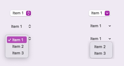
- Pop up buttons have a double arrow indicator on the side pointing up and down, while pull down have a single arrow indicator pointing just down.
- Pop up buttons display all menu items assigned to them when the menu is expanded. Pull down buttons use the first menu item as a label, and display only the rest on menu expansion. This fact makes pull down buttons ideal for toolbars or other action-containing places, as they can display a title, an image, or a combination of them that hide a bunch of menu items triggering various operations.
- Pop up buttons display the selected item when the menu is collapsed. On the other hand, pull down buttons always show their label, no matter which menu item is selected.
Right next you can see samples of both pop up (left side) and pull down (right side) buttons. Initially with the default appearance, then without border, and lastly the displayed menu items when the menu is expanded:
Creating a pop up button
Let’s get started by going through what it takes to create a pop up button programmatically. Undeniably, the first thing we need is a stored property in the view controller (or the view) class that we are working on, just like the next one:
|
1 2 3 4 5 6 7 8 |
class ViewController: NSViewController { var popupButton: NSPopUpButton! … } |
When it comes to initialize and configure UI controls programmatically, then I prefer to create separate methods for that purpose, especially if the creation of a control requires more than a few lines of code. In that spirit, in the next sample method we initialize the popupButton declared right above:
|
1 2 3 4 5 6 7 |
func configurePopUpButton() { popupButton = NSPopUpButton() layoutPopupButton() } |
The layoutPopupButton() method contained in the previous snippet is another method that adds the pop up button to the view controller’s view and set its constraints up. It places the pop up button to the center of the view, and its implementation is presented right in the next code segment. Keep in mind, however, that this is just a layout suitable to the purposes of this post, and there are no other views to consider.
|
1 2 3 4 5 6 7 8 9 |
func layoutPopupButton() { view.addSubview(popupButton) popupButton.translatesAutoresizingMaskIntoConstraints = false popupButton.centerXAnchor.constraint(equalTo: view.centerXAnchor).isActive = true popupButton.centerYAnchor.constraint(equalTo: view.centerYAnchor).isActive = true popupButton.widthAnchor.constraint(equalToConstant: 80).isActive = true } |
Other than that, we initialized the pop up button in the previous snippet with an initializer that takes no arguments. There are more initializers though, which can accept a frame for the pop up button, a title, an image and more. To keep things simple I won’t focus on them, but I leave it to you to explore further and see if there is any initializer that fits better your needs.
Adding menu items to pop up button
Usually, creating and configuring the menu items that a pop up button will display is where the majority of time is spent. There are two particular ways menu items can be assigned to a pop up button, which we’ll meet here. Then, I’ll show you a more convenient way to deal with all that.
When defining new menu items we need to specify the next three pieces of data:
- A title, image, or both for the menu item.
- A method that will be invoked on click and perform some action.
- The target class of the action method.
You’d probably expect that it would be possible to assign entire NSMenuItem objects to pop up buttons. However, that’s not the case here. A pop up button accepts just either a single, or multiple titles and it creates the respective menu items automatically. But still, we have to go through them and set their action methods and targets manually.
Let’s see first how to specify and configure menu items one by one. You can see in the next snippet that we can create a new menu item providing a single title with the addItem(withTitle:) method:
|
1 2 3 |
popupButton.addItem(withTitle: “Summer”) |
Once the actual item is created after having called the above method, we can then fetch it using a property named lastItem and then set the missing data. Keep in mind though that lastItem returns an optional object, so it’s necessary to unwrap it first:
|
1 2 3 4 5 6 |
if let item = popupButton.lastItem { item.action = #selector(action1) item.target = self } |
The item’s action is a Selector object containing the name of the method to be invoked when the item gets clicked. The target is usually the same class itself, indicated by the self keyword above, but you can always set a different target if necessary.
Notice that selector methods must be marked with the @objc keyword. For the purposes of this post we are going to use the following dummy action methods:
|
1 2 3 4 5 6 7 8 9 10 11 12 13 14 15 16 17 |
@objc func action1(_ sender: Any?) { print(“action 1”) } @objc func action2(_ sender: Any?) { print(“action 2”) } @objc func action3(_ sender: Any?) { print(“action 3”) } @objc func action4(_ sender: Any?) { print(“action 4”) } |
Similarly to what I just demonstrated, we can keep adding more titles in order to create menu items. Here’s an example continuing the presented sample so far:
|
1 2 3 4 5 6 7 8 9 10 11 12 13 14 15 16 17 18 19 20 21 22 23 24 25 26 27 28 29 30 31 |
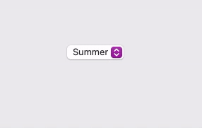
func configurePopUpButton() { popupButton = NSPopUpButton() layoutPopupButton() // Create menu items for the pop up button. popupButton.addItem(withTitle: “Summer”) if let item = popupButton.lastItem { item.action = #selector(action1) item.target = self } popupButton.addItem(withTitle: “Autumn”) if let item = popupButton.lastItem { item.action = #selector(action2) item.target = self } popupButton.addItem(withTitle: “Winter”) if let item = popupButton.lastItem { item.action = #selector(action3) item.target = self } popupButton.addItem(withTitle: “Spring”) if let item = popupButton.lastItem { item.action = #selector(action4) item.target = self } } |
The above code creates four menu items with the specified titles. Here’s what we’ll get by running this simple demo app:
Don’t forget that the configurePopUpButton() must be called somewhere, and the most suitable place for that here is the viewDidLoad() method:
|
1 2 3 4 5 6 7 |
override func viewDidLoad() { super.viewDidLoad() configurePopUpButton() } |
Although the previous code works just fine, it still has a flaw. It takes a considerable amount of repetitive lines with only some of them containing actual changes. For a large number of items, doing the above is totally counter-productive. It’s possible to speed up things a little though following a different approach; we’ll start by providing multiple titles at once:
|
1 2 3 |
popupButton.addItems(withTitles: [“Summer”, “Autumn”, “Winter”, “Spring”]) |
Now, instead of accessing each item separately, we’ll use a for-in loop to iterate through all of them. We’ll use another method named item(at:) in order to get each item, but note once again that it returns an optional value:
|
1 2 3 4 5 6 7 |
for index in 0..<popupButton.itemArray.count { if let item = popupButton.item(at: index) { } } |
Setting the target for each item is not going to be difficult; it’s the same for all items:
|
1 2 3 |
item.target = self |
Things are not the same regarding the action methods however. We need to specify an action for each item separately, so we’ll use a switch statement for that:
|
1 2 3 4 5 6 7 8 9 |
switch index { case 0: item.action = #selector(action1) case 1: item.action = #selector(action2) case 2: item.action = #selector(action3) case 3: item.action = #selector(action4) default: break } |
The configurePopUpButton() method now becomes as shown next:
|
1 2 3 4 5 6 7 8 9 10 11 12 13 14 15 16 17 18 19 20 21 22 23 24 |
func configurePopUpButton() { popupButton = NSPopUpButton() layoutPopupButton() // Create multiple menu items. popupButton.addItems(withTitles: [“Summer”, “Autumn”, “Winter”, “Spring”]) // Use a loop to set the action method and target for all items. for index in 0..<popupButton.itemArray.count { if let item = popupButton.item(at: index) { item.target = self switch index { case 0: item.action = #selector(action1) case 1: item.action = #selector(action2) case 2: item.action = #selector(action3) case 3: item.action = #selector(action4) default: break } } } } |
Much better this time, but there is still room for improvement, so we can change only what’s actually needed.
A faster way to configure menu items
Supposing that the target of the menu actions is going to be the self instance always, then what we only care to set for each menu item is the title, image (optionally) and the action method. Based on that thinking we can define the following method that accepts all the above as arguments, including one more; the pop up button that we are configuring menu items for:
|
1 2 3 4 5 6 7 8 |
func addMenuItem(withTitle title: String, image: NSImage? = nil, action: Selector, to control: NSPopUpButton) { } |
Note: In fact, the control parameter can be omitted, but I’m going to use the same method when I’ll talk about pull down buttons as well. So, we keep it there and make the method more general and not for a particular button only.
In the method’s body we’ll put in motion what we have already met. We’ll begin by providing the title for a new menu item, and then we’ll fetch it in order to assign the image, selector and target:
|
1 2 3 4 5 6 7 8 9 10 11 12 13 14 |
func addMenuItem(withTitle title: String, image: NSImage? = nil, action: Selector, to control: NSPopUpButton) { control.addItem(withTitle: title) guard let item = control.lastItem else { return } item.image = image item.action = action item.target = self } |
In the configurePopUpButton() we can now call the above method as many times as the menu items we want to create, supplying it with the proper arguments each time:
|
1 2 3 4 5 6 7 8 9 10 11 12 |
func configurePopUpButton() { popupButton = NSPopUpButton() layoutPopupButton() // Create menu items using the addMenuItem(withTitle:image:action:to) brand new method. addMenuItem(withTitle: “Summer”, action: #selector(action1), to: popupButton) addMenuItem(withTitle: “Automn”, action: #selector(action2), to: popupButton) addMenuItem(withTitle: “Winter”, action: #selector(action3), to: popupButton) addMenuItem(withTitle: “Spring”, action: #selector(action4), to: popupButton) } |
No doubt, that’s shorter compared to both implementations presented in the previous part, but on top of that, we now have a reusable method that can be used in other projects as well.
Borderless pop up buttons
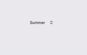
The default pop up button’s appearance might not be always matching to the user interface of an app. Removing the visible default border gives a totally different look, and trying it out is totally effortless.
In fact, all we need in order to remove the border and the standard appearance is to set false to the isBordered property:
|
1 2 3 |
popupButton.isBordered = false |
The result of the above is the following:
Creating a pull down button
A pull down button is actually a pop up button where a few properties have different values. Practically, if you can create a pop up button then you are just a step away from converting it into a pull down.
Just like as before, let’s get started with the declaration of a new NSPopUpButton property in the view controller class:
|
1 2 3 |
var pullDownButton: NSPopUpButton! |
Next, we initialize the above in a new method, the place where we’ll configure it as well:
|
1 2 3 4 5 6 |
func configurePullDownButton() { pullDownButton = NSPopUpButton() layoutPullDownButton() } |
For reference, the layoutPullDownButton() is the following:
|
1 2 3 4 5 6 7 8 9 10 |
func layoutPullDownButton() { view.addSubview(pullDownButton) pullDownButton.translatesAutoresizingMaskIntoConstraints = false pullDownButton.centerXAnchor.constraint(equalTo: view.centerXAnchor).isActive = true pullDownButton.centerYAnchor.constraint(equalTo: view.centerYAnchor).isActive = true pullDownButton.widthAnchor.constraint(equalToConstant: 40).isActive = true pullDownButton.heightAnchor.constraint(equalToConstant: 28).isActive = true } |
If you call the configurePullDownButton() method and try to run the app, what you’ll get is a pop up button. There is one particular property that changes it from a pop up to a pull down; the pullsDown that you see right next:
|
1 2 3 |
pullDownButton.pullsDown = true |
For the sake of the demonstration, let’s say that we want to configure the pull down button so it displays an image only instead of a title as label. To specify that, it’s necessary to set the imageOnly value to the imagePosition property like so:
|
1 2 3 |
pullDownButton.imagePosition = .imageOnly |
As mentioned in the introduction already, pull down buttons present the first menu item that will be given to them as label and not as part of the menu. Therefore, we’ll specify one that will contain an image without a title. Once again we’ll make use of the addMenuItem(withTitle:image:action:to:) method implemented earlier:
|
1 2 3 4 5 6 |
addMenuItem(withTitle: “”, image: NSImage(systemSymbolName: “ellipsis.circle”, accessibilityDescription: nil), action: #selector(noAction), to: pullDownButton) |
The image in this demo is an SF Symbol. Notice that it’s necessary to provide an action method in this case as well, but this one will remain empty:
|
1 2 3 |
@objc func noAction(_ sender: Any?) { } |
Just like it happened with the pop up button, the next step is to specify the menu items that will appear in the button’s menu when it gets clicked:
|
1 2 3 4 5 |
addMenuItem(withTitle: “Insert”, image: nil, action: #selector(action1), to: pullDownButton) addMenuItem(withTitle: “Update”, image: nil, action: #selector(action2), to: pullDownButton) addMenuItem(withTitle: “Delete”, image: nil, action: #selector(action3), to: pullDownButton) |
With all the above in place, if we call the configurePullDownButton() in viewDidLoad() we’ll get the following:
|
1 2 3 4 5 6 7 |
override func viewDidLoad() { super.viewDidLoad() configurePullDownButton() } |
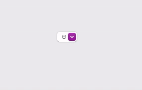
I mentioned earlier about borderless pop up buttons. Removing the border is sometimes more useful in pull down buttons, as it removes the default appearance and emphasizes the displayed image:
|
1 2 3 |
pullDownButton.isBordered = false |
Finally, there’s one more property that you might find useful in cases like the one discussed here. It’s the imageScaling that allows to scale the displayed image through some default values:
|
1 2 3 |
pullDownButton.imageScaling = .scaleProportionallyUpOrDown |
Right next you can see the configurePullDownButton() method with all the additions made to it, and then how the pull down button looks like eventually:
|
1 2 3 4 5 6 7 8 9 10 11 12 13 14 15 16 17 18 19 |
func configurePullDownButton() { pullDownButton = NSPopUpButton() layoutPullDownButton() pullDownButton.pullsDown = true pullDownButton.isBordered = false pullDownButton.imagePosition = .imageOnly pullDownButton.imageScaling = .scaleProportionallyUpOrDown addMenuItem(withTitle: “”, image: NSImage(systemSymbolName: “ellipsis.circle”, accessibilityDescription: nil), action: #selector(noAction), to: pullDownButton) addMenuItem(withTitle: “Insert”, image: nil, action: #selector(action1), to: pullDownButton) addMenuItem(withTitle: “Update”, image: nil, action: #selector(action2), to: pullDownButton) addMenuItem(withTitle: “Delete”, image: nil, action: #selector(action3), to: pullDownButton) } |

Conclusion
Pop up and pull down buttons are special buttons on macOS as they both present a menu when clicked, but still have some differences as shown in previous parts. Creating them programmatically is not difficult, with the most important task being the definition of the menu items to display. Hopefully, the proposed solution with the addMenuItem(withTitle:image:action:to:) method might be proved useful in actual projects of yours. But even without it, everything is a straightforward process that just takes some additional lines of code to complete. Creating pop up and pull down buttons can also be done graphically in Interface Builder, but that’s a topic that I might cover in a future post.
Thanks for reading, enjoy coding! ????????