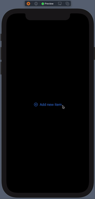
One of the most used controls in SwiftUI is the Button view. When creating buttons, a default style is applied to them. For simple cases where customization is not necessary, the predefined style works well; it creates a borderless button with a default highlight appearing when tapped.
As an example, suppose that we have the following button:
|
1 2 3 4 5 6 7 8 |
Button(action: {}, label: { HStack { Image(systemName: “plus.circle”) Text(“Add new item”) } }) |
With the default button style and without any customization, here is how the button responds when tapped:
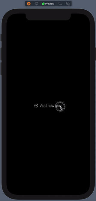
Besides the default one, there is also the plain button style (PlainButtonStyle). This one does not decorate the button at all, and it applies a lighter highlight to button on tap. To use it, provide an instance of it to the .buttonStyle view modifier:
|
1 2 3 4 5 6 |
Button(action: {}, label: { … }) .buttonStyle(PlainButtonStyle()) |
Here’s how the same button looks now:
However, besides the system provided button styles, it’s also possible to create custom styles as well. This can be proved quite handy when we need similarly configured and customized buttons all over an app. It can save us from the trouble of applying the same view modifiers to multiple buttons, which not only is a waste of time, but also a bad technique; DRY (Don’t Repeat Yourself) principle won’t apply by doing so.
Before we see how to create a custom button style, let’s configure a bit the sample button we’ve seen so far:
|
1 2 3 4 5 6 7 8 9 |
Button(action: {}, label: { … }) .padding(12) .background(Color(UIColor.systemIndigo)) .foregroundColor(.white) .cornerRadius(8) |
Let’s create a custom button style now. In order to do so, we have to implement a new structure which will be conforming to the ButtonStyle protocol. Structure’s name can be anything, but there is a required method that we have to necessarily define, called makeBody(configuration:):
|
1 2 3 4 5 6 7 |
struct SampleStyle: ButtonStyle { func makeBody(configuration: Self.Configuration) -> some View { } } |
The return type of that method is some View; an opaque type that allows to return any SwiftUI view. Practically, that means two things:
- We can return the button’s label configured as necessary by applying the proper view modifiers.
- We can return a SwiftUI view or a stack of views also configured properly with any view modifiers we want.
In both cases, by applying the custom style the button will update its appearance accordingly.
Let’s have a closer look at both.
Configuring the button’s label
To access and therefore configure the appearance of the button’s label, meaning the displayable content of the button, it’s necessary to use the configuration parameter value of the makeBody(configuration:) method.
configuration has a property called label. This is what will be returned from the method, and this is where any view modifiers that update the button’s appearance should be applied to. Taking the sample modifiers shown above, here’s how we can configure a custom button style:
|
1 2 3 4 5 6 7 8 9 10 11 |
struct SampleStyle: ButtonStyle { func makeBody(configuration: Self.Configuration) -> some View { configuration.label .padding(12) .background(Color(UIColor.systemIndigo)) .foregroundColor(.white) .cornerRadius(8) } } |
To apply the above in the actual button implementation, all we have to do is to use the SampleStyle custom style:
|
1 2 3 4 5 6 |
Button(action: {}, label: { … }) .buttonStyle(SampleStyle()) |
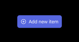
Changing appearance on press
Another fact that makes custom button style creation interesting is that makes really easy to change the button’s appearance on press and release (touch down & touch up) events. The configuration parameter value used above has one more property available to use, called isPressed. When true, the button is being pressed, and when false, the button is released.
To see how that can be used in action, let’s make the background and foreground colors used in the previous example change depending on the isPressed value.
|
1 2 3 4 5 6 7 8 9 10 11 12 13 14 15 16 17 18 |
struct SampleStyle: ButtonStyle { func makeBody(configuration: Self.Configuration) -> some View { configuration.label .padding(12) // Indigo background color on release, yellow on press. .background(!configuration.isPressed ? Color(UIColor.systemIndigo) : Color(UIColor.systemYellow)) // White text color on release, black on press. .foregroundColor(!configuration.isPressed ? .white : .black) .cornerRadius(8) } } |
If the button is not pressed, then the indigo color will be used as the button’s background and the white for the text. In the opposite case where the button is pressed, then the background becomes yellow and the text black.
The result of these modifications are shown next:
Configuring and returning a view
Besides the button’s label that can be returned from the makeBody(configuration:) method, it’s also possible to return any other SwiftUI view.
To see an example of that, let’s move the sample button’s displayed content from its implementation to the makeBody(configuration:) method. At first, the button’s label will become empty:
|
1 2 3 4 5 6 |
Button(action: {}, label: { // Button’s label remains empty. }) .buttonStyle(SampleStyle()) |
In the custom button style implementation we’re going to have the following, applying the same time all modifiers we previously met:
|
1 2 3 4 5 6 7 8 9 10 11 12 13 14 15 16 |
struct SampleStyle: ButtonStyle { func makeBody(configuration: Self.Configuration) -> some View { HStack { Image(systemName: “plus.circle”) Text(“Add new item”) } .padding(12) .background(!configuration.isPressed ? Color(UIColor.systemIndigo) : Color(UIColor.systemYellow)) .foregroundColor(!configuration.isPressed ? .white : .black) .cornerRadius(8) } } |
The button will render properly again. Even though it doesn’t have a label, the view that we return here (the HStack) is part of its style and this is what will be displayed.
However, having fixed values for views like the Image and Text does not sound really convenient. To come up with a more dynamic and meaningful implementation, we can declare the following properties and pass the displayed values as arguments when initializing a SampleStyle instance:
|
1 2 3 4 5 6 7 8 9 10 11 12 |
struct SampleStyle: ButtonStyle { let imageName: String let title: String HStack { Image(systemName: imageName) Text(title) } … } |
The call to SampleStyle must be changed accordingly, containing the actual values:
|
1 2 3 4 5 |
Button(action: {}, label: {}) .buttonStyle(SampleStyle(imageName: “plus.circle”, title: “Add new item”)) |
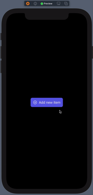
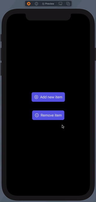
Doing the above allows to add as many buttons as necessary with similar style, but different displayed content. Right next we have two buttons using the SampleStyle:
|
1 2 3 4 5 6 7 8 9 10 11 12 13 |
VStack { Button(action: {}, label: {}) .buttonStyle(SampleStyle(imageName: “plus.circle”, title: “Add new item”)) Spacer().frame(height: 40) Button(action: {}, label: {}) .buttonStyle(SampleStyle(imageName: “minus.circle”, title: “Remove item”)) } |
The result of the above is this:
Note though that the same results can be achieved by implementing and configuring a button as a separate SwiftUI view, and then using that instead of creating a custom style as above just for that reason. And probably it’s a better idea to go with the latter in that case.
Also note that all the above apply to Link views as well.
Conclusion
I personally find custom button style implementation especially useful for getting rid of the default highlight applied to buttons, and for customizing appearance meant to be used repeatedly in multiple occasions. But regardless of what the reason you will create a button style is, it remains an undeniable fact that doing so is quite easy. SwiftUI is great, isn’t it?
This post has also been published on Medium.