Grids in SwiftUI is the equivalent of the UICollectionView in UIKit. A missing element in the original release of SwiftUI that Apple came to introduce a year later in the WWDC 2020.
A grid is not a single view in SwiftUI; it’s just a term that describes the concept of the collection view. However, creating a grid and presenting other views and data in rows and columns is quite easy, and it can lead to some great visual results.
The most important step before creating a grid is to decide about two things; the first is whether you want a vertical or horizontal layout. The second is how to distribute content on each column or row of the grid.
One thing to remember is that columns go in pair with vertical layout, while rows regard horizontal layout. Rows are repeated in vertical layout, so we take care of the number and appearance of columns on each row. On the other hand, columns are repeated in horizontal layout, so we only specify the number and appearance of rows.
There are three – four views that we need in order to create a grid in SwiftUI. These are:
- A
ScrollView: It’s the grid’s container, and enables the most expected action; to scroll among visible data. - A
LazyVGridor aLazyHGridview: The core view that in combination to all the rest described here results to the grid appearance. Their name starts with Lazy as they lazy-load their content only when needed. We use the former to define vertical, and the latter for horizontal grids. - A
ForEachview: It’s necessary to iterate through displayed data and content. When having 2-3 rows or 2-3 columns to display only, we can simply omit it. However, when there are tens or hundreds of items to show, it’s the best approach so we go through them. - A
GridItem: It’s equally, if not more important than LazyVGrid and LazyHGrid views. With such objects we have the ability to configure the number and layout of columns and rows on vertical and horizontal grids respectively.
If all that seem confusing to you, then let’s jump to a few examples that will make everything pretty clear.
Creating a vertical grid
In order to keep thins as simple as possible, I will be using color views instead of other actual content in all examples throughout this post. Colors will be chosen randomly from a small predefined collection. A method marked with the @ViewBuilder attribute returns each color view:
|
1 2 3 4 5 6 7 8 9 10 |
let colors: [Color] = [.red, .green, .blue, .yellow, .purple] @ViewBuilder func ColorView() -> some View { (colors.randomElement() ?? .gray) .cornerRadius(10) .frame(minHeight: 40) } |
Let’s create now a vertical grid with several rows of ColorView views. In the simplest form, we do that as follows:
|
1 2 3 4 5 6 7 8 9 10 |
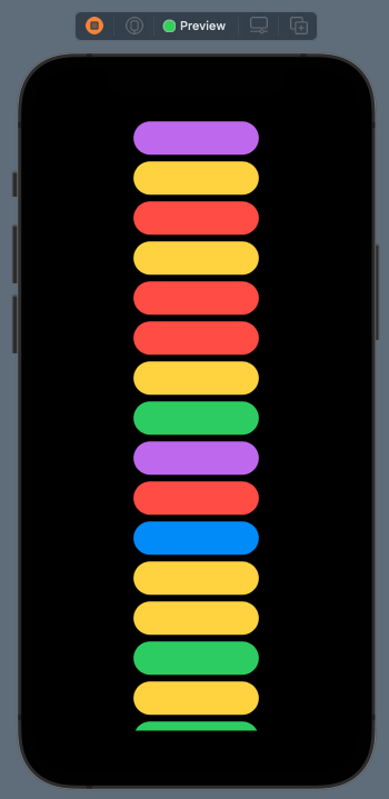
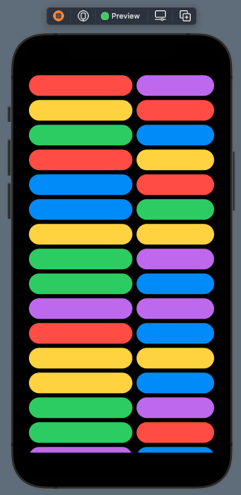
ScrollView(.vertical) { LazyVGrid(columns: [GridItem(.fixed(150))]) { ForEach((0…250), id: \.self) { _ in ColorView() } } } .padding() |
The first view we define is the ScrollView. See that the desired layout is given as argument, and it can be either .vertical or .horizontal. Note that in a case like this one where we have a vertical layout, we can omit providing the above argument. So, the ScrollView { ... } initialization without explicitly setting the scroll direction is equally correct.
The next view we meet is the LazyVGrid. It’s the one to use with the vertical layout. The columns argument is an array of GridItem objects; those that define how content will be distributed in columns. With the above grid item object in the array only, we’re specifying one column per row. That column will have a fixed width of 150pt. LazyVGrid, as well as LazyHGrid, can accept more arguments, but we’ll talk about that in a while.
The LazyVGrid view embeds the ForEach, which is quite simple for the sake of the example here. Since there is not an actual data source to go through, it performs a specific number of iterations in order to present an equal number of rows with ColorView instances.
Here’s the result of the above:
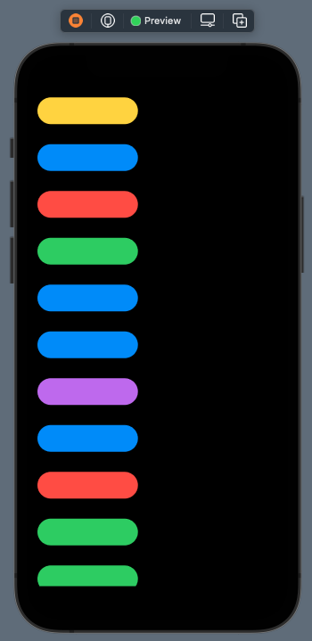
See that the content of each row is aligned to the center by default. We can change that by providing another alignment to the LazyVGrid initialization:
|
1 2 3 4 5 6 |
LazyVGrid(columns: [GridItem(.fixed(150))], alignment: .leading) { … } |
In a similar fashion, we can also change the spacing among rows:
|
1 2 3 4 5 6 7 |
LazyVGrid(columns: [GridItem(.fixed(150))], alignment: .leading, spacing: 30) { … } |
Specifying any the above is optional, and both of these parameters let us control the final outcome. The columns parameter is not optional though; it’s required and at least one grid item should always exist.
Grid item configuration
In the above example we initialized a GridItem object in the array given to the columns parameter. During that initialization, we set the fixed size with a constant width. The fact that there is just one GridItem instance in that array, indicates that there should be one column on each row only. To have more columns, it’s necessary to initialize more similar objects in the array.
We create as many GridItem objects as the number of columns we want to exist on each row.
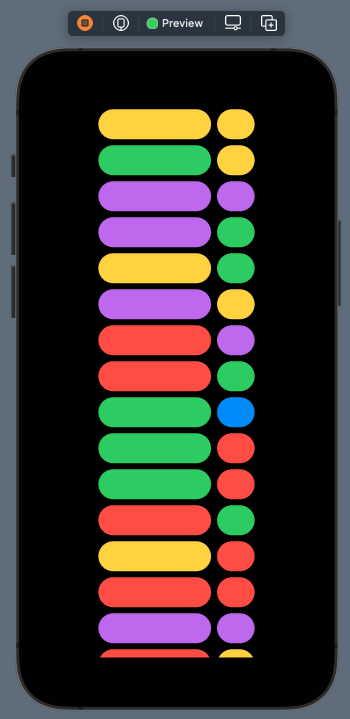
For example, right next we are initializing two columns with fixed size:
|
1 2 3 4 5 6 7 8 9 10 11 12 13 |
let columns = [GridItem(.fixed(150)), GridItem(.fixed(50))] var body: some View { ScrollView { LazyVGrid(columns: columns) { … } } } .padding() |
The fixed value is not the only available grid item size to use. There are two more that can offer great flexibility. The next one we are going to meet is the flexible size:
|
1 2 3 |
let columns = [GridItem(.flexible())] |
As its name suggests, it allows a column to expand or shrink depending on the available space. When used without any parameters, it automatically sets the width of the column to the maximum possible value. The grid size and the width of other potentially existing columns in the row limit that maximum value.
We can optionally provide minimum and maximum width values as arguments if that’s necessary. The following flexible initialization demonstrates that:
|
1 2 3 |
let columns = [GridItem(.flexible(minimum: 50, maximum: 250))] |
The minimum value has no real effect when it’s less than the available width to expand and there are no other columns in the row. It becomes handy when there are many columns in a limited space, and we want to ensure that the column won’t shrink beyond a certain amount.
Note that the flexible size can be combined with any available size:
|
1 2 3 4 |
let columns = [GridItem(.flexible(maximum: 250)), GridItem(.fixed(150))] |
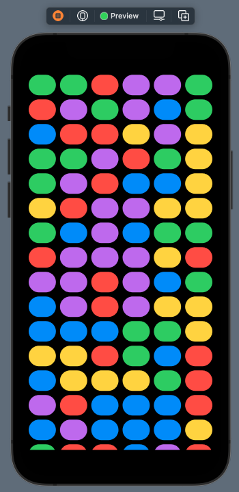
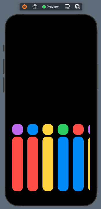
Besides the two grid item sizes presented already, there is also the adaptive size. Contrarily to the other two that allow to have one item in the column, the adaptive size tries to place as many items as possible in the available space given to the column. The total available space for all items with the adaptive size is equal to the space that just one item would occupy using the flexible size.
The adaptive size accepts two arguments; the desired minimum and maximum width for each item. The minimum size is the one that the system is using automatically in order to place as many items as it can to the column. However, items can expand up to the maximum value if needed.
The following snippet demonstrates how to use the adaptive size:
|
1 2 3 |
let columns = [GridItem(.adaptive(minimum: 50, maximum: 80))] |
The result is this:
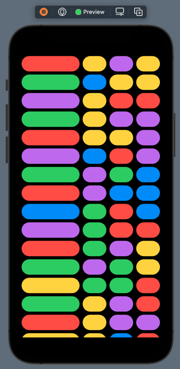
Obviously, the adaptive size can be combined with other sizes as well for greater flexibility:
|
1 2 3 4 |
let columns = [GridItem(.fixed(150)), GridItem(.adaptive(minimum: 50, maximum: 80))] |
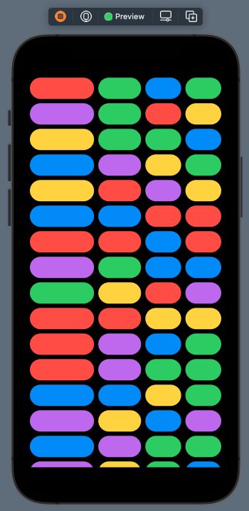
|
1 2 3 4 5 |
let columns = [GridItem(.fixed(120)), GridItem(.flexible(maximum: 80)), GridItem(.adaptive(minimum: 50, maximum: 120))] |
Creating a horizontal grid
Creating a horizontal grid is similar to creating a vertical grid, with the following changes being however necessary:
- The
.horizontallayout must be explicitly specified to the scroll view initialization. - The LazyHGrid must be used in place of the LazyVGrid.
- The
columnsparameter does not exist in LazyHGrid; instead, it’s replaced by therowsparameter.
In addition, note that grid items regard rows, not columns. Also, provided arguments to LazyHGrid have effect on the opposite axis than before; the spacing is applied on vertical axis, and the alignment includes top and bottom edges, but not leading or trailing.
The following example creates a horizontal grid with two rows; the first one has a fixed size, the second is using the flexible size with a maximum value applied. There is also a specific spacing among items, and the bottom alignment has been set:
|
1 2 3 4 5 6 7 8 9 10 11 12 13 14 |
ScrollView(.horizontal) { LazyHGrid(rows: [GridItem(.fixed(50)), GridItem(.flexible(maximum: 250))], alignment: .bottom, spacing: 20, content: { ForEach((0…250), id: \.self) { _ in ColorView() .frame(width: 50) } }) } .padding() |
Combining grids
If you start playing around with grids, soon you will realize that you can do a lot more than what you originally thought. After a short period of time you’ll want to achieve more advanced layouts, and one question will be born in your mind; can we combine grids?
The answer is yes! We can combine grids, so we can come up with more powerful and appealing user interfaces. What you will do and how you’ll put everything together, depends on what you want to achieve.
The following code snippet creates a vertical grid with a flexible column, where right after each ColorView there is a horizontal grid. It shows more ColorView instances in the horizontal axis, allowing to scroll on that direction too:
|
1 2 3 4 5 6 7 8 9 10 11 12 13 14 15 16 17 18 19 20 21 22 |
ScrollView { LazyVGrid(columns: [GridItem(.flexible())], spacing: 20, content: { ForEach((0…100), id: \.self) { _ in ColorView() .frame(minHeight: 120) ScrollView(.horizontal) { LazyHGrid(rows: [GridItem(.flexible())], alignment: .center, content: { ForEach((0…50), id: \.self) { _ in ColorView() .frame(minWidth: 50, minHeight: 50) } }) } .padding(.bottom, 10) } }) } .padding() |
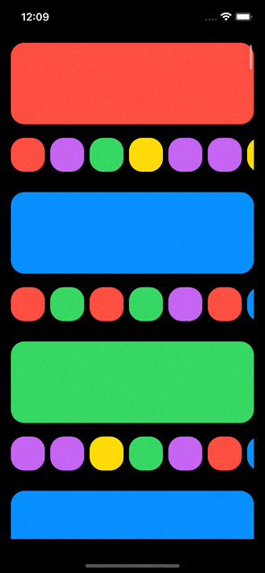
The above is a simple demonstration of combining grids. Use your imagination and follow the guidelines presented here to create unique interfaces.
Summary
It’s really easy to create grids in SwiftUI. And undeniably, it’s way more easy comparing to collection views in UIKit. The downside is that they are available since iOS 14 and above, so we can’t use them to support iOS 13. A different approach is necessary in that case, which I will probably present in a new post. Regardless of that, I hope you found this post valuable. Thank you for reading!