SF Symbols are an essential part of almost every SwiftUI app. They offer a wide range of system icons, which developers can access and integrate easily in all kind of apps. There are SF Symbol icons nearly for every occasion, and they work great out of the box in almost all cases. However, they become even more powerful when customizing them, and that’s what we’ll explore in this post; we’ll go through different ways that allow us to resize, style and animate them. You will learn eventually that SF Symbols can be a lot more than just plain icons, which can enhance the final visual outcome with just a few simple moves.
Resizing SF Symbols
The first thing we’ll get to know about SF Symbols is how to resize them, as that’s a quite common need when integrating them in apps. There are more than one ways to manage that, with the most usual and effective one being the use of the font view modifier.
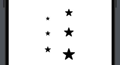
Indeed, the same modifier that changes the size of text, can work perfectly with SF Symbols too, and it’s applied exactly just like on Text or other views. As you see next, different font sizes produce different results:
|
1 2 3 4 5 6 7 8 9 10 11 12 |
VStack(spacing: 40) { Image(systemName: “star.fill”) .font(.body) Image(systemName: “star.fill”) .font(.title) Image(systemName: “star.fill”) .font(.largeTitle) } |

Applying the font modifier is just enough almost always. However, there’s also the imageScale view modifier, which, as the name suggests, can scale an image. It takes as argument any of the three relative sizes, small, medium and large, while they all depend on the font size applied to the Image view or the container view that Image views exist in.
See, for instance, what the results of these three values are when applying two different font sizes:
|
1 2 3 4 5 6 7 8 9 10 11 12 13 14 15 16 17 18 19 20 21 22 23 24 25 26 27 28 |
HStack(spacing: 40) { VStack(spacing: 40) { Image(systemName: “star.fill”) .imageScale(.small) Image(systemName: “star.fill”) .imageScale(.medium) Image(systemName: “star.fill”) .imageScale(.large) } .font(.body) VStack(spacing: 40) { Image(systemName: “star.fill”) .imageScale(.small) Image(systemName: “star.fill”) .imageScale(.medium) Image(systemName: “star.fill”) .imageScale(.large) } .font(.largeTitle) } |
A heads up; do not combine the imageScale with resizable modifiers. Doing so overrides the functionality of imageScale :
|
1 2 3 4 5 |
Image(systemName: “star.fill”) .resizable() .imageScale(.small) |

Resizing by setting a frame
Besides just employing font and scaleImage, we can also resize an SF Symbol icon by specifying a width and height using the frame modifier. Keep always in mind, however, that applying the resizable modifier before frame is mandatory, otherwise the icon remains constrained to its default size. Here’s an example:
|
1 2 3 4 5 |
Image(systemName: “star”) .resizable() .frame(width: 50, height: 30) |

It’s becoming clear from the above image that the SF Symbol is resized, but it’s stretched to fit the exact size of the largest dimension –the width in this case. The reason is that the width and height are not equal, and there are two ways to fix that. The first is quite obvious, just make them equal:
|
1 2 3 4 5 |
Image(systemName: “star”) .resizable() .frame(width: 50, height: 50) |
The second way to fix stretching is to apply the scaledToFit modifier right after resizable and before frame, telling SwiftUI to maintain the original aspect ratio of the icon. Note that when width and height have different values, the maximum size on any dimension is equal to the minimum value of width or height:
|
1 2 3 4 5 6 |
Image(systemName: “star”) .resizable() .scaledToFit() .frame(width: 50, height: 30) |
Here’s all the above examples together in one place and their visual result after that:
|
1 2 3 4 5 6 7 8 9 10 11 12 13 14 15 16 |
HStack(spacing: 40) { Image(systemName: “star”) .resizable() .frame(width: 50, height: 30) Image(systemName: “star”) .resizable() .frame(width: 50, height: 50) Image(systemName: “star”) .resizable() .scaledToFit() .frame(width: 50, height: 30) } |

☝️Note:
Instead of scaledToFit, we can also apply the aspectRatio modifier with the .fit argument: .aspectRatio(contentMode: .fit).
Styling SF Symbols
By default, SF Symbol icons are monochrome, and most of the times, the best effort we do to differentiate them a bit is to apply a foreground color using the foregroundStyle modifier:
|
1 2 3 4 5 |
Image(systemName: “heart.circle.fill”) .symbolRenderingMode(.monochrome) .foregroundStyle(.purple) |
However, monochrome is just one mode among four. In addition to it, the following three modes are also available (descriptions are taken straight from the docs):
- hierarchical: A mode that renders symbols as multiple layers, with different opacities applied to the foreground style.
- palette: A mode that renders symbols as multiple layers, with different styles applied to the layers.
- multicolor: A mode that renders symbols as multiple layers with their inherit styles.
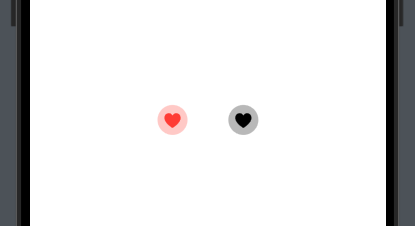
We use any of the above modes by providing them as arguments to the symbolRenderingMode view modifier. Starting with the hierarchical, icons that support this mode are displayed using two or three (depending on the icon’s layers) shades of the given color. If no foreground color is set, the icon uses the default label color instead:
|
1 2 3 4 5 6 7 8 9 10 |
HStack(spacing: 40) { Image(systemName: “heart.circle.fill”) .symbolRenderingMode(.hierarchical) .foregroundStyle(.red) Image(systemName: “heart.circle.fill”) .symbolRenderingMode(.hierarchical) } |
Next, it’s the palette mode. It applies different colors to each layer of the icon, but note that it’s mandatory to use the foregroundStyle modifier in order to specify colors. There are icons with two layers where we only set primary and secondary colors. There are also icons with a third layer, where we can also set a tertiary color. The next code demonstrates both cases:
|
1 2 3 4 5 6 7 8 9 10 11 |
HStack(spacing: 40) { Image(systemName: “heart.circle.fill”) .symbolRenderingMode(.palette) .foregroundStyle(.red, .yellow) Image(systemName: “cloud.sun.rain.fill”) .symbolRenderingMode(.palette) .foregroundStyle(.gray, .yellow, .blue) } |

☝️Note:
It might not be widely known or commonly used, but foregroundStyle provides initializers that allows us to provide primary, secondary and tertiary values for additional styling of the views.
Lastly, there is the multicolor mode. When setting it, SF Symbols use built-in colors, while foregroundStyle has no effect at all and there is no need to use it. Here are two icons that use default, built-in colors when the multicolor mode is set:
|
1 2 3 4 5 6 7 8 9 |
HStack(spacing: 40) { Image(systemName: “heart.circle.fill”) .symbolRenderingMode(.multicolor) Image(systemName: “sun.max.fill”) .symbolRenderingMode(.multicolor) } |

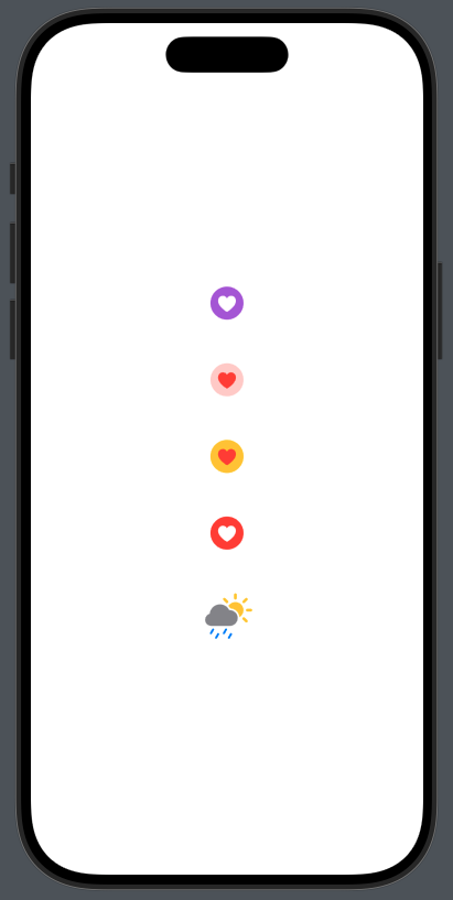
In the next code snippet you can find all rendering modes in one place:
|
1 2 3 4 5 6 7 8 9 10 11 12 13 14 15 16 17 18 19 20 21 22 23 |
VStack(spacing: 40) { Image(systemName: “heart.circle.fill”) .symbolRenderingMode(.monochrome) .foregroundStyle(.purple) Image(systemName: “heart.circle.fill”) .symbolRenderingMode(.hierarchical) .foregroundStyle(.red) Image(systemName: “heart.circle.fill”) .symbolRenderingMode(.palette) .foregroundStyle(.red, .yellow) Image(systemName: “heart.circle.fill”) .symbolRenderingMode(.multicolor) Image(systemName: “cloud.sun.rain.fill”) .symbolRenderingMode(.palette) .foregroundStyle(.gray, .yellow, .blue) } .font(.largeTitle) |
A couple of notes about styling SF Symbols
It’s not mandatory to always explicitly specify the rendering mode you want to apply. In certain cases it can be determined by the compiler even if you omit the symbolRenderingMode modifier. For instance, it’s not necessary to specify the monochrome mode for single-colored icons; the foregroundStyle (or the lack of it) implicitly declares the rendering mode. Similarly, three colors in foregroundStyle imply the palette mode:
|
1 2 3 4 5 6 7 8 9 10 11 |
VStack(spacing: 40) { Image(systemName: “heart.circle.fill”) // .symbolRenderingMode(.monochrome) <– Can be omitted .foregroundStyle(.purple) Image(systemName: “cloud.sun.rain.fill”) // .symbolRenderingMode(.palette) <– Can be omitted .foregroundStyle(.gray, .yellow, .blue) } |
It’s not difficult to find out when it’s necessary to explicitly set the rendering mode and when not. The more you make use of all that, the clearer it becomes. But generally speaking, you’ll mostly want to use symbolRenderingMode in the next cases:
- To differentiate
hierarchicalfrompalettemode. - To enforce the
multicolormode. - When styling is not working as expected without
symbolRenderingMode.
All the above rendering modes can produce beautiful and attractive icons, however, how can we know which modes each symbol supports? Not all of them support all modes.
One way to answer that is to do the obvious; try the various modes on an SF Symbol and see if and which have actual effect. Then you’ll know if you’ve found a suitable one, or you should search for a different icon.
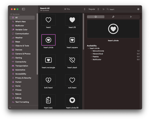
There’s nothing wrong with that, but there’s a better alternative; just use the SF Symbols macOS app from Apple. On the side pane you can see all the available information for any selected symbol, the supported rendering modes, animations, even samples of them.
Presenting variable symbols
All the Image view occurrences we’ve seen so far in all previous examples accept a single argument; the name of the SF Symbol we want to display. However, there’s another initializer that allows to provide an additional value: Image(systemName:variableValue:).
The variableValue parameter expects for an optional Double value ranging from 0.0 to 1.0. Some SF Symbols adapt to that additional value, resulting to showing various levels of progress indications. For instance:
|
1 2 3 4 |
Image(systemName: “speaker.wave.3”, variableValue: 0.4) .font(.largeTitle) |

The variable value does not have to be a hardcoded number. If necessary, we can change it on the fly and make the symbol adapt dynamically. To achieve that, initially we need a state property to keep the variable value that will change on demand:
|
1 2 3 |
@State private var soundLevel: Double = 0.5 |
To modify it, we can use any control that’s necessary, such as the Slider demonstrated in the following example. While the slider updates the value of soundLevel, the icon in the Image view gets updated accordingly.
|
1 2 3 4 5 6 7 8 9 |
VStack { Image(systemName: “speaker.wave.3”, variableValue: soundLevel) .font(.largeTitle) Slider(value: $soundLevel, in: 0…1) .padding() } |
Adjusting appearance with variants
Several SF Symbols come in variants; alternative representations of the same icon that may have shapes (circle, rectangle), fill colors, and more. To get a better understanding, take a look at the following:
|
1 2 3 4 5 6 7 8 |
HStack(spacing: 30) { Image(systemName: “pencil”) Image(systemName: “pencil.circle”) Image(systemName: “pencil.circle.fill”) } .font(.largeTitle) |
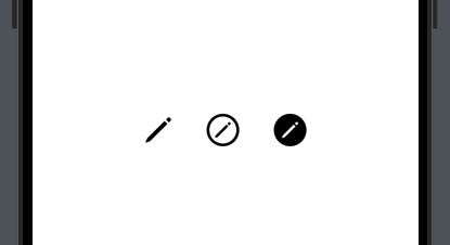
The main symbol is the same in all three occurrences, but the “pencil.circle” and “pencil.circle.fill” are variants of the original icon.
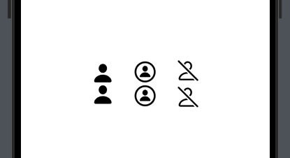
As of iOS 15, we can set one or more variants to a symbol using the symbolVariant modifier, besides just in the icon’s name. In the next code, you see how variants can be specified both in the symbol’s name and using the symbolVariant:
|
1 2 3 4 5 6 7 8 9 10 11 12 13 14 15 16 17 18 19 20 21 22 23 24 25 |
HStack(spacing: 30) { VStack { Image(systemName: “person.fill”) Image(systemName: “person”) .symbolVariant(.fill) } VStack { Image(systemName: “person.circle”) Image(systemName: “person”) .symbolVariant(.circle) } VStack { Image(systemName: “person.slash”) Image(systemName: “person”) .symbolVariant(.slash) } } .font(.largeTitle) |
Of course, we can apply several variants with the symbolVariant modifier. In fact, we can do that in two several ways; either by applying it multiple times with a different variant each timer, or by concatenating variants in the same modifier. The following lead to the same results:
|
1 2 3 4 5 6 7 8 9 10 11 12 13 |
VStack { Image(systemName: “person.circle.fill”) Image(systemName: “person”) .symbolVariant(.circle) .symbolVariant(.fill) Image(systemName: “person”) .symbolVariant(.circle.fill) } } |
The symbolVariant modifier can also be applied on a container view. When doing that, all symbols in the container adopt the variant or variants specified:
|
1 2 3 4 5 6 7 8 |
VStack { Image(systemName: “person”) Image(systemName: “heart”) Image(systemName: “star”) } .symbolVariant(.fill) |
Animating SF Symbols
Since iOS 17, there’s been an easy and straightforward way to animate SF Symbols. Thanks to the symbolEffect modifier and a variety of available animation effects, we can bring symbols to life at no time.
The fastest way to animate a symbol is to apply the symbolEffect modifier, passing as argument the desired effect:
|
1 2 3 4 |
Image(systemName: “heart”) .symbolEffect(.bounce) |
Almost all effects have variations, providing alternative ways to animate a symbol. To access these variations, simply press the dot key right after the effect’s value, and Xcode will suggest them all. Note that each effect has its own variations, even though some seem to be common among different animation effects:
|
1 2 3 4 |
Image(systemName: “info.circle”) .symbolEffect(.breathe.plain) |
☝️Note:
In fact, the above is just a chain of symbol effects.
Similarly to the previous example, we can chain more than two effects together. The following bounces towards down, but the animation takes place separately on each layer of the symbol:
|
1 2 3 4 |
Image(systemName: “person.wave.2”) .symbolEffect(.bounce.down.byLayer) |
Besides accepting the desired effect, or the chain of them, symbolEffect provides additional initializers that allow customizing the animations. The next example demonstrates another effect, which is set to be repeated periodically in constant intervals through the options parameter:
|
1 2 3 4 5 |
Image(systemName: “wifi”) .symbolEffect(.variableColor.dimInactiveLayers, options: .repeat(.periodic)) |
The periodic option can be also given as a method that accepts two arguments; the number of times to repeat the animation, and the interval between subsequent repetitions (in seconds):
|
1 2 3 4 5 |
Image(systemName: “wifi”) .symbolEffect(.variableColor.hideInactiveLayers, options: .repeat(.periodic(10, delay: 0.5))) |
It’s possible to provide just the one or the other argument when necessary in the periodic(_:delay:) method above. The following specifies only the interval between repetition; the symbol will keep animating indefinitely:
|
1 2 3 4 5 |
Image(systemName: “wifi”) .symbolEffect(.variableColor.hideInactiveLayers, options: .repeat(.periodic(delay: 0.5))) |
In addition to all the above, we can also animate a symbol programmatically or after a user interaction. The next code demonstrates how to do that, where we provide the value that controls the animation as argument to the value parameter in another initializer of symbolEffect. To keep things simple, the animation is triggered on tap gesture:
|
1 2 3 4 5 6 7 |
Image(systemName: “star”) .symbolEffect(.rotate, value: isRotating) .onTapGesture { isRotating.toggle() } |
isRotating is a state property in the view:
|
1 2 3 |
@State private var isRotating = false |
Note here that options and value parameters can exist together in the same initializer.
There are symbol effects which, even though they can’t be applied as all these we’ve met so far, they can help transition from one SF Symbol to another. In the code presented next, the displayed symbol is determined by the value of the replaceSymbol flag. On tap, we toggle the flag’s value. The transition between the two icons is happening animated using the contentTransition modifier, which accepts as argument a symbol effect:
|
1 2 3 4 5 6 7 |
Image(systemName: !replaceSymbol ? “plus” : “xmark”) .contentTransition(.symbolEffect(.replace.downUp)) .onTapGesture { replaceSymbol.toggle() } |
Just like before, replaceSymbol is a state property declared in the view:
|
1 2 3 |
@State private var replaceSymbol = false |
Finally, it’s worth saying that we can apply symbolEffect along with other modifiers that affect SF Symbols:
|
1 2 3 4 5 6 |
Image(systemName: “bell”) .symbolEffect(.wiggle, options: .repeat(.periodic)) .symbolRenderingMode(.monochrome) .foregroundStyle(.indigo) |
Right next you can see all previous examples together in one place:
|
1 2 3 4 5 6 7 8 9 10 11 12 13 14 15 16 17 18 19 20 21 22 23 24 25 26 27 28 29 30 31 32 33 34 35 36 |
VStack(spacing: 40) { Image(systemName: “heart”) .symbolEffect(.bounce) Image(systemName: “info.circle”) .symbolEffect(.breathe.plain) Image(systemName: “person.wave.2”) .symbolEffect(.bounce.down.byLayer) Image(systemName: “wifi”) .symbolEffect(.variableColor.hideInactiveLayers, options: .repeat(.periodic(delay: 0.5))) Image(systemName: “star”) .symbolEffect(.rotate, value: isRotating) .onTapGesture { isRotating.toggle() } Image(systemName: !replaceSymbol ? “plus” : “xmark”) .contentTransition(.symbolEffect(.replace.downUp)) .onTapGesture { replaceSymbol.toggle() } Image(systemName: “bell”) .symbolEffect(.wiggle, options: .repeat(.periodic)) .symbolRenderingMode(.monochrome) .foregroundStyle(.indigo) } .font(.largeTitle) .symbolVariant(.fill) .symbolRenderingMode(.multicolor) |
Conclusion
Coming to the end, I think it’s clear that SF Symbols is a lot more than just simple system-provided icons. With just a few moves, we can transform their default appearance and add beautiful, and quite often, useful visual touches to the user interface of our apps. To explore all their possibilities, just go ahead and experiment with the various modifiers that affect symbols. It’s definitely one of the most fun things you can do in SwiftUI. Thanks for reading!