SwiftUI makes it quite easy to create beautiful user interfaces. That fact becomes even bolder when it comes to apply simple styling to views, as many times a single line of code is enough to do the job. Drawing borders confirms that statement, as we can achieve nice results with almost no effort at all. This post demonstrates how to display simple borders around views, as well as how to create more complicated and configurable borders.
Displaying a simple border around a view is just a matter of calling a view modifier. The following code illustrates that by adding a border around a text view. Note that specifying the desired color for the border is mandatory:
|
1 2 3 4 |
Text(“Borders in SwiftUI!”) .border(.pink) |

You can see in the above screenshot that there is no actual space between the content of the view -the text in this case- and the border. We will rarely want to keep it that way, and we can easily get around that by adding some padding to the view. This will increase the distance between the view’s content and the border:
|
1 2 3 4 5 |
Text(“Borders in SwiftUI!”) .padding() .border(.pink) |

Most of the times, the order of view modifiers in SwiftUI matters, as different order can lead to different results. This rule applies in this case too, as it’s important to add the padding() view modifier before the border.
By default, the width of the border is 1 point. If that width is not suitable for the user interface we are making, then we can set another value by providing an additional argument like so:
|
1 2 3 4 5 |
Text(“Borders in SwiftUI!”) .padding() .border(.pink, width: 5) |

Not just rectangular borders
In the above example, the demonstrated border has a rectangular shape, and the only parameterized settings are the color and the line width values. However, the requirement to draw borders with rounded corners is pretty common, and the above view modifier does not give us any option to set that.
In such cases, there is a different approach that we should follow, and instead of a border, we should add an overlay to the view! As argument to the overlay we provide a shape view, and in order to end up with rounded corners, the RoundedRectangle view is the best choice to make; it allows to set a corner radius value.
But the shape view is not a border, nor it draws one automatically; it’s just a view having the given shape with a default opaque color. To change that, and make the shape view act as a border, all we have to do is to apply a stroke to it, passing as argument the desired color.
All the above are demonstrated in the following code:
|
1 2 3 4 5 6 7 8 |
Text(“Borders in SwiftUI!”) .padding() .overlay( RoundedRectangle(cornerRadius: 5) .stroke(.pink) ) |

Once again, the default line width is 1 point. In order to override that value and set a different one, we supply the stroke view modifier with one more argument; the lineWidth:
|
1 2 3 4 5 6 7 8 |
Text(“Borders in SwiftUI!”) .padding() .overlay( RoundedRectangle(cornerRadius: 5) .stroke(.pink, lineWidth: 8) ) |

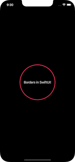
Obviously we can use any shape as the overlay’s contents, not just a RoundedRectangle instance. The next code demonstrates how to use a Circle view instead; note however that for this specific shape, it’s also necessary to set a frame to the text view that forms a conceivable rectangle:
|
1 2 3 4 5 6 7 8 9 |
Text(“Borders in SwiftUI!”) .frame(width: 150, height: 150) .padding() .overlay( Circle() .stroke(.pink, lineWidth: 3) ) |
Lastly, besides the solid line that the shape has by default, we can also specify a different stroke style and come up with a dashed line. In the stroke view modifier we replace the lineWidth argument with a StrokeStyle instance as shown next:
|
1 2 3 4 5 6 7 8 9 10 |
Text(“Borders in SwiftUI!”) .frame(width: 150, height: 150) .padding() .overlay( Circle() .stroke(.pink, style: StrokeStyle(lineWidth: 3, dash: [20, 5])) ) |

The line width is the first argument in the StrokeStyle initializer. The numbers in the dash argument indicate the length of each painted and unpainted segment in the dashed line. Note that StrokeStyle has more arguments to optionally supply with, but you will almost never need to use them.
Conclusion
For simple borders around a view, the border view modifier is the easiest way to go. We provide the desired color, and optionally the line width. Remember though to add some padding before the border, so it does not stick to the view’s content. For more advanced borders that should be containing rounded corners, or even different shapes, such as circle or capsule, the solution is to use an overlay and then the shape you need to display. Drawing a shape as a border was demonstrated above and it requires to apply the stroke view modifier. In any case, feel free to play around a bit with what you have read, and make shapes act as borders the way it fits you the most.
Thank you for reading, take care! ????