Shadows are quite often the missing ingredient in making a view look more appealing to users, eliminating the totally flat appearance and giving some sense of depth. Doing so in SwiftUI is easy; all it takes is to call a view modifier and pass a few arguments that configure the shadow.
A shadow can be shown on any view, and it can even be animated. Although in most cases applying a shadow has no side effects, buttons might need a bit of special care. That’s why I’m covering this case separately later in this post. First, let’s get a taste of shadows in SwiftUI.
The following lines define a Text in SwiftUI, with some padding around it and the title font:
|
1 2 3 4 5 |
Text(“Shadow in SwiftUI!”) .padding() .font(.title) |
To drop shadow on it, the shadow view modifier must be called like so:
|
1 2 3 4 5 6 |
Text(“Shadow in SwiftUI!”) .padding() .font(.title) .shadow(color: .blue, radius: 5, x: 0, y: 5) |
Provided arguments in order of appearance are:
- The shadow color
- The shadow blur amount. The higher this value, the most blurry the shadow becomes.
- Shadow offset on the X axis.
- Shadow offset on the Y axis.
The result of the above is this:
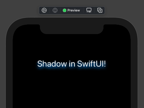
As said in the beginning, a shadow can be applied on any view. For instance, the following demonstrates how to drop shadow on a Shape:
|
1 2 3 4 5 6 |
RoundedRectangle(cornerRadius: 15) .frame(width: 250, height: 100) .foregroundColor(Color(UIColor.systemIndigo)) .shadow(color: .pink, radius: 3, x: –2, y: 2) |
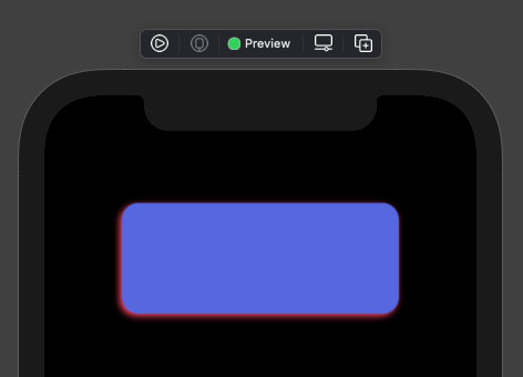
We can drop shadow in Colors directly; don’t forget that a Color is a view in SwiftUI:
|
1 2 3 4 5 6 |
Color(.darkGray) .frame(width: 100, height: 100) .clipShape(Circle()) .shadow(color: .green, radius: 4, x: –2, y: 1) |
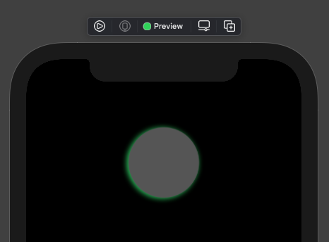
Animating shadow
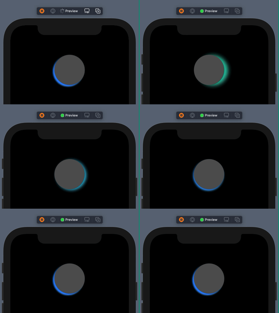
Shadow values can be animated as well. To see that, let’s suppose that we want to update with animation the shadow color, radius, and offset of the last example right above.
In order to achieve that, we need the following four properties marked with the @State property wrapper; they are going to update the view each time their value gets changed:
|
1 2 3 4 5 6 |
@State private var shadowColor: Color = .green @State private var shadowRadius: CGFloat = 8 @State private var shadowX: CGFloat = 20 @State private var shadowY: CGFloat = 0 |
Next, we’ll use the values of the above properties instead of fixed values for the shadow arguments:
|
1 2 3 |
.shadow(color: shadowColor, radius: shadowRadius, x: shadowX, y: shadowY) |
Finally, let’s apply the following animation when the view appears:
|
1 2 3 4 5 6 7 8 9 10 11 12 |
Color(.darkGray) … .onAppear() { withAnimation(.linear(duration: 2.5)) { shadowColor = .blue shadowRadius = 2 shadowX = –5 shadowY = 5 } } |
Here’s the outcome of the above animation:
Buttons and shadow
Button is a kind of view in SwiftUI that might not give you the desired result when applying a shadow on it. The best way to make this point clear, is to demonstrate it with an example.
Let’s begin with the following button:
|
1 2 3 4 5 6 7 8 9 |
Button(action: {}, label: { Text(“Press Me!”) .font(Font.largeTitle.lowercaseSmallCaps()) .foregroundColor(Color(.darkText)) }) .padding(12) .background(Color(.darkGray)) |
There is nothing difficult here; button’s label consists of a Text, and two view modifiers apply some padding and background color to the button.
Let’s set the following shadow now:
|
1 2 3 |
.shadow(color: .yellow, radius: 8, x: 0, y: 5) |
The result is this:
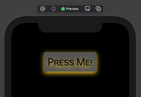
See that the shadow is dropped not only on the button’s shape, but also on the button’s label; the Text view in this case. That effect may suits you, but sometimes may not.
There are two ways to prevent the shadow from being applied to the button’s label. The first is to round its corners:
|
1 2 3 4 5 6 7 8 |
Button(action: {}, label: { … }) … .cornerRadius(8) .shadow(color: .yellow, radius: 8, x: 0, y: 5) |
The above will remove the shadow from the label:
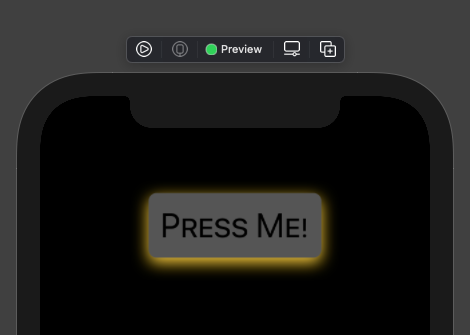
However, be really careful here; the cornerRadius modifier must come before the shadow modifier! Order really matters! If you change that order, then you cut the shadow from the button’s shape and allow it in the label only:
|
1 2 3 4 5 6 7 8 |
Button(action: {}, label: { … }) … .shadow(color: .yellow, radius: 8, x: 0, y: 5) .cornerRadius(8) |
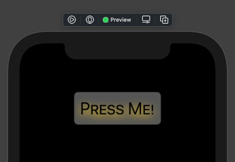
The second way to prevent shadow from being dropped to the button’s label is by avoiding to use a background color and rounded corners. Instead, use a shape with a fill color, and apply the shadow to the shape:
|
1 2 3 4 5 6 7 8 9 10 |
Button(action: {}, label: { … }) .padding(12) .background(RoundedRectangle(cornerRadius: 8) .fill(Color(.darkGray)) .shadow(color: .yellow, radius: 8, x: 0, y: 5) ) |
The result will be similar as above:

Summary
Dropping shadow on SwiftUI views is quite straightforward as you can see in this post, and if you want so, shadow can also be animated. Also, it seems that button and shadow is an interesting combination; keep the tricks I demonstrated right above under your sleeves, and use them when a shadow does not look right on your buttons. Thanks for being around!