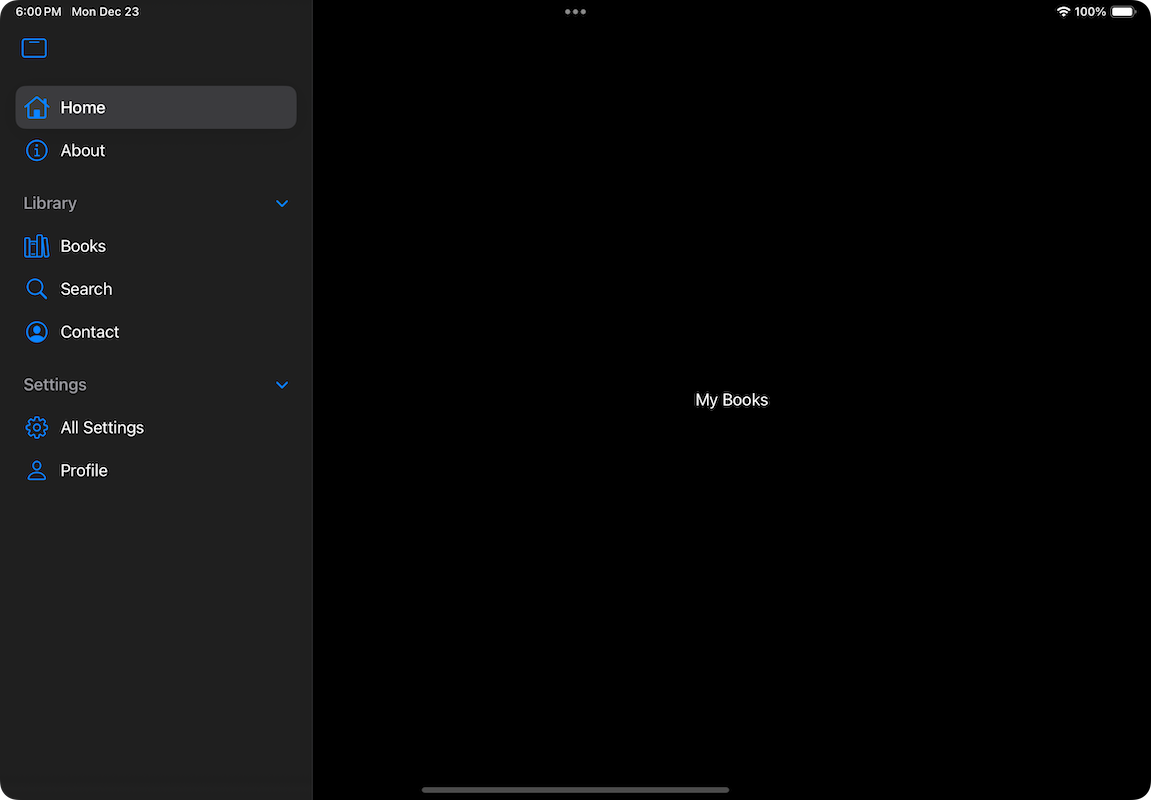
Welcome to the second part of the two-part tutorial about new features and capabilities announced for the SwiftUI TabView in WWDC 2024. In the first part and the initial round of exploration we talked about:
- The all brand new Tab view that comes to replace the
tabItem(_:)view modifier, - how to switch tabs programmatically,
- the also brand new sidebarAdaptable tab view style that allows to switch between the top floating tab bar and a sidebar on iPad,
- how to create tab sections and organize tabs logically when displaying the sidebar on iPad.
In this post we’ll focus on two things mainly; how to display tabs conditionally depending on the given size class (available real estate of the screen), and how to allow users to customize the sidebar and the top bar on iPad by reordering and moving tab items. So, let’s just dive in.
Displaying tabs and tab sections conditionally
The new sidebarAdaptable tab view style enables the appearance of a sidebar on iPad without any effort on our side at all. Theoretically, we can show any number of tabs and tab sections in the sidebar, offering a variety of options to users. But that’s meaningful only when running on iPad, and only when viewing in regular size class in particular.
On iPhone and the horizontally compact size class on iPad (when showing two apps side by side for example), the sidebar (or the top floating bar) gets the form of the familiar bottom tab bar we all know from any tab-based app. The problem here is that the bottom bar can display up to five tabs, and in addition to that, no tab sections are supported. All tabs are shown one after the other, and when they’re more than five, the last one becomes automatically the More tab that navigates to a list with the rest of the items.

It’s often against best user experience to have a big number of tabs shown on iPhone or the horizontally compact size class on iPad. Therefore, it is more preferable to adapt the displayed tab items, so the app looks equally good on any interface.To see how we do that, let’s consider the hypothetical library app from the previous part, which is enriched with more tabs this time:
|
1 2 3 4 5 6 7 8 9 10 11 12 13 14 15 16 17 18 19 20 21 22 23 24 25 26 27 28 29 30 31 32 33 34 35 36 |
TabView { Tab(“Home”, systemImage: “house”) { Text(“My Books”) } TabSection(“Library”) { Tab(“Books”, systemImage: “books.vertical”) { Text(“All Books”) } Tab(role: .search) { Text(“Find Books”) } Tab(“Contact”, systemImage: “person.crop.circle”) { Text(“Get in Touch”) } } TabSection(“Settings”) { Tab(“All Settings”, systemImage: “gearshape”) { Text(“All Settings, Profile, etc”) } Tab(“Profile”, systemImage: “person”) { Text(“My Profile”) } } Tab(“About”, systemImage: “info.circle”) { Text(“About this app”) } } .tabViewStyle(.sidebarAdaptable) |
Tabs shown in the previous code are too many to be properly shown in compact size class. It would be much better if we could show different tabs in regular and compact modes. In order to manage that, we can check the current size class value and then display the proper tabs conditionally.
Using the size class and if statements
For starters, we need to read the current size class value, which is easily accessible as an environment value in SwiftUI:
|
1 2 3 |
@Environment(\.horizontalSizeClass) var sizeClass |
We can now update the original code and depending on the size class value to display different tabs everywhere we need so:
|
1 2 3 4 5 6 7 8 9 10 11 12 13 14 15 16 17 18 19 20 21 22 23 24 25 26 27 28 29 30 31 32 33 34 35 36 37 38 39 40 41 42 43 44 45 46 47 48 49 50 51 52 53 54 55 56 |
TabView { Tab(“Home”, systemImage: “house”) { Text(“My Books”) } if sizeClass == .regular { // Regular size class. TabSection(“Library”) { Tab(“Books”, systemImage: “books.vertical”) { Text(“All Books”) } Tab(role: .search) { Text(“Find Books”) } Tab(“Contact”, systemImage: “person.crop.circle”) { Text(“Get in Touch”) } } } else { // Compact size class. Tab(“Library”, systemImage: “building.columns”) { Text(“Books, Contact”) } Tab(role: .search) { Text(“Find Books”) } } if sizeClass == .regular { // Regular size class. TabSection(“Settings”) { Tab(“All Settings”, systemImage: “gearshape”) { Text(“All Settings, Profile, etc”) } Tab(“Profile”, systemImage: “person”) { Text(“My Profile”) } } Tab(“About”, systemImage: “info.circle”) { Text(“About this app”) } } else { // Compact size class. Tab(“Settings”, systemImage: “gearshape”) { Text(“All Settings, Profile, About, etc”) } } } .tabViewStyle(.sidebarAdaptable) |
After that change, we now have a beautiful sidebar on iPad and specific number of tabs on compact size class, regardless of the device.


Displaying tabs conditionally using the hidden view modifier
Even though I personally prefer the conditional appearance using if statements, there’s also another way to display different tabs on each size class. That is by showing and hiding them using the hidden(_:) view modifier. Look closely at the following code, where the hidden state of tabs and sections is defined by the current size class:
|
1 2 3 4 5 6 7 8 9 10 11 12 13 14 15 16 17 18 19 20 21 22 23 24 25 26 27 28 29 30 31 32 33 34 35 36 37 38 39 40 41 42 43 44 45 46 47 48 49 50 51 52 53 54 55 56 57 |
TabView { Tab(“Home”, systemImage: “house”) { Text(“My Books”) } TabSection(“Library”) { Tab(“Books”, systemImage: “books.vertical”) { Text(“All Books”) } Tab(role: .search) { Text(“Find Books”) } Tab(“Contact”, systemImage: “person.crop.circle”) { Text(“Get in Touch”) } } .hidden(sizeClass == .compact) // Hide in compact size class. Tab(“Library”, systemImage: “building.columns”) { Text(“Books, Contact”) } .hidden(sizeClass != .compact) // Show in compact size class. Tab(role: .search) { Text(“Find Books”) } .hidden(sizeClass != .compact) // Show in compact size class. TabSection(“Settings”) { Tab(“All Settings”, systemImage: “gearshape”) { Text(“All Settings, Profile, etc”) } Tab(“Profile”, systemImage: “person”) { Text(“My Profile”) } } .hidden(sizeClass == .compact) // Hide in compact size class. Tab(“About”, systemImage: “info.circle”) { Text(“About this app”) } .hidden(sizeClass == .compact) // Hide in compact size class. Tab(“Settings”, systemImage: “gearshape”) { Text(“All Settings, Profile, About, etc”) } .hidden(sizeClass != .compact) // Show in compact size class. } .tabViewStyle(.sidebarAdaptable) |
The search Tab view
Now that we’ve seen how to specify different tabs for different size classes, we can move on and learn how to allow customization. But before that, it would be beneficial to highlight something we saw in the previous code snippets.
For the search tab, I used the following Tab view initializer:
|
1 2 3 4 5 |
Tab(role: .search) { Text(“Find Books”) } |
Because search is a common functionality that almost always uses the magnifying glass as icon, the above initializer comes as a shortcut to the following, which produces exactly the same results:
|
1 2 3 4 5 |
Tab(“Search”, systemImage: “magnifyingglass”) { Text(“Search Books”) } |
Enabling user customization
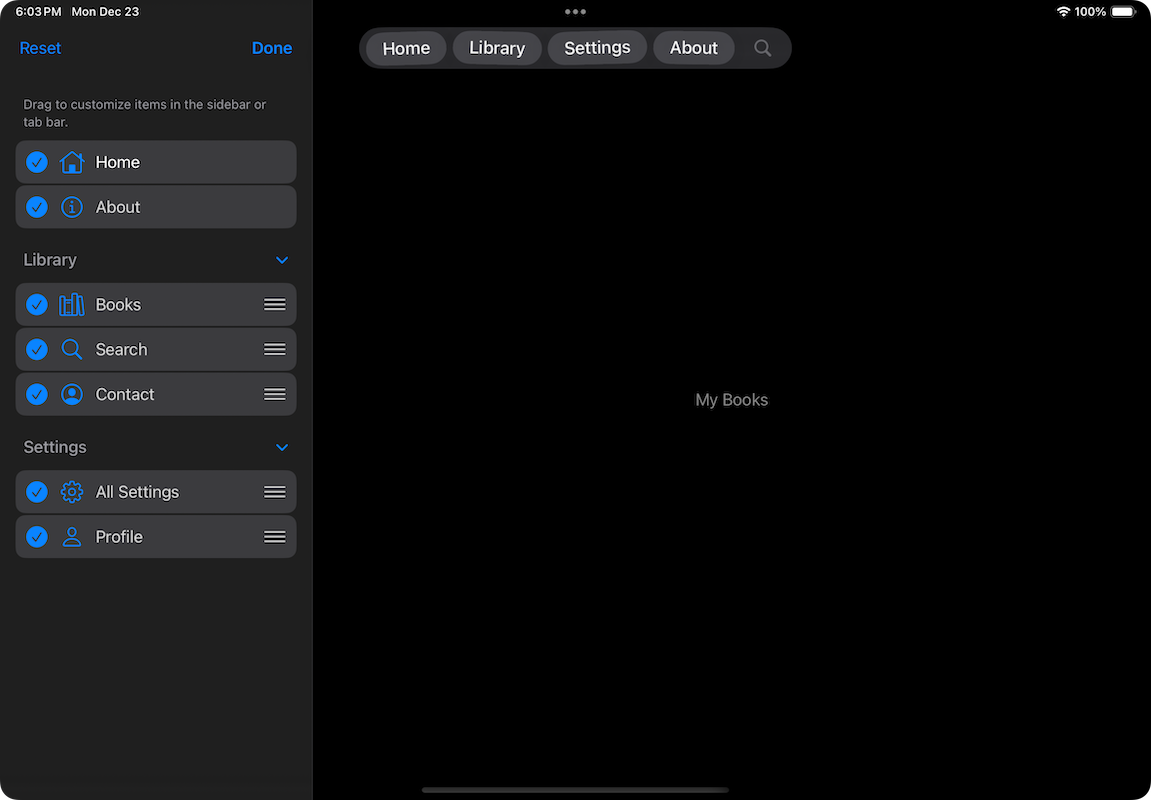
The updated TabView provides customization capabilities when using the sidebarAdaptable style and displaying the sidebar. Users can reorder tab items in the sidebar, but they can also change items of the top floating bar by dragging them from the sidebar. Customization requires a few certain actions, which are presented one by one next.
1 – Declare a tab view customization property
All customizations that users perform must be kept somewhere, so the UI can reflect and maintain all changes made at any given time. Storing customization changes is the job of a type called TabViewCustomization. In the SwiftUI view, we should initialize a state property of that type as shown next:
|
1 2 3 |
@State private var customization = TabViewCustomization() |
The above, along with the additional actions we’ll see next, will allow to customize items in the tab view. However, these changes won’t be stored permanently and the next time users will launch the app, all items will appear in their original place.
That behavior might be desirable sometimes, but other times the app might need to persist any changes that users perform. If you want to store items persistently, then use the @AppStorage attribute instead of @State like so:
|
1 2 3 4 |
@AppStorage(“tabCustomization”) private var customization = TabViewCustomization() |
2 – Use the customization property in a dedicated view modifier
The next step is to provide user customizations to the tab view using a particular view modifier, named tabViewCustomization(_:):
|
1 2 3 4 5 6 7 8 9 |
TabView { … } .tabViewStyle(.sidebarAdaptable) // Specify the customization to apply. .tabViewCustomization($customization) |
3 – Set customization identifiers
Lastly, it’s necessary to set customization identifiers to all tab items and tab sections that we would like to make available for customization. These identifiers are used internally by the TabViewCustomization instance declared previously. We just need to specify them, and make sure that they are unique.
To satisfy that requirement, Apple suggests to use a notation that follows the pattern:
com.AppName.TabItemName
For instance, the following is the customization identifier for the Home tab in the example scenario we’ve been working on in this post:
|
1 2 3 |
.customizationID(“com.NewTabViewDemo.home”) |
Note that customizationID(_:) is a view modifier applied to any tab item and section that users should be able to customize. The next code demonstrates how all items and sections get their customization identifiers:
|
1 2 3 4 5 6 7 8 9 10 11 12 13 14 15 16 17 18 19 20 21 22 23 24 25 26 27 28 29 30 31 32 33 34 35 36 37 38 39 40 41 42 43 44 45 46 |
TabView { Tab(“Home”, systemImage: “house”) { Text(“My Books”) } .customizationID(“com.NewTabViewDemo.home”) TabSection(“Library”) { Tab(“Books”, systemImage: “books.vertical”) { Text(“All Books”) } .customizationID(“com.NewTabViewDemo.books”) Tab(role: .search) { Text(“Find Books”) } .customizationID(“com.NewTabViewDemo.search”) Tab(“Contact”, systemImage: “person.crop.circle”) { Text(“Get in Touch”) } .customizationID(“com.NewTabViewDemo.contact”) } .customizationID(“com.NewTabViewDemo.library”) TabSection(“Settings”) { Tab(“All Settings”, systemImage: “gearshape”) { Text(“All Settings, Profile, etc”) } .customizationID(“com.NewTabViewDemo.allSettings”) Tab(“Profile”, systemImage: “person”) { Text(“My Profile”) } .customizationID(“com.NewTabViewDemo.profile”) } .customizationID(“com.NewTabViewDemo.settings”) Tab(“About”, systemImage: “info.circle”) { Text(“About this app”) } .customizationID(“com.NewTabViewDemo.about”) } .tabViewStyle(.sidebarAdaptable) .tabViewCustomization($customization) |
It’s really important not to neglect setting a customization identifier to tab sections too, not just to tab items.
By making the previous updates, the sidebar will show an Edit button that enables customization mode on tap:

In edit mode users can reorder items, and move items to and from the top floating bar altering the default appearance. There’s also a Reset button that reverts all changes automatically.

Summary
TabView in SwiftUI has received significant updates that let us create modern and fluid user interfaces easily. In the first part of this two-part tutorial we got to know the essentials of these updates, and in this post we focused mainly on customizations. That includes our efforts to display tab items conditionally based on the current size class, and when the goal is to let users customize the UI according to their preferences. Note that all advancements presented in the current and the previous post are available as of iOS 18, so conditional code that mixes new and old APIs is needed while it’s still necessary to support prior versions.
I hope you enjoyed this post, thank you for reading!