SwiftUI is full of views that act as composing blocks for other views. Some of them are quite well-known, while some others are not; yet, such views can be really useful tools that save us valuable time and help avoid writing unnecessary code. A view like that is the LabeledContent, a container that combines a label with a content, presenting everything in a predefined fashion.
In this post we’ll go through the various forms of LabeledContent; in fact, we’ll get to know the different available initializers, the type of content we can provide, and eventually how to create custom styles for that view.
Getting to know LabeledContent
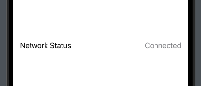
In its simplest form, LabeledContent is initialized with two String values; one for the label and one for the content as shown next:
|
1 2 3 |
LabeledContent(“Network Status”, value: “Connected”) |
The value argument can be anything conforming to StringProtocol, which practically means a String value. Depending on our needs, we can either hardcode it as shown above, or use a property so it can change dynamically:
|
1 2 3 4 5 6 7 8 9 10 11 12 13 14 15 16 17 18 |
struct ContentView: View { @State private var networkStatus: String = “Connected” var body: some View { VStack { LabeledContent(“Network Status”, value: networkStatus) Picker(“What’s your status?”, selection: $networkStatus) { Text(“Connected”).tag(“Connected”) Text(“Disconnected”).tag(“Disconnected”) Text(“Error”).tag(“Error”) } } .padding() } } |
Initializing with custom content
The previous initializer is suitable in cases where content is a String value, either fixed or dynamic. However, there might be times where we need to present a totally different type of content.
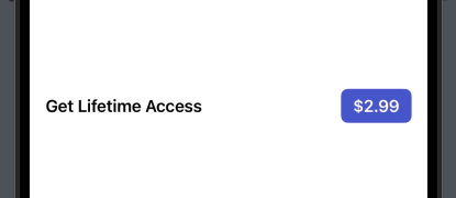
Suppose, for instance, that our goal is to show a label along with a button that will let users initiate an in-app purchase. The LabeledContent(_:content:) initializer can help us do that, as content can be any SwiftUI view necessary:
|
1 2 3 4 5 6 7 8 |
LabeledContent(“Get Lifetime Access”) { Button(“$2.99”) { } .buttonStyle(.borderedProminent) .tint(.indigo) } .font(.headline) |
We add any custom view we would like to the closure, with the button being a quite common such view. It’s worth noticing that the tint modifier sets the button’s background color and works well with the borderedProminent style, while we decorate the label using a different font style.
Initializing with custom label and content
The previous initializer is more powerful than the first one, since it allows us to add a LabeledContent container with a custom content. But it’s not as powerful as the next one, which enables us to provide both a custom label and a custom content.
The LabeledContent(content:label:) initializer expects two arguments, where both are closures. We add any view or views combination necessary to each closure, having the flexibility to build a more rich result.
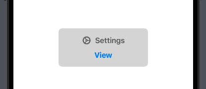
The label of the LabeledContent view in the following example contains a text and an icon, while the content is once again a button:
|
1 2 3 4 5 6 7 |
LabeledContent { Button(“View”) { } } label: { Label(“Settings”, systemImage: “gear”) } |
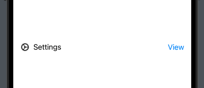
Needless to say, but the label doesn’t have to be a Label view necessarily. It could be just a Text view, an icon, or their combination.
Initializing with a title and a subtitle
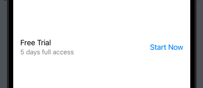
Sometimes it makes sense to display a subtitle along with the label title. That’s easy to do and the system automatically makes the subtitle distinguishable. We don’t need another initializer for that purpose, as the LabeledContent(content:label:) we met in the previous part does the job.
The trick in order to display a title and a subtitle is simple. We just have to place two Text views in the label, and the second one automatically becomes the subtitle:
|
1 2 3 4 5 6 7 8 |
LabeledContent { Button(“Start Now”) { } } label: { Text(“Free Trial”) Text(“5 days full access”) } |
The same effect is produced even if the first view is a Label instead of a Text view:
|
1 2 3 4 5 6 7 8 |
LabeledContent { Button(“Start Now”) { } } label: { Label(“Free Trial”, systemImage: “star”) Text(“5 days full access”) } |
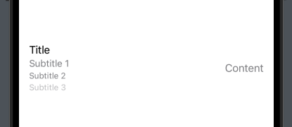
Finally, it might be helpful to note that there are three levels of subtitles in total which are highlighted accordingly by the system:
|
1 2 3 4 5 6 7 8 9 10 |
LabeledContent { Text(“Content”) } label: { Text(“Title”) Text(“Subtitle 1”) Text(“Subtitle 2”) Text(“Subtitle 3”) } |
Initializing with formatted values
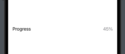
There is one last initializer of LabeledContent view suitable to use when we need to show formatted content, such as temperature, length, dates and time, etc. In contrary to the previous initializers, this one gets three arguments; the label value as a String, the value to display, and the desired format.
For instance, the following example shows a percent value properly formatted:
|
1 2 3 |
LabeledContent(“Progress”, value: 45, format: .percent) |
Creating custom styles
All previous examples have something in common; the way LabeledContent presents the label and the content. If using this view is suitable but the visual outcome is not desirable or needs tweaking, then we can create custom styles in order to change the appearance of LabeledContent.
Say that we’d like to show the label and the content vertically instead of horizontally. It’s not difficult to achieve that and give any styling we want, as long as we create a new style. For that, we have to implement a new struct that conforms to LabeledContentStyle protocol and implement the makeBody(configuration:) method:
|
1 2 3 4 5 6 7 |
struct CustomLabeledContentStyle: LabeledContentStyle { func makeBody(configuration: Configuration) -> some View { } } |
In the method’s body we define the custom style. The configuration parameter value provides us access to both the label and the content of the LabeledContent view. In the following implementation you see these two values put one after the other in a VStack, while they are all styled with a few modifiers:
|
1 2 3 4 5 6 7 8 9 10 11 12 13 14 15 16 17 18 |
struct CustomLabeledContentStyle: LabeledContentStyle { func makeBody(configuration: Configuration) -> some View { VStack(spacing: 12) { configuration.label .font(.headline) .foregroundStyle(.opacity(0.75)) configuration.content .fontWeight(.bold) } .padding() .frame(width: 200) .background(.black.opacity(0.15)) .clipShape(.rect(cornerRadius: 8)) } } |
We can now use any LabeledContent initializer, and apply the CustomLabeledContentStyle we defined previously. For example:
|
1 2 3 4 5 6 7 8 |
LabeledContent { Button(“View”) { } } label: { Label(“Settings”, systemImage: “gear”) } .labeledContentStyle(CustomLabeledContentStyle()) |
Conclusion
The LabeledContent is a handy view that allows us to easily display a label and content of various types. Through its various initializers we have the ability to specify how both parts appear. Even more, we can define custom styles for a totally different appearance. Note that LabeledContent is available as of iOS 16. I hope you found this post valuable and what you read here helps completing your UI-coding tasks easier. Thanks for reading!