There are many iOS and macOS applications both from Apple and third parties we often use, which are navigation based and present a special particulariry; they have three columns in order to navigate among dynamic content. The best example you can think of is the built-in Mail app. It consists of a sidebar in order to choose a mail folder, another column that lists all emails in the selected folder, and a third column that displays a chosen email.
In UIKit and AppKit, a UISplitViewController and a NSSplitViewController would be the necessary classes for building that functionality. In SwiftUI things are different though; a NavigationView with a couple of List views do the job in a much simpler fashion. The only requirement is to follow certain steps in the proper order.
In this post we are going to see what it takes in order to implement a three-column navigation in SwiftUI. For that, we’ll be based on a small demo project; it will provide us with the minimum amount of data we need so we can simulate a real app. With no more delay, let’s get straight to it.
A simple concept to implement
Let’s suppose that we have an app where we manage various settings. The goal is to use a three-column navigation in order to do the management easy and straightforward. We will proceed having the following hierarchy in mind:
- Settings are organized in categories. Those categories are going to be displayed on the sidebar.
- Settings contained in a category are going to be shown on the second column. That’s something that will be happening by selecting a category, either by tapping or clicking on it (on macOS).
- The details of each setting will be presented on the third column, once we select a setting first. Since this is a fake scenario, we’ll make no real details available here. Instead, a random “lorem ipsum” text will be displayed for each setting selected in the second column.
The following code includes all custom types and fake data that will serve the demo project shown in this post:
|
1 2 3 4 5 6 7 8 9 10 11 12 13 14 15 16 17 18 19 20 21 22 23 24 25 26 27 28 29 30 31 32 33 34 35 36 37 38 39 40 41 42 43 44 45 46 47 48 49 50 51 52 53 54 55 56 57 58 59 60 61 62 |
struct Category: Identifiable, Hashable { var id = UUID().uuidString var name: String } struct Setting: Identifiable, Hashable { var id = UUID().uuidString var name: String var value: String { [ “Lorem ipsum dolor sit amet, consectetur adipiscing elit, sed do eiusmod tempor incididunt ut labore et dolore magna aliqua.”, “Pretium viverra suspendisse potenti nullam ac tortor vitae purus.”, “Laoreet suspendisse interdum consectetur libero id faucibus nisl.”, “Faucibus et molestie ac feugiat sed lectus vestibulum.”, “Faucibus et molestie ac feugiat sed lectus vestibulum.” ][Int.random(in: 0..<5)] } } class CategoriesModel: ObservableObject { @Published var categories: [Category] = [Category(name: “Profile”), Category(name: “Language”), Category(name: “Connected Accounts”), Category(name: “Color Theme”) ] } class SettingsModel: ObservableObject { @Published var settings = [Setting]() init(with category: String) { switch category { case “Profile”: settings = [Setting(name: “Name”), Setting(name: “Picture”), Setting(name: “Gender”)] case “Language”: settings = [Setting(name: “English”), Setting(name: “German”), Setting(name: “French”), Setting(name: “Italian”), Setting(name: “Spanish”), Setting(name: “Greek”), Setting(name: “Russian”), Setting(name: “Hindi”), Setting(name: “Chinese”)] case “Connected Accounts”: settings = [Setting(name: “Facebook”), Setting(name: “Twitter”), Setting(name: “Instagram”), Setting(name: “Linkedin”), Setting(name: “Google”)] case “Color Theme”: settings = [Setting(name: “Red”), Setting(name: “Yellow”), Setting(name: “Purple”), Setting(name: “Green”), Setting(name: “Monochrome”)] default: break } } } |
The navigation view
Traditionally, we use a NavigationView for implementing a navigation experience that leads from a main to a detail view. On iPad and macOS, that’s usually a sidebar and content view combination, with the latter being updated in accordance to the choices made to the former one. However, there is a small, yet vital detail that we don’t read about often; NavigationView in SwiftUI can show up to three views (three columns).
Apparently, NavigationView is the first among a series of specific SwiftUI views we need to make use of; it constitutes the starting point towards implementing the three-column navigation. Besides the steps that follow in the next parts though, the first important move we need to do is to start by adding three subviews in the NavigationView.
That’s important for one, simple reason; the number of columns that the navigation view will contain is defined at compile time; and it depends on the number of subviews that we provide it with.
The following code snippet demonstrates that:
|
1 2 3 4 5 6 7 8 9 10 11 12 13 14 15 16 |
struct ContentView: View { var body: some View { NavigationView { // The first column is the sidebar. Sidebar() // Initial content of the second column. EmptyView() // Initial content for the third column. Text(“Select a category of settings in the sidebar.”) } } } |
As you can see above, the first view should be the one that implements the sidebar contents (it comes in the next part). The other two views are the initial content for the second and third columns of the navigation view; it’s what users will see until they make their first selection on the sidebar, and on the second column after that.
What you will use as the initial views is obviously totally up to you. Undeniably, we can consider them as placeholders that will be presented until actual content is ready to be displayed. For demonstration, I am using an empty view for the second column here, and a Text view for the third one. Of course, initial views can be more complex SwiftUI views, containing text, images, or anything else you find suitable for your app.
The sidebar
It’s a fact that we could implement the three-column navigation views in one SwiftUI source code file only. However, that’s not really handy when it comes to readability and maintanability. What I prefer to do in that case, is to separate steps in different files, and eventually end up with simple implementations easy to work with.
So, I’ll keep going with the sidebar’s implementation in a different file. Initially, we need to declare two properties in the struct that will implement the sidebar; one regarding the source of truth for the sidebar contents, and one that will be holding the selected settings category. That’s going to be necessary pretty soon in the NavigationLink we’ll add next.
The source of truth, or in other words, the datasource for the sidebar contents will be the available categories of settings in this example. The selected category will be kept in a Category property:
|
1 2 3 4 5 6 7 8 |
struct Sidebar: View { @ObservedObject var settingsCategories = CategoriesModel() @State private var selectedCategory: Category? … } |
In the view’s body now, we need to implement a List view:
|
1 2 3 4 5 6 7 |
var body: some View { List(settingsCategories.categories) { category in } } |
Alternatively, you may use a ForEach inside the List like so:
|
1 2 3 4 5 6 7 |
List { ForEach(settingsCategories.categories) { category in } } |
Given that we are seeking to implement a navigation behavior in the app, we are going to need a NavigationLink view inside the List’s body. That navigation link will be loading and presenting the view to the second column.
Here it is:
|
1 2 3 4 5 6 7 8 9 10 11 12 13 14 |
List(settingsCategories.categories) { category in NavigationLink( destination: SettingsListView(settingsCategory: category), tag: category, selection: $selectedCategory, label: { HStack { Image(systemName: “folder”) Text(category.name) } }) } |
The destination view is the SettingsListView in this case, and we’ll implement it next. We’ll be providing the selected category in it, so the settings included in that category can be fetched and listed to the second column.
The selection argument in the above NavigationLink initializer keeps the category that is currently selected, and it’s the reason we had to declare the selectedCategory state property earlier.
The displayable content of the navigation link is a horizontal stack that contains an SF Symbol as an image, along with the name of the category.
However, and besides the necessity to use a NavigationLink as the content of the List, it’s also necessary to assign a specific style to the list; the sidebar list style:
|
1 2 3 4 5 6 |
List(settingsCategories.categories) { category in … } .listStyle(SidebarListStyle()) |
Even though the effect of the above is not immediately obvious, it’s what will actually assign the proper sidebar behavior to the List. In case there are sections in it, this modifier makes them expandable and collapsible with the use of disclosure indicators.
On macOS specifically, we may also set a specific width to the sidebar, or a desired minimum width. On iPad, doing so seems to be having negative visual effects, so give it a try first before using it.
|
1 2 3 4 5 6 |
List(settingsCategories.categories) { category in … } .frame(minWidth: 200) |
That’s everything regarding the sidebar implementation. Of course, instead of retrieving the content dynamically as shown here, you can have static content and implement an equivalent number of navigation links. But that’s of a little importance right now; what actually matters to take with you leaving this part is that you need a List view along with one or more NavigationLink views, and the SidebarListStyle to apply as the list’s style.
The second column
In the example project demonstrated in this post, the second column is going to be presenting all available settings for a chosen category in the sidebar. The implementation here involves steps quite similar to those in the previous part where we focused on the sidebar making. That means that we are going to use a List and a NavigationLink embedded in it, in order to achieve the navigation behavior of the second column in the navigation view.
Before getting there however, let’s perform some initial actions that will let us get the data that we’ll present here. So, in a new SwiftUI file I will start with the following three declarations:
|
1 2 3 4 5 6 7 8 9 |
struct SettingsListView: View { var settingsCategory: Category @ObservedObject var settingsModel: SettingsModel @State private var selectedSetting: Setting? … } |
The settingsCategory property is the Category instance passed as argument upon the view’s initialization. The settingsModel is the source of truth for the data we’ll show in this view, as we will fetch available settings for the given category through that. Lastly, selectedSetting property will be holding any setting that the user has might clicked or tapped on.
See that the settingsModel property is not initialized above. In order to do so, it’s necessary to feed it with the name of the selected category and get the settings regarding it. For that purpose, we’ll manually implement the init method of the struct like so:
|
1 2 3 4 5 6 |
init(settingsCategory: Category) { self.settingsCategory = settingsCategory settingsModel = SettingsModel(with: settingsCategory.name) } |
With the above in place, the settingsModel property will be initialized using the category’s name when SettingsListView gets loaded.
Into the actual point now, a List view is necessary once again for listing all settings for the selected category. In the List’s body, a NavigationLink view will help up achieve the desired navigation functionality in the second column. The destination view that we’ll specify this time, is the view that will appear in the third column:
|
1 2 3 4 5 6 7 8 9 10 11 12 13 14 |
var body: some View { List(settingsModel.settings) { setting in NavigationLink(destination: SettingDetailsView(setting: setting), tag: setting, selection: $selectedSetting) { HStack { Image(systemName: “gearshape”) Text(setting.name) } } } } |
Notice that the displayable content for the navigation link is a horizontal stack displaying each setting name, next to an SF Symbol image (a gear icon).
In addition to the above, we may optionally display the selected category’s name as the navigation title:
|
1 2 3 4 5 6 |
List(settingsModel.settings) { setting in … } .navigationTitle(settingsCategory.name) |
There is practically nothing more to do in this view. The List along with the navigation link are content views in the NavigationView implemented in a previous part; that navigation view will assign the proper behavior to the views added here.
The third column
The third and last column in the navigation view is probably the easiest and fastest one to implement in this demo project; all we’ll do is to display a random “lorem ipsum” text in place of the details of a real setting. After all, that’s a fake application.
Right below you can see the implementation of one last new SwiftUI view; the SettingDetailsView. It’s the one provided as destination in the previous part:
|
1 2 3 4 5 6 7 8 9 10 11 12 |
struct SettingDetailsView: View { var setting: Setting var body: some View { Text(setting.value) .font(.title2) .padding(.horizontal) .navigationTitle(setting.name) } } |
The selected setting is given as argument to the view when it gets initialized. The value property used in the Text view returns the random text that will be displayed. The other view modifiers are there just to style the text a bit, with a bigger font and by creating some padding on the horizontal axis.
The last view modifier sets the setting name as the navigation title. Note that this has effect on iOS only, and not on macOS apps. That navigation title will be presented on the third column when viewed on iPad, without replacing the category name we set as the navigation title previously; that will be shown on the second column.
Bonus: Toggling the sidebar
All the necessary implementation that will give us the three-column navigation is now complete. However, I think there is a final touch that is still missing here; that is how to toggle the appearance of the sidebar on macOS apps. On iOS, sidebar is hidden by default until we choose to open it using the Back button in the second column.
We need a way to trigger that operation, and that is to add a button to the app’s toolbar. That’s something that we’ll do in the initial content view, right after the closing of the NavigationView:
|
1 2 3 4 5 6 7 8 9 10 11 12 13 14 |
NavigationView { … } .toolbar { ToolbarItem(placement: ToolbarItemPlacement.navigation) { Button { } label: { Label(“Toggle sidebar”, systemImage: “sidebar.left”) } } } |
See that the button we’re adding to the toolbar is placed on the .navigation position; that’s on the left side of the navigation title.
To manage to toggle the appearance of the sidebar, it’s necessary to resort to AppKit. What we’ll do exactly is to call a method called toggleSidebar() by accessing the NSSplitViewController lying behind the navigation view with the sidebar. And we’ll do so through the app’s window like so:
|
1 2 3 4 5 6 7 |
Button { NSApp.keyWindow?.firstResponder?.tryToPerform( #selector(NSSplitViewController.toggleSidebar(_:)), with: nil ) } label: { … } |
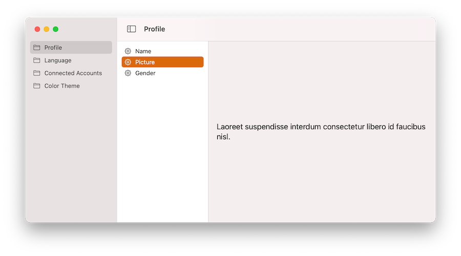
Finally, and after all the above, here’s the result on macOS and iPad respectively:
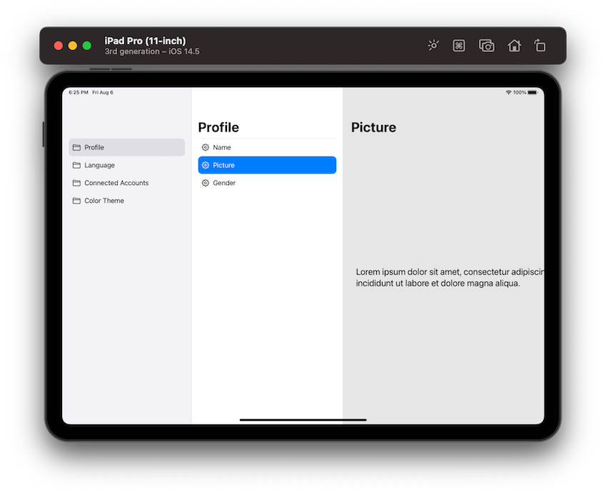
Summary
Creating a three-column navigation for iOS and macOS apps includes a series of specific steps to perform. And in this post I made an effort to outline them as simply as possible through a fake project that separates and highlights each step. Obviously, the details and the displayable content is going to be different for each app, but the path to build a three-column navigation will be remaining the same. And there is no doubt that SwiftUI makes it really easy to implement such a functionality with just a few simple moves. I hope that you found this post useful and educative. Thank you for reading, take care!