When making apps, it’s sometimes necessary to provide users with a specific feature; the ability to select and change the color of one or more visual elements of the app. Think, for example, of a text editing app. Users might want to change both the background and the text color according to their own personal preferences and taste.
Implementing a custom palette is easy if colors collection should contain a limited set of colors. However, if we want to give users advanced options, then implementing such a custom control might not be that easy.
Thankfully, SwiftUI contains a built-in view just for that, available in iOS 14 and above. It’s a system provided color picker both in iOS and macOS; and in this post I’m going to show how to integrate it in your apps.
Using the color picker on iOS
In its simplest form, here is what it takes to present a color picker in SwiftUI:
|
1 2 3 |
ColorPicker(“Choose a background color”, selection: $bgColor) |
There are two arguments that we must provide when initializing a ColorPicker view; a text that will be displayed as the picker’s label, and a binding value, usually of a @State property.
Suppose that the above line presents the color picker in order to let users change the background color of a view. Even though that single line initializes and presents the color picker, it’s not enough. According to Apple documentation, we must include the color picker in a container view; a VStack, HStack, List, and so on.
To demonstrate that, as well as to show a more complete example, take a look at the following code snippet:
|
1 2 3 4 5 6 7 8 9 10 11 12 13 14 15 |
struct ContentView: View { @State private var bgColor = Color.blue.opacity(0.5) var body: some View { VStack { ColorPicker(“Choose a background color”, selection: $bgColor) .padding(.horizontal) } .frame(maxWidth: .infinity, maxHeight: .infinity) .background(bgColor) .ignoresSafeArea() } } |
What the above does is to present a VStack that covers the entire view ignoring the safe area, and using the background color stored in the bgColor state property. The VStack contains a ColorPicker instance, which we can use to change the background color.

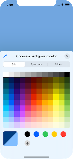
See that the argument text is shown as label next to the color well that displays the currently selected color. By tapping on it, the following view is showing up:
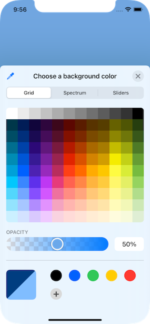
This time, the picker shows the text as a title at the top. Besides that, however, it displays colors in three different ways; the first one is a grid where users can simply tap to select a color. Right below that, there is also a colored slider that allows to change the opacity of the color.
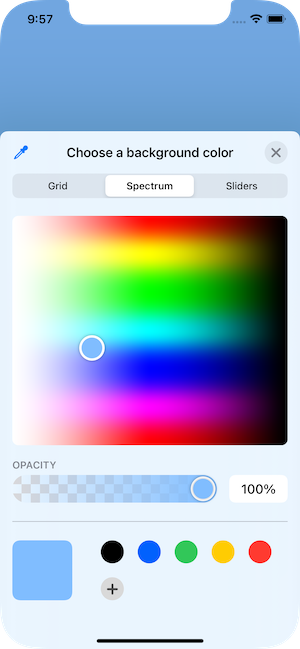
If grid is not a suitable representation, then users can display a color spectrum by selecting the Spectrum tab at the top:
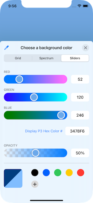
There is a third option to specify a color as well, and lies behind the third tab named Sliders. There, it’s possible to set the red, green and blue values of a color in two ways; either by using the respective sliders, or by typing actual values ranging from 0 to 255. In addition, there is one more field both for indicating the equivalent hex value of the color, and accepting one.
Even more, it’s possible to switch between two color spaces; sRGB and Display P3. Users can do that by tapping on the button right before the color’s hex value.
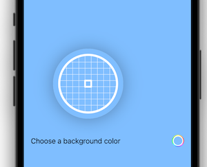
If the above are not enough, color picker also provides an eyedropper button; it allows to pick a color from anywhere in the screen:
Note that the color picker won’t be dismissed automatically once users select a color. It’s still necessary to tap on the close button on the top-right corner.
Color picker without opacity
As demonstrated in the previous screenshots, the color picker contains a slider in order to control a color’s alpha value (opacity). However, it might not be always desirable to allow users to alter the opacity.
For such cases, we can actually hide the opacity slider. All it takes is an additional argument in the picker’s initialization:
|
1 2 3 4 5 |
ColorPicker(“Choose a background color”, selection: $bgColor, supportsOpacity: false) |
supportsOpacity is by default true, and the opacity slider is visible in the picker. By setting false, color picker won’t be displaying it:
Multiple color pickers
As mentioned previously, the color picker expects the binding value of a color property as an argument. However, what if it’s necessary to pick colors for more than one visual elements?
In such cases, it’s perfectly fine to have as many color pickers as necessary in the view. The important thing is to have an equal number of @State properties (or other sources of truth) in order to use their binding values in the pickers.
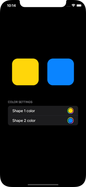
Let’s have a look at another pretty simple example. The following code defines a VStack that contains two shapes with two different foreground colors. Right after these shapes, there is a form representing fake settings with a single section; and inside the section there are two color picker views:
|
1 2 3 4 5 6 7 8 9 10 11 12 13 14 15 16 17 18 19 20 21 22 23 24 25 26 27 28 29 30 31 32 |
struct ContentView: View { @State private var shape1Color = Color.yellow @State private var shape2Color = Color.blue var body: some View { VStack { HStack { RoundedRectangle(cornerRadius: 25) .frame(width: 120, height: 120) .foregroundColor(shape1Color) .padding(.horizontal) RoundedRectangle(cornerRadius: 25) .frame(width: 120, height: 120) .foregroundColor(shape2Color) .padding(.horizontal) } Form { Section(header: Text(“Color Settings”)) { ColorPicker(“Shape 1 color”, selection: $shape1Color) ColorPicker(“Shape 2 color”, selection: $shape2Color) } } .frame(height: 150) .padding(.horizontal) .padding(.top, 50) } } } |
See that there are two @State properties this time. Each color picker accepts a different binding value, so it’s possible to change both colors. Depending on the picker that will be used, the color of the respective shape is going to be modified.
Alternative color picker labels
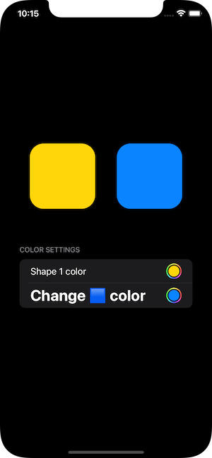
In all previous examples a simple String value is what color pickers show as a label. However, there is an alternative initializer that we can use in order to specify a custom label to use instead.
Here, the picker’s label is the last argument, and it’s a container view. In its body we can implement a more advanced label using other SwiftUI views.
Note that if the the label is a Text view, then its content will appear as the picker’s title above colors. If not, then a default title will be set by the system automatically.
Based on the last example demonstrated above, let’s change the initialization of the second color picker. Here we have a Text view that does not contain only text, with the font being changed as well:
|
1 2 3 4 5 6 7 |
ColorPicker(selection: $shape2Color, label: { Text(“Change ???? color”) .font(.title) .fontWeight(.bold) }) |
Here’s how the picker shows now:
Note that turning off the opacity is also possible with this initializer too. We just have to set false to the supportsOpacity argument, which comes before the label:
|
1 2 3 4 5 |
ColorPicker(selection: $shape2Color, supportsOpacity: false, label: { … }) |
Color picker on macOS
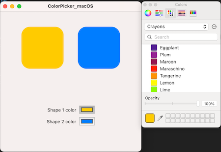
When it comes to macOS, there is practically no difference in the implementation of the color picker. Everything you’ve read so far applies on macOS too.
What changes is the appearance of color picker in the app. Instead of circular, there is a rectangular color well here. When presented, what we see is the familiar system color picker that we all know pretty well. And as shown previously in iOS, it’s possible to hide the opacity slider as well.
To get a taste of how it looks on macOS, an implementation similar to the above one with the two colored shapes, and two color pickers, will give us the following:
Summary
Color picker is a handy tool that we may use without resorting to custom solutions. It’s available natively in SwiftUI, and as you’ve seen in this post, initializing and presenting one is a single line job. The actual benefit of using the system provided color picker is that users meet a familiar and known control; that makes it easy for them to use it and navigate around without the need of being trained first. And that sounds like a big deal in terms of user experience. In any case, thank you for reading up to the end; stay tuned for more posts in SwiftUI and not only!