It’s quite usual when creating iOS apps to ask for confirmation right before users perform critical or important actions. For instance, doing so is pretty common when they are about to delete important data permanently. Since iOS 15, SwiftUI makes that an easy task, providing us with a particular view modifier for that purpose. In this post I’m going to demonstrate what it takes to use it in any project, and all possible configuration we can do.
A confirmation dialog at its simplest form
To demonstrate the built-in confirmation dialog we don’t need much. We’ll start simple, with just a button in a SwiftUI view that will trigger the confirmation’s appearance:
|
1 2 3 4 5 6 7 8 9 10 11 |
struct ContentView: View { @State private var showConfirmation = false var body: some View { Button(“Delete my data”) { showConfirmation = true } } } |
When the button gets tapped, the showConfirmation property becomes true, and that change will make the confirmation dialog show up right next.
If you’re coming from UIKit, then you will soon find out that the confirmation dialog is nothing else but an action sheet. Regardless, it’s a system provided control with specific purpose that users are familiar with, so it’s a great solution if it fits to your user interface or you don’t want to resort to implementing custom confirmations.
To present the system-provided confirmation dialog we can use the following view modifier, supplying it with the minimum required arguments:
|
1 2 3 4 5 6 7 8 |
Button(“Delete my data”) { showConfirmation = true } .confirmationDialog(“Delete data?”, isPresented: $showConfirmation) { } |
- The first argument is a title which we can optionally show to users. More details about that in a while, but you may have an empty string here if you’re not planning to show a title.
- The second argument is the binding value of the state property that controls the appearance of the dialog.
- The last argument is a closure where we provide the actions that should be present in the dialog. In fact, the expected actions are SwiftUI buttons, but there is an important detail to remember; button labels should be text only, as anything else will simply not be displayed.
With that said, let’s add a button matching to the first action:
|
1 2 3 4 5 |
.confirmationDialog(“Delete data?”, isPresented: $showConfirmation) { Button(“Yes, delete it all”, action: {}) } |
Running the code we have so far, here’s what we’ll get:

See that the button’s title gets the default blue color, but if you want to indicate a destructive operation you can set the respective role in the button’s initialization:
|
1 2 3 4 5 |
.confirmationDialog(“Delete data?”, isPresented: $showConfirmation) { Button(“Yes, delete it all”, role: .destructive, action: {}) } |

The Cancel button
You have definitely noticed that the confirmation dialog contains a Cancel button, even though we did not explicitly specify one previously. That button is there by default in case users want to simply dismiss the dialog without proceeding with whatever they are asked to confirm.
Most of the times the default “Cancel” title will be just okay, but it might be necessary sometimes to have a different one. We can override “Cancel” and provide a custom title simply by adding another action button, passing the cancel role to the matching argument:
|
1 2 3 4 5 6 7 8 |
.confirmationDialog(“Delete data?”, isPresented: $showConfirmation) { Button(“Yes, delete it all”, role: .destructive, action: {}) // This button overrides the default Cancel button. Button(“I changed my mind”, role: .cancel, action: {}) } |
There is no need to provide a particular action in the action closure here, not even to change the showConfirmation to false in order to dismiss the confirmation. Actually…
It’s not necessary to manually set false to the binding value that controls the appearance of the confirmation dialog! The system does so automatically after pressing any button.
So, our dialog after having added the new button to cancel looks like this:

Providing additional actions
A confirmation dialog does not always have to be a strict “Yes – No” or “Do – Don’t” view. It might be meaningful sometimes to provide more options to users and additional actions to perform.
Doing so is not difficult, as all it takes is defining one or more extra buttons. In this example, let’s give one more option to users:
|
1 2 3 4 5 6 7 8 9 10 |
.confirmationDialog(“Delete data?”, isPresented: $showConfirmation) { Button(“Yes, delete it all”, role: .destructive, action: {}) // This is an additional action made available to users. Button(“Delete but keep my settings”, action: {}) Button(“I changed my mind”, role: .cancel, action: {}) } |

According to the documentation, note here that if there are multiple buttons defined in the dialog, then the system might change the order of their appearance depending on their role or prominence. To ensure that the button you want to be on top actually remains on top, suffix it with the keyboardShortcut(_:) view modifier providing the defaultAction as argument like so:
|
1 2 3 4 5 6 7 8 9 10 |
.confirmationDialog(“Delete data?”, isPresented: $showConfirmation) { Button(“Yes, delete it all”, role: .destructive, action: {}) .keyboardShortcut(.defaultAction) Button(“Delete but keep my settings”, action: {}) Button(“I changed my mind”, role: .cancel, action: {}) } |
Title visibility
You might have noticed from the previous screenshots that the title given to the confirmation dialog is not displayed at all. This is default behavior, but we can easily change it.
All we have to do is to initialize the view modifier with one more argument that explicitly sets the title visible:
|
1 2 3 4 5 6 7 |
.confirmationDialog(“Delete data?”, isPresented: $showConfirmation, titleVisibility: .visible) { // Action buttons… } |
With the above the title is now present:

Displaying a message
Along with the title, it’s also possible to display a message to users. And similarly as before, this is a matter of another argument in the dialog’s initialization. As you can see right next, that new argument is a closure where we can provide one or more Text views with the message we want to show:
|
1 2 3 4 5 6 7 |
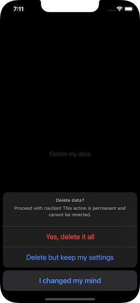
.confirmationDialog(“Delete Data?”, isPresented: $showConfirmation, titleVisibility: .visible) { // Action buttons… } message: { Text(“Proceed with caution! This action is permanent and cannot be reverted.”) } |
Conclusion
As you have found out while coming to this point, using the confirmation dialog in SwiftUI is an easy and quick job. It allows to ask users for critical or other actions right before performing them, and all that in just a few lines of code and almost with a single move. Consider using it if that system dialog fits to the look of your apps, and prevent users from proceeding to dangerous actions by requiring their confirmation easily.
Thank you for reading!