One of the tasks iOS developers often come to perform is to present paged content. That usually happens in on-boarding screens, as well as other parts in apps where users should scroll left or right to see subsequent content. Doing so in SwiftUI is surprisingly easy, especially when comparing to UIKit where things are a bit more tricky.
I have already demonstrated a related how-to in an older post, but not as a standalone topic, rather as the last part of another one. Nevertheless, it’s a programming technique that definitely deserves its own tutorial, so let’s stick just on that to find out how to show content in pages using SwiftUI.
Creating Pages
What usually indicates paged content is the appearance of a series of white dots at the bottom side of the screen, where each dot matches to a page and the selected dot is the current page. These dots are also known as the page index view.

Although that view is usually there so users have a visual feedback about the page they are in and the remaining ones, it’s also possible to make it invisible. This doesn’t change the fact, though, that the presented content is still separated in pages.
If you have not implemented something similar before in SwiftUI, then you’ll probably realize with surprise that the page index view is actually a “disguised” tab view. What makes the difference and changes the default appearance and behavior of the tab view is just a single view modifier.
Let’s take things step by step, so for starters consider the following simple view implementation. It contains a tab view with five items:
|
1 2 3 4 5 6 7 8 9 10 11 12 13 14 15 16 17 18 19 20 21 22 23 24 25 26 27 28 29 30 |
var body: some View { TabView(selection: $selectedPage) { formattedText(“Page #1”, backgroundColor: .indigo, foregroundColor: .white).tag(0) .tabItem { Text(“Page 1”) } formattedText(“Page #2”, backgroundColor: .pink, foregroundColor: .white).tag(1) .tabItem { Text(“Page 2”) } formattedText(“Page #3”, backgroundColor: .mint).tag(2) .tabItem { Text(“Page 3”) } formattedText(“Page #4”, backgroundColor: .yellow).tag(3) .tabItem { Text(“Page 4”) } formattedText(“Page #5”, backgroundColor: .cyan).tag(4) .tabItem { Text(“Page 5”) } } } |
The selected page is stored in the following property:
|
1 2 3 |
@State var selectedPage = 0 |
The formattedText(_:backgroundColor:foregroundColor:) content of each tab item is implemented in the following method marked with the @ViewBuilder attribute:
|
1 2 3 4 5 6 7 8 9 10 11 12 |
@ViewBuilder func formattedText(_ text: String, backgroundColor: Color, foregroundColor: Color = .black) -> some View { Text(text) .font(.largeTitle) .frame(width: 250, height: 250) .padding() .background(backgroundColor) .foregroundColor(foregroundColor) .cornerRadius(15) } |
Note: You can read more about creating SwiftUI views in methods using the @ViewBuilder attribute in this older post.
In order to show the above content in pages, the simplest move that we can do is to change the tab view’s style using the tabViewStyle(_:) modifier and provide the page argument:
|
1 2 3 4 5 6 |
TabView(selection: $selectedPage) { … } .tabViewStyle(.page) |
Notice that the text given to Text views in all tab items is disregarded, and a dot matches to each page.
Showing and hiding the page index view
By default, the page index view is visible so users can easily know how many pages exist to go through, and what page they are currently in. However, there are cases where displaying it is not a desirable behavior of the app.
To make the pages indicator invisible, we use the tabViewStyle(_:) modifier once again. This time, however, page is not a static property, but a static method that accepts the visible state of the indicator as argument. The never argument, for instance, hides the dots permanently:
|
1 2 3 4 5 6 |
TabView(selection: $selectedPage) { … } .tabViewStyle(.page(indexDisplayMode: .never)) |
There are two more values that we can give as arguments; always and automatic. The former forces the pages index view to be always visible, while the latter makes it visible only when there are more than one pages.
Page index view and the white background
A permanent issue of the page index view is that dots are not visible in light background. The following image illustrates that:
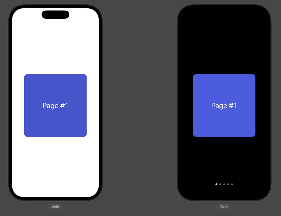
The fix comes by applying an additional view modifier to the tab view, called indexViewStyle(_:). To find out how it works, take a look at the last modifier in the following code snippet:
|
1 2 3 4 5 6 7 |
TabView(selection: $selectedPage) { … } .tabViewStyle(.page) .indexViewStyle(PageIndexViewStyle(backgroundDisplayMode: .always)) |
See that the argument of the indexViewStyle(_:) view modifier is a PageIndexViewStyle instance. While initializing it, we specify the desired value for the background. Passing always will give us the next result, making dots visible in the light background:
There are three more values that can be supplied as arguments:
never: The background will never be displayed. That’s equivalent to not applying theindexViewStyle(_:)modifier at all.automatic: The background will be displayed or not, depending on the operating system the app runs to.interactive: The background becomes visible only when users interact with the page index view, i.e. touch and scroll in the dots so as to present quickly another page.
Replacing the default dots
It’s possible to replace the white dots of the page index view with custom images when presenting paged content. The only requirement to achieve that is to use Image views in the tab items instead of text.
To demonstrate that, here’s the previous tab view using Image views in tab items. Images are random SF Symbols:
|
1 2 3 4 5 6 7 8 9 10 11 12 13 14 15 16 17 18 19 20 21 22 23 24 25 26 27 28 29 |
TabView(selection: $selectedPage) { formattedText(“Page #1”, backgroundColor: .indigo, foregroundColor: .white).tag(0) .tabItem { Image(systemName: “camera”) } formattedText(“Page #2”, backgroundColor: .pink, foregroundColor: .white).tag(1) .tabItem { Image(systemName: “desktopcomputer”) } formattedText(“Page #3”, backgroundColor: .mint).tag(2) .tabItem { Image(systemName: “cart.fill”) } formattedText(“Page #4”, backgroundColor: .yellow).tag(3) .tabItem { Image(systemName: “paperplane.fill”) } formattedText(“Page #5”, backgroundColor: .cyan).tag(4) .tabItem { Image(systemName: “book.fill”) } } .tabViewStyle(.page) |
The result is illustrated right next:
Conclusion
Coming to the end, all we can say is that presenting content in pages is an easy task in SwiftUI. It doesn’t introduce an additional learning step, as it’s based on the tab view; a view that if you know how to handle already, then you’re just a couple of view modifiers away from configuring the page index view as you prefer. And most importantly, you have more time to spend on the actual content creation. I hope you enjoyed this post, thanks for reading!