Traditionally, two kinds of text input controls exist in iOS and macOS; text fields and text views. The difference between them is that a text field accepts a single line of text, while a text view provides multi-line text editing.
Although in macOS it’s possible -but not so common- to override the default behavior of the text field and disregard the single line rule using AppKit, this was never the case in iOS. But all that up until iOS 16 and macOS 13 (Ventura), where the fourth revision of SwiftUI brings a feature that the majority of the developers would call… a present. That is, text fields that can expand either horizontally or vertically, resulting to having multiple lines when the latter is applied.
The bad news with expandable text fields, also called scrollable text fields, is that they provide no backwards compatibility. We cannot use them in projects that support iOS versions lower than 16, and macOS versions lower than 13. In such cases, we still need to resort to solutions we already put in motion, such as text views.
Presenting an expandable text field
To present and use an expandable text field in SwiftUI is just a matter of choosing the right initializer, just like the next one:
|
1 2 3 |
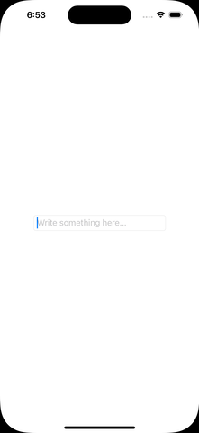
TextField(“Write something here…”, text: $text, axis: .vertical) |
The first argument is a placeholder string that we may optionally provide. To avoid displaying one, simply pass an empty string value. The second is a state property that stores the input text:
|
1 2 3 |
@State var text = “” |
The most important argument, however, is the last one; the value we supply there indicates the axis that we want the text field to expand towards to. Here I set the vertical value, meaning that the text field will grow in the vertical axis.
To demonstrate how a text field with the above initializer works, let’s put everything into a simple SwiftUI view:
|
1 2 3 4 5 6 7 8 9 10 11 |
struct ContentView: View { @State var text = “” var body: some View { TextField(“Write something here…”, text: $text, axis: .vertical) .textFieldStyle(.roundedBorder) .padding(.horizontal, 30) } } |
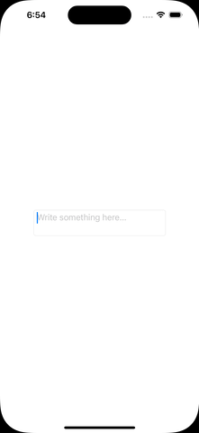
The above will result to a multi-line text field if the amount of text given to it won’t fit to the field’s width:

Note that the text field will keep growing up to a specific height and number of lines while we keep typing text on it. If that wouldn’t be an issue, then here you are; you know all you need in order to present an expandable text field supporting multiple lines. To find out how to limit the displayed number of lines, though, then keep reading and you’ll meet some interesting tips.
Limiting the number of displayed lines
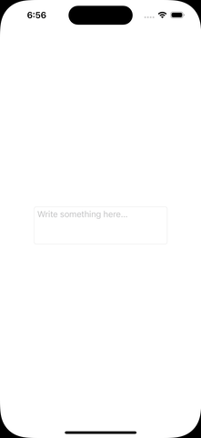
Having a growing text field without limiting the displayed number of lines is not always a desirable behavior. To prevent that from happening, there is a particular view modifier we can use, named lineLimit().
The simplest value we can provide that view modifier with is the number of lines we would like to display. For instance, the following allows the text field to expand as much as the height required to display three lines:
|
1 2 3 4 |
TextField(“Write something here…”, text: $text, axis: .vertical) .lineLimit(3) |
Note that the text field becomes scrollable if the amount of text does not fit to the number of lines provided.
Besides an arbitrary number, we can also set a range of lines. The following sets the minimum number of lines to two, but without specifying a limit to the maximum number of lines:
|
1 2 3 4 |
TextField(“Write something here…”, text: $text, axis: .vertical) .lineLimit(2…) |
In the same logic, we can omit the minimum number of lines and define only a limit for the maximum number of lines:
|
1 2 3 4 |
TextField(“Write something here…”, text: $text, axis: .vertical) .lineLimit(…3) |

It’s also possible to dictate a closed range that describes a “from-to” number of lines for the text field:
|
1 2 3 4 |
TextField(“Write something here…”, text: $text, axis: .vertical) .lineLimit(2…5) |
In the above example, the text field will display from two up to five lines, depending on the given text. As said earlier, if the text becomes too much to fit in displayable area, then it will start scrolling.

Finally, there’s an additional argument that we can feed the lineLimit() view modifier with. As you can see next, by passing true as the second argument we actually ask text field to get and keep the maximum possible height based on the number of lines to display, even if there is no text in it:
|
1 2 3 4 |
TextField(“Write something here…”, text: $text, axis: .vertical) .lineLimit(3, reservesSpace: true) |
There is something to keep in mind here. The first argument in the lineLimit(_:reservesSpace:) view modifier must be always an integer value; not a range of lines. For example, the following is not accepted and Xcode shows an error:
|
1 2 3 4 5 6 |
.lineLimit(2…5, reservesSpace: true) // Error: // Cannot convert value of type ‘ClosedRange<Int>’ to expected argument type ‘Int’ |
Text fields and the macOS
In order to better highlight the text field’s appearance in all previous examples, I set rounded borders to it by overriding its default style:
|
1 2 3 |
.textFieldStyle(.roundedBorder) |
Although this particular style works perfectly fine while displaying an expandable text field in iOS, it’s the reason for an unwanted behavior in macOS.
Specifically, the number of displayed lines remains always constant and equal to one when applying the roundedBorder style to text fields in macOS apps, and it does not change as demonstrated in all previous examples. To manage that effect in macOS too, then just avoid the rounded borders in text fields and either keep the default style set by the system (squareBorder style), or set no border at all (plain style).
Lastly, it would be also interesting to underline that we can add new lines in expandable text fields in macOS simply by pressing Cmd + Return on the keyboard.
Conclusion
Undeniably, it’s amazingly easy to present an expandable and scrollable text field both in iOS and macOS using SwiftUI. Additionally, and given that we can adjust the displayed number of lines, we can end up with handy text fields in no time at all. The only downside is that older system versions are not supported; iOS 16 and macOS 13 are the minimum required versions in order to make everything demonstrated in this post work. Yet, it’s impressive what a single initializer and a view modifier can do, and that proves once again how awesome SwiftUI is.
Thank you for reading! ????