Popover is a system provided control used widely in applications running both in iPad and Mac. It allows to display additional content or ask for user interaction in a concise and elegant fashion; most importantly, users are familiar with it, so it is easy for them to use popovers.
Presenting a popover in SwiftUI hides no tricky parts, and it’s quite similar to the way alerts are presented. That means that there is a specific view modifier to call in order to display it, as well as to provide a few configuration options. Note that popovers show up as alerts in iPhone; they are meant for iPad and Mac devices only.
Presenting a popover
Suppose that we have the following simple button implementation in SwiftUI:
|
1 2 3 4 5 6 7 8 9 10 11 12 13 14 |
VStack { Button { } label: { Text(“Today”) .font(.title2) .foregroundColor(.white) } } .frame(minWidth: 400, minHeight: 250) .background(Color.indigo) .cornerRadius(8) |
The goal here is to display a popover when the button gets tapped in order to show the current date. Popover is not a view that we just need to initialize, passing a number of values as arguments to it. Instead, there is a view modifier responsible to present it. We trigger its appearance by changing the value of a property dedicated to indicate the popover’s presented state, marked with the @State property wrapper, just like the next one:
|
1 2 3 |
@State private var showPopover = false |
The initial false value indicates that the popover should be originally hidden. To change that, all we have to do is to make the above true in the button’s action closure:
|
1 2 3 4 5 6 7 |
Button { showPopover = true } label: { … } |
In the actual topic now, we present a popover with the following view modifier. See that the first argument is the binding value of the showPopover property:
|
1 2 3 4 5 6 7 8 |
VStack { … } .popover(isPresented: $showPopover) { } |
The second argument of the popover view modifier is the content closure; the place where we add the content that we want to show in the popover. It can be anything; a series of SwiftUI views implemented locally in the closure, or a call to another custom view that implements the content:
|
1 2 3 4 5 |
.popover(isPresented: $showPopover) { PopoverContent() } |
In this particular example, PopoverContent() is a different custom SwiftUI view implementation. Its purpose is to simply present a title along with the current date like so:
|
1 2 3 4 5 6 7 8 9 10 11 12 13 14 15 16 17 18 19 20 21 22 |
struct PopoverContent: View { var formattedDate: String { let dateFormatter = DateFormatter() dateFormatter.dateStyle = .full return dateFormatter.string(from: Date()) } var body: some View { VStack { Text(“Today is:”) .font(.title) .fontWeight(.bold) .padding(.bottom, 20) Text(formattedDate) .font(.title2) } .frame(width: 350, height: 200) } } |
Even though the code above is just for demonstration, there is something important to take into consideration. The container view is a VStack, and right after we set its size, width and height. That size is going to be the popover’s size as well. Keep that in mind, and make sure that you always provide a size for your popovers.
Specifying popover’s position and direction
Running the implementation we have so far, this is what we’ll see on an iPad:
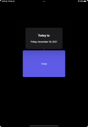
The first and foremost observation we can make is about the position of the popover. See that it’s pointing to the container view of the button, instead of pointing to the button that triggers its appearance. This is happening for one simple reason; the view we use to call the popover view modifier is not the proper one; and apparently, that view seems to really count.
Fixing that issue is easy; we have to move the popover view modifier from the VStack that is currently applied to the button:
|
1 2 3 4 5 6 7 8 9 10 |
Button { … } label: { … } .popover(isPresented: $showPopover) { PopoverContent() } |
The second thing to notice is the popover’s pointing direction and arrow edge. The system automatically placed popover above the button, pointing towards bottom. However, what if the default appearance is not what we really want sometimes? What if we need to place the popover in a different position, and therefore have it pointing to a different direction?
The answer to that comes through two additional parameters that we may optionally pass to the popover’s view modifier. The first one is the attachementAnchor. Practically speaking, with it we can specify the anchor point of the view that the popover will point to; top, bottom, leading, trailing, top-leading, top-trailing, and so on.
However, setting just the anchor point usually is not enough; most of the times it will be also necessary to specify a matching edge to the popover’s arrow. Otherwise, visual results will most probably be totally undesired. So, the other argument we can provide popover view modifier with is the arrowEdge, passing as value the wanted arrow edge.
Transforming the above two points in code, the following example shows how we can present the popover on the trailing edge of the button:
|
1 2 3 4 5 6 7 |
.popover(isPresented: $showPopover, attachmentAnchor: .point(.trailing), arrowEdge: .trailing) { … } |
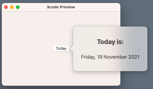
Unfortunately, there is an actual problem here now; the arrowEdge value seems not to be working on iPadOS, with the system totally ignoring it. That’s not the case on macOS however, where the proper combination of the attachmentAnchor and arrowEdge are working fine:
Conclusion
So, this is pretty much everything you need to know in order to present a popover in SwiftUI. Summarizing what’s really important to remember, the view where we apply the popover view modifier matters, as this is where popover will be pointing. Secondly, specifying a size is necessary, as the system has no way to know how big or small we want it to be. And finally, use the additional arguments demonstrated above in order to change the anchor point of the view that the popover points to, and the arrow edge. If you’re working on a macOS app, then the last two will work without any issues, even if iPadOS seems to be disregarding them and positioning the popover automatically. An alternative that I’ve seen suggested by others online is the Menu view, so if you see it fitting, go for it in your iPad apps.
Thank you for reading! ????