The progress view, also known as activity indicator or spinner in UIKit, is a SwiftUI view that indicates visually the progress of a task towards its completion. It has two variations; linear and circular, where the first represents the progress of tasks that we can determine when they finish, while the second shows progress of tasks with unpredictable completion point.
There is already an older post where I’m discussing about the progress view, and if you just want to get the grasp of it, please take a few minutes to give it a read. In this post, the aim is to present a new capability of progress view that was introduced in the fourth revision of SwiftUI, and it’s still in beta stage at the time of writing this.
To be more particular, progress view in SwiftUI is now capable of displaying time progress based on a given time interval that we provide it with. This kind of progress reporting is suitable when counting time and we want to also show a visual representation of that, such as in a count down. But as it happens with many new features, this addition is unfortunately available only in systems presented in WWDC 2022 and above; iOS 16+, macOS 13+, and so on.
Implementing a progress view with time interval
In its simplest form, a progress view that displays time based progress is initialized with one required argument only; the time interval that will be animating the progress for.
There is an important fact to take into consideration here. That time interval is not a TimeInterval (aka Double) value, but a Date closed range like this:
|
1 2 3 |
startDate…endDate |
The approach that I find as the most handy one is to prepare this closed range beforehand, and then pass it as argument to the progress view at the initialization point.
With that in mind and in order to demonstrate some code, let’s declare a computed property in the SwiftUI view struct that will be returning a Date closed range similar to the previous example. In its body we’ll specify two dates; the start and end dates, with the second representing a timestamp five (5) seconds after the first one. As a last step, we will form a close range using these two dates and we’ll return them from the property.
Here is what I just described in code:
|
1 2 3 4 5 6 7 8 9 10 11 12 |
struct ContentView: View { var progressInterval: ClosedRange<Date> { let start = Date() let end = start.addingTimeInterval(5) return start…end } // View’s body implementation… … } |
Two things to note here. Firstly, there are more ways to initialize the start and end date instances, but I believe the above is the fastest one for this particular example. Secondly, it’s not necessary to create a computed property when it comes to use a time based progress view. It could also be a function accepting values that would be forming the dates dynamically. Or even faster, to build the closed range inline right when the progress view is initialized. However, for clarity and for the sake of the demonstration, the above is what we’ll stick with here.
With the progressInterval in place, let’s initialize a progress view in the simplest possible way:
|
1 2 3 4 5 6 |
var body: some View { ProgressView(timerInterval: progressInterval) .padding() } |
See that the progressInterval is supplied as argument to the ProgressView(timeInterval:) initializer. This is enough if we don’t want to apply any styling with view modifiers; the padding shown above is to prevent the progress view from sticking to the screen edges in the following figure, which we get by running the demo app with the above code:
You can notice from the above demonstration that the progress is going towards the empty state instead of getting filled, however that’s the default behavior. To change it and make the progress keep filling the view, it’s necessary to provide an additional, optional argument to the initializer, setting the false value to it:
|
1 2 3 |
ProgressView(timerInterval: progressInterval, countsDown: false) |
Besides the progress bar’s direction, you can also notice in the two previous graphics that there is a built-in label reporting the time, with the displayed value also depending on the countsDown parameter value.
On top of all that, there is one more optional argument that we can provide; a custom label that will be displayed right above the progress view:
|
1 2 3 4 5 |
ProgressView(timerInterval: progressInterval, countsDown: true, label: { Text(“The count down has started!”) }) |
The above is all it takes in order to show a progress view that will be reporting progress for a specific date range. Keep in mind that all the above work for the linear progress view style; applying a circular style will have no result and the spinner will be animating forever.
Time based progress view with custom styles
As it turns out, this particular kind of progress view can accept a custom style if only a ProgressView instance is initialized in the custom style’s implementation. Let’s use as example the following custom style implementation taken from the previous post about the progress view:
|
1 2 3 4 5 6 7 8 9 10 11 |
struct WithBackgroundProgressViewStyle: ProgressViewStyle { func makeBody(configuration: Configuration) -> some View { ProgressView(configuration) .padding(8) .background(Color.gray.opacity(0.25)) .tint(.red) .cornerRadius(8) } } |
Now let’s apply it to the progress view:
|
1 2 3 4 5 6 |
ProgressView(timerInterval: progressInterval, countsDown: true, label: { Text(“The count down has started!”) }) .progressViewStyle(WithBackgroundProgressViewStyle()) |
As you will see next, the result is the expected one:
Notice that in the above custom style there is a ProgressView instance that gets initialized in the makeBody(configuration:) method. The following, however, is not going to work; also taken from the previous post, that custom style does not create a new ProgressView instance, but it represents progress by combining other views and using data from the configuration parameter value:
|
1 2 3 4 5 6 7 8 9 10 11 12 13 14 15 16 17 |
struct RoundedRectProgressViewStyle: ProgressViewStyle { func makeBody(configuration: Configuration) -> some View { ZStack(alignment: .leading) { RoundedRectangle(cornerRadius: 14) .frame(width: 250, height: 28) .foregroundColor(.blue) .overlay(Color.black.opacity(0.5)).cornerRadius(14) RoundedRectangle(cornerRadius: 14) .frame(width: CGFloat(configuration.fractionCompleted ?? 0) * 250, height: 28) .foregroundColor(.yellow) } .padding() } } |
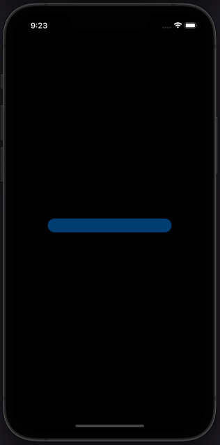
As it seems, the fractionCompleted property of the Configuration type does not get updated when using a date range with the progress view, so no progress is indicated here. That’s useful information to know in advance, so you avoid implementing custom styles that most probably won’t lead to the desired result.
Conclusion
In my opinion, the time based progress view is a useful feature that was definitely missing from the various flavors of the progress view. However, I find two negative points, with the first being the lack of support of previous system versions. The other one is the incapability to create fully custom styles that would fit to the appearance of custom interfaces. Regardless, even with none or a slight customization, this new kind of progress view remains quite interesting and useful.
Thanks for reading, take care! ????