Swipe actions is not a new concept in iOS or macOS programming. We have been using such actions for years in Apple’s applications, with a quite typical example being the Mail app. Programmatically we know them from the table view in UIKit, where we implement them in order to allow users to perform specific operations on individual cells. In SwiftUI swipe actions had not been available until WWDC 2021; it was there where it was eventually announced that the third release of SwiftUI was going to support such actions natively. In this post we are about to explore this topic, and have a hands-on experience on how to integrate swipe actions in SwiftUI.
A demo scenario
Let’s suppose that we have the next list of old movies:
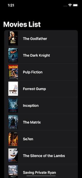
Credits: Top rated movies from IMDB.
Our goal here is to add swipe actions to both the leading and trailing edges of each row, so we can do the following:
- Indicate whether the user has watched a movie or not.
- Indicate whether the user watched that movie alone or with friends, i.e. in a cinema.
- Remove a movie from the list in case the user does not like it.
Here’s what we actually need to end up with:
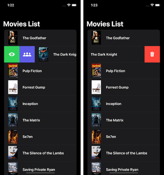
For the first two cases, visual indications will be displayed on rows with movies that have been watched, and if so, watched with friends or not. These are going to be images. For the last case, the movie will simply be removed from the list.
The following code implements the list:
|
1 2 3 4 5 6 7 8 9 10 11 12 13 14 15 16 |
struct ContentView: View { @ObservedObject var movies = Movies() var body: some View { NavigationView { List { ForEach(movies.moviesData) { movie in movieInfo(for: movie) } } .navigationTitle(“Movies List”) } } } |
Movies is an ObservableObject custom type. It contains the moviesData property marked with the @Published property wrapper, which is an array with the data of each single movie. In addition, it contains a few properties that update a specific movie in the moviesData array according to the task that will be triggered from the swipe actions we’ll add next.
Note: You can find the demo project of this post on Github.
Each movie is represented with the MovieData custom type:
|
1 2 3 4 5 6 7 8 9 |
struct MovieData: Identifiable { var id = UUID().uuidString var title: String var image: String var watched = false var watchedWithFriends = false } |
Also, the movieInfo(for:) method shown in the previous code snippet is a @ViewBuilder method that implements the contents of each row:
|
1 2 3 4 5 6 7 8 9 10 11 12 13 14 15 16 17 18 19 20 21 22 23 |
@ViewBuilder func movieInfo(for movie: MovieData) -> some View { HStack { Image(movie.image) .padding(.trailing) Text(movie.title) .font(.headline) if movie.watched || movie.watchedWithFriends { Spacer() } if movie.watched { Image(systemName: “eye”) } if movie.watchedWithFriends { Image(systemName: “person.3”) } } } |
With all the above as granted, let’s add the first swipe action to the displayed rows of the list.
Adding a swipe action
Adding swipe actions to the rows of a list is possible by applying the swipeActions view modifier on each row’s content. The following code demonstrates that:
|
1 2 3 4 5 6 7 8 9 10 |
List { ForEach(movies.moviesData) { movie in movieInfo(for: movie) .swipeActions { } } } |
In this example, the content of each row is implemented in the movieInfo(for:) method, so that’s where the swipeActions modifier is applied.
Here is the first important detail now. Using the modifier as shown above adds a swipe action to the trailing edge of the row by default. However, we want to make it possible to change the watched state of the movies with a swipe action on the leading edge. To manage that, it’s necessary to specify the edge as an argument:
|
1 2 3 4 5 |
.swipeActions(edge: .leading, content: { }) |
There is also another argument that we can supply swipeActions with:
|
1 2 3 4 5 |
.swipeActions(edge: .leading, allowsFullSwipe: true, content: { }) |
The meaning of the allowsFullSwipe is the following:
When it’s true, then a full swipe on the row will perform the first (outermost) action automatically. When false, then the first action should be tapped (or clicked on macOS) as the swipe gesture won’t trigger it. By default it’s true, so we can simply omit it here.
Swipe action’s content
Focusing on the content closure now, here we have to implement one or more buttons that represent and perform the actual actions. The order of the buttons matters, as the first one matches to the outermost action.
That said, right next you can see the first button’s implementation responsible for changing the watched state of the movie that is applied on:
|
1 2 3 4 5 6 7 8 9 10 |
.swipeActions(edge: .leading, content: { Button { movies.toggleWatched(for: movie.id) } label: { Label(“Watched”, systemImage: !movie.watched ? “eye” : “eye.slash”) } }) |
toggleWatched(for:) method will update the watched state of the movie with the given id, and subsequently will trigger the appearance of a respective image to the row. At the same time, the displayed image in the button’s label will vary depending on the watched state of the movie. SF Symbol images are great candidates to use in swipe actions’ buttons, and that’s what I also do here.
Here’s another important detail about the image in the button’s label; when using SF Symbol images, the system will automatically apply the fill variation of the symbol, so the action is emphasized and distinguished easily.
Note that it’s not necessary to use the Label view as the button’s label; you may use an Image view or a Text view instead.
Running the app at this point, here’s what we have managed so far:
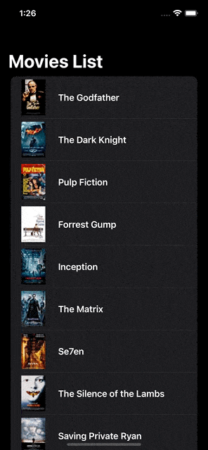
See that both the full swipe gesture and the tap on the action’s button have the same result. Also notice how the displayed image of the swipe action gets changed depending on the watched state.
Changing the action’s tint color
Admittedly, we have managed to achieve a great functionality with just a few lines of code. However, you’ll notice in the above running example that the button’s background color is gray. That’s the color used by default, unless we explicitly change it with the tint() view modifier applied to the button; the desired color is passed as argument:
|
1 2 3 4 5 6 7 8 |
.swipeActions(edge: .leading, content: { Button { … } label: { … } .tint(.green) }) |
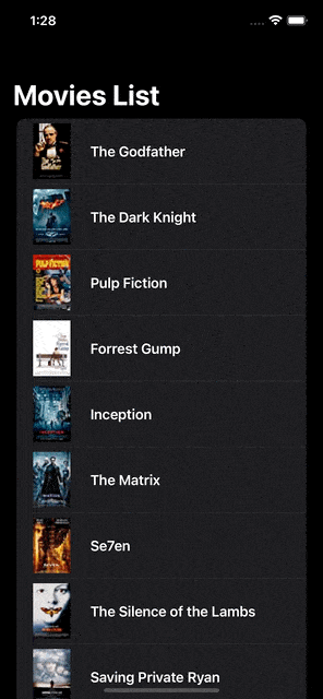
Now we have a different result:

Adding another swipe action
You can be sure that adding a second, or a third swipe action is not difficult, and it all starts with a decision; where exactly the new action should appear. Should it be the next one in a collection of actions in a specific edge? Or should it be placed to the other edge?
We’ll see that all, focusing on the first case in this section. For the sake of the demonstration, let’s say that we want to have one more action right next to the previous one which will be toggling whether a movie has been watched with friends or not.
In fact, doing so is quite easy, as all it takes is to add one more button to the content closure of the swipeActions modifier we already have. Keeping in mind that the order of buttons matters, we’ll add the new one after the button defined in the previous part:
|
1 2 3 4 5 6 7 8 9 10 11 12 13 |
movieInfo(for: movie) .swipeActions(edge: .leading, content: { Button(…) Button { movies.toggleWatchedWithFriends(for: movie.id) } label: { Image(systemName: “person.3”) } .tint(.indigo) }) |
toggleWatchedWithFriends(for:) method will operate on the actual data, and doing so will trigger the re-rendering of the row matching to the altered movie. See that once again here we’re specifying a custom tint color with the tint() modifier applied to the button.
Here is the result of the above addition:

Removing rows with a swipe action
Continuing with the demo app, let’s say that we want to give our users one more functionality; to remove movies from the list that they don’t like or they are not planning to watch.
Let’s do so by adding a new swipe action, but this time to the trailing edge of the row. It would be confusing to have it along with the other two actions.
In order to add swipe actions to a row edge that we have not previously used, it’s necessary to use another swipeActions modifier right after the first one. Since we want the new swipe action to appear in the trailing edge, we’ll do so without passing any parameters to the modifier; we could have done so, but it’s not necessary as trailing is the edge used by default:
|
1 2 3 4 5 6 7 8 9 10 11 |
List { ForEach(movies.moviesData) { movie in movieInfo(for: movie) .swipeActions(edge: .leading, content: { … }) .swipeActions { } } } |
Inside the new swipeActions modifier’s content closure we’ll implement one more button that will be removing the selected movie from the data source:
|
1 2 3 4 5 6 7 8 9 10 11 |
.swipeActions { Button(role: .destructive) { withAnimation(.linear(duration: 0.4)) { movies.removeMovie(with: movie.id) } } label: { Label(“Delete”, systemImage: “trash”) } } |
The removeMovie(with:) method in the Movies type will remove the proper movie based on the given id value. The removal of the row will be animated. Note here that instead of providing a specific tint color, I set the button’s role to destructive. By attaching a role to the button, the system will automatically assign a proper tint color; in this case it’s going to be red.
Here is the result of the above addition:
Summary
This quick exploration on the swipe actions in the third release of SwiftUI just comes to its end. You may get the sample project from this repository on Github and try out everything discussed in this post, as well as to see parts of code not presented here. There is no doubt that integrating swipe actions in SwiftUI lists is easy, and there are just a few details to remember when doing so. I hope you enjoyed this post and found it valuable. Thank you for reading it!
Note: This post has also been published on Medium.