Presenting proportionally scaled views in SwiftUI is something we often do, with the Image view being the most significant example. The main tool for scaling is the aspectRatio modifier, which helps us avoid distorted views, while also letting us choose whether a view fits within its bounds or fills the available space given to it. The aspectRatio modifier is more than what it’s known for, or what we use it for. In this post we’ll explore it in greater depth and find out how it works, so we can make the most of it in SwiftUI.
Defining the content mode
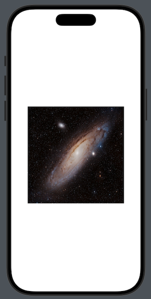
We’ll get started with the most common use case, displaying an image in an Image view. By default, any image is presented in its original size, occupying the entire available space. If the Image view is a child view in a container or a specific frame is set to it, it disregards any bounds in order to present the image in full size. Take a look at the following:
|
1 2 3 4 |
Image(“sample-image”) .frame(width: 300, height: 300) |

☝️Note:
Image Credits: Luis Felipe Alburquerque Briganti: https://www.pexels.com/el-gr/photo/galaxy-5191961/
Even though we set a frame, the Image view overrides it, with large portions of the image being off-screen. That’s normal to happen, because images are not resizable by default; we have to explicitly dictate that with the resizable modifier:
|
1 2 3 4 5 |
Image(“sample-image”) .resizable() .frame(width: 300, height: 300) |
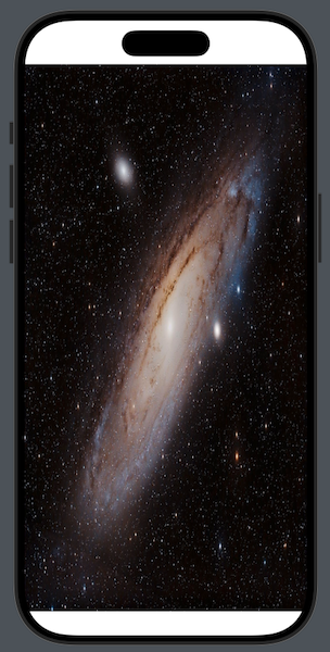
The image is now resized to the frame we set, but it’s distorted because its proportions do not match those of the frame. Similar undesired results appear even if we omit frame:
|
1 2 3 4 |
Image(“sample-image”) .resizable() |
We can fix this using the aspectRatio view modifier, which scales the Image view based on the content mode we’ll provide. Let’s start with fit, the most common content mode:
|
1 2 3 4 5 |
Image(“sample-image”) .resizable() .aspectRatio(contentMode: .fit) |
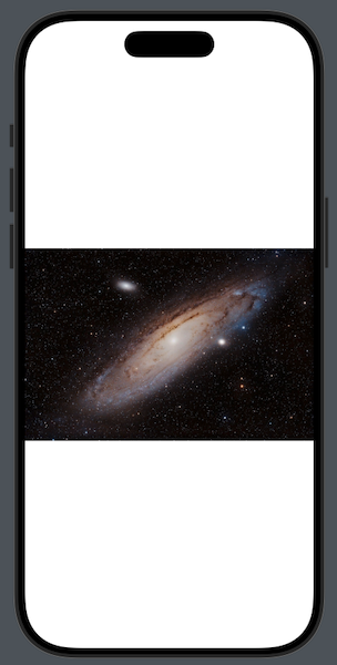
The above modifier resizes the Image view, making its width equal to the width of the container view —the main view of the window in this case. But at the same time, it respects the original width-to-height ratio of the image, and calculates the final height accordingly. As a result, the image is not distorted any more.
Notice that the aspectRatio modifier with the fit content mode is similar to applying the scaledToFit modifier:
|
1 2 3 4 5 |
Image(“sample-image”) .resizable() .scaledToFit() |
☝️Note:
The combination of resizable, aspectRatio (or scaledToFit) and usually frame modifier is a common recipe to scale down and show images in correct proportion.
The “fill” content mode
Besides fit, there is also the fill content mode which we can provide as an argument to aspectRatio modifier. Unlike the former, fill occupies the entire available space, while maintaining the original aspect ratio. If the container view and the Image view (or any other view that’s scaled) have the same aspect ratio, then scaling works as expected. Otherwise, the fill mode makes the scaled view match the container’s size on one axis and calculates the other dimension, which is always larger:
|
1 2 3 4 5 |
Image(“sample-image”) .resizable() .aspectRatio(contentMode: .fill) |
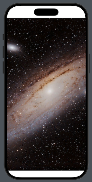
In the above screenshot the height of the image is equal to the height of the view. However, the width is much larger so the image is not distorted, resulting to a large area of it being out of the visible area.
Generally, the fill mode scales views in a way that usually escape the bounds of the parent view. Before we get to see how to prevent that from happening, it’s important to underline that similar to the .aspectRatio(contentMode: .fill) is the scaledToFill modifier:
|
1 2 3 4 5 |
Image(“sample-image”) .resizable() .scaledToFill() |
Comparing content modes side by side
To get a better taste of the two content modes, let’s consider the following example, where we have the same image presented twice in a VStack. The first time is scaled down using the fit content mode, the second using fill. A frame is applied to both Image views, while a border color indicates the bounds of each view visually:
|
1 2 3 4 5 6 7 8 9 10 11 12 13 14 15 |
VStack(spacing: 40) { Image(“sample-image”) .resizable() .aspectRatio(contentMode: .fit) .frame(width: 300, height: 300) .border(Color.blue, width: 4) Image(“sample-image”) .resizable() .aspectRatio(contentMode: .fill) .frame(width: 300, height: 300) .border(Color.blue, width: 4) } |
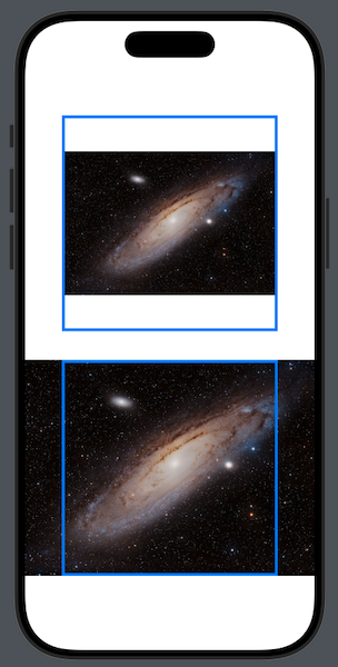
With the fit mode, the image is resized and remains constrained in the specified frame. The width becomes equal to the available width, while the height is calculated based on the aspect ratio of the image.
With the fill mode, the height of the Image view becomes equal to the height we set in the frame modifier. However, the width disregards the width value in frame and it’s expanded, so the original aspect ratio is preserved.
The above screenshot clearly demonstrates the behavior of the aspectRatio modifier when using either content mode. There’s no better or worse choice, it’s all about applying the right mode for the needs of each app.
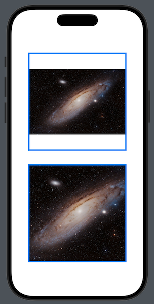
It’s possible to prevent the image from exceeding the specified bounds in the second Image view. We do that with the clipped modifier, which we can apply right after the frame modifier:
|
1 2 3 4 5 6 7 8 9 10 11 12 |
VStack(spacing: 40) { … Image(“sample-image”) .resizable() .aspectRatio(contentMode: .fill) .frame(width: 300, height: 300) .clipped() .border(Color.blue, width: 4) } |
Beyond images – More ways to use aspect ratio
So far we have talked only about images and the Image view, and that’s fine because aspectRatio is used to help resize images while maintaining the original proportions in the majority of cases. But the truth is that it can be useful in other views too, where a width-to-height ratio is needed.
Unlike Image views where the content itself implies an aspect ratio (i.e. images), in other views we have to explicitly specify it. And for that, the aspectRatio modifier gives us an additional initializer where, besides the content mode, we also have to provide the desired aspect ratio as a CGFloat value.
Take a look at the following example. The aspectRatio is applied to a SwiftUI Color, while the desired aspect ratio is given as the first argument. For easier understanding, the border visually indicates the frame of the Color view:
|
1 2 3 4 5 6 |
Color.indigo .aspectRatio(4/3, contentMode: .fit) .frame(width: 300, height: 300) .border(.red, width: 4) |
In this particular example, we set the width-to-height ratio to 4/3. Given that we use the fit content mode and the width is equal to the width of the color view, the height is equal to: width * 3/4 = 300 * 3/4 = 225 pts. As a result, the color view is scaled as shown in the above screenshot, always staying within the specified frame.
In the previous code we passed the aspect ratio value as a CGFloat value (even though it was expressed as a fraction for better visibility). In addition to that, there’s one last initializer that accepts a CGSize value as the first argument. There, we can set the ratio by providing distinct values to width and height.
For instance, let’s see the previous example again but using CGSize as first argument this time:
|
1 2 3 4 5 6 |
Color.indigo .aspectRatio(CGSize(width: 4, height: 3), contentMode: .fit) .frame(width: 300, height: 300) .border(.red, width: 4) |
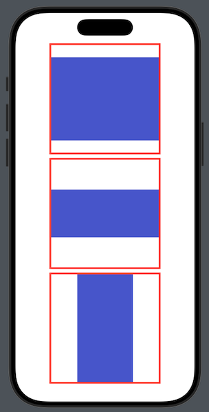
Next, you can see color views scaled using various aspect ratios, providing a better visual understanding of how aspectRatio affects them:
|
1 2 3 4 5 6 7 8 9 10 11 12 13 14 15 16 17 18 |
VStack { Color.indigo .aspectRatio(4/3, contentMode: .fit) .frame(width: 250, height: 250) .border(.red, width: 4) Color.indigo .aspectRatio(21/9, contentMode: .fit) .frame(width: 250, height: 250) .border(.red, width: 4) Color.indigo .aspectRatio(0.5, contentMode: .fit) .frame(width: 250, height: 250) .border(.red, width: 4) } |
Animating aspect ratio
When using the aspectRatio modifier we mainly focus on the content mode and, when necessary, the aspect ratio value we explicitly set. So it might not be immediately obvious, but we can animate changes to the aspect ratio value, creating smooth visual transitions in the target view.
The first thing we need to do in order to achieve this is to declare a state property in the view that will keep the aspect ratio value. That’s what we’ll animate later:
|
1 2 3 |
@State private var aspectRatioValue: CGFloat = 16/9 |
Next, let’s use similar examples to those in the previous parts, where we apply aspectRatio to a Color with a specific frame:
|
1 2 3 4 5 6 |
Color.indigo .aspectRatio(aspectRatioValue, contentMode: .fit) .frame(width: 300, height: 300) .border(.red, width: 4) |
Notice that instead of a hardcoded aspect ratio, we just provide the aspectRatioValue we set earlier.
To keep things simple, let’s animate changes to aspectRatioValue when the Color appears. We’ll use a withAnimation block as shown next:
|
1 2 3 4 5 6 7 8 9 10 11 |
Color.indigo .aspectRatio(aspectRatioValue, contentMode: .fit) .frame(width: 300, height: 300) .border(.red, width: 4) .onAppear { withAnimation(.smooth.repeatForever()) { aspectRatioValue = aspectRatioValue == 16/9 ? 1/2 : 16/9 } } |
We set the animation to run forever, switching between two different aspect ratio values. When the view appears, the following animation starts:
Conclusion
Even though we mostly use aspectRatio to proportionally scale images in combination with the resizable modifier, this post has made it clear that it’s more than that. Image view is not the only type of view that can use aspectRatio; we can use it with other views too, explicitly setting the desired width-to-height ratio. Even more, we can animate aspect ratio values, managing to create attractive visual transitions when needed. I hope this has been valuable to you, thanks for reading!