In WWDC 2023 and among other advancements and announcements about SwiftUI, Apple made available a particular view called ContentUnavailableView. The sole purpose of it is to be displayed when there is actual data to show using an easy and straightforward API.
Implementing and displaying a “no-content” view is not a new thing, nor the need for an empty view containing some related information for the user when data is not available. However, by including ContentUnavailableView to SwiftUI framework, Apple aims to achieve a double goal; to provide a universal user experience through the predefined visual format of ContentUnavailableView when no content exists, and to elevate SwiftUI even more with such a built-in and configurable view that’s a breeze to use.
Getting To Know The ContentUnavailableView
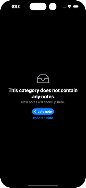
ContentUnavailableView has a specific and predefined way to present content. The minimum amount of visual elements that can appear include an image, and a title right below the image. The title is a plain localizable string value, while the image can be either a SF Symbol (system image), or a custom image existing in the Assets catalog.
In addition to these two, ContentUnavailableView can also present a description; an additional piece of text that is meant to provide more information to users if needed. Furthermore, one or more action buttons (Call To Action buttons — CTA) can also be defined, so users can easily initiate an action that will let them add content and end up with some actual and meaningful content.
Right in the next part we’ll see how we can specify and configure all these different visual items, but first, the next image illustrates how the ContentUnavailableView looks like.

Presenting And Configuring The ContentUnavailableView
In its simplest form, ContentUnavailableView gets a title and an image as arguments right upon initialization:
|
1 2 3 4 |
ContentUnavailableView(“This category does not contain any notes.”, systemImage: “tray”) |

The title can be as long or as short as you desire, but keep it to the point so users understand why there’s no data appearing instead of this view. Image can be a system provided one (an SF Symbol) as shown above, or an image from the Assets catalog if you need so. In the latter case though, you should use this alternative initializer:
|
1 2 3 4 |
ContentUnavailableView(“This category does not contain any notes.”, image: “image_name”) |
Besides a title and an image, ContentUnavailableView can also display a description if more details are necessary to be displayed to users. The description is supplied as a third (optional) argument in the initializer. Watch out here though, because description is not a plain string value; it’s a Text view instead:
|
1 2 3 4 5 6 |
ContentUnavailableView(“This category does not contain any notes”, systemImage: “tray”, description: Text(“New notes will show up here.”) ) |

Besides the above, there is also an alternative way to initialize ContentUnavailableView. This time, the title and the image become arguments of a Label view, which in turn is the content of a closure:
|
1 2 3 4 5 |
ContentUnavailableView { Label(“This category does not contain any notes”, systemImage: “tray”) } |
Exactly as above, the description can be provided to another closure; once again, remember that description is a Text view:
|
1 2 3 4 5 6 7 |
ContentUnavailableView(label: { Label(“This category does not contain any notes”, systemImage: “tray”) }, description: { Text(“New notes will show up here.”) }) |
There is also a third, optional closure to pass as argument. This is the place where we can add buttons and call users to perform one or more actions.
In the example next you can see two buttons; the first allows users to create a new note and the second to import one. Also, the first one has the borderedProminent style in order to highlight it as the primary action, and the second gets the default button format.
|
1 2 3 4 5 6 7 8 9 10 11 12 13 14 15 16 17 18 19 20 21 22 |
ContentUnavailableView(label: { Label(“This category does not contain any notes”, systemImage: “tray”) }, description: { Text(“New notes will show up here.”) }, actions: { VStack { Button(action: { // Actions to create a new note… }, label: { Text(“Create note”) }) .buttonStyle(.borderedProminent) Button(action: { // Actions to import a note… }, label: { Text(“Import a note”) }) } }) |

A Built-In Premade View
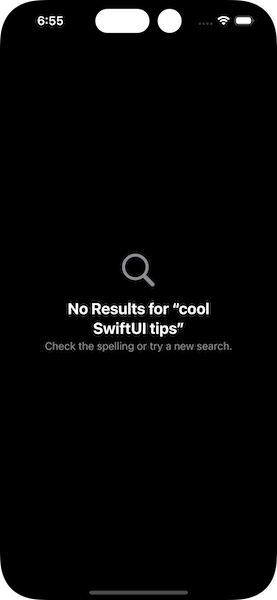
ContentUnavailableView provides a built-in, already made view for a pretty common task that many applications integrate, the search functionality. It’s quite usual a search operation to return empty results, and Apple makes it easy to let users know about that with a static property called search:
|
1 2 3 |
ContentUnavailableView.search |

A slight configuration is allowed to be made to this built-in view, but this time using a static method. In it, we can supply the search term that users looked up as argument, and that term will appear in the title of the view:
|
1 2 3 |
ContentUnavailableView.search(text: “cool SwiftUI tips”) |

At the time being, search is the only built-in view that comes with ContentUnavailableView. It’s possible to create our own views and append them as static properties or methods. However, doing so requires a particular series of steps, therefore it might become the topic of a future tutorial.
Conclusion
It’s needless to say that using and configuring the ContentUnavailableView hides no difficult or tricky parts. Also, the built-in search view is a nice and useful touch for those who want to use it, as it can save some time from creating a custom view. But as always, there is a downside too. ContentUnavailableView is available for iOS 17 and above, so if supporting previous system versions is a requirement, implementing custom views is unavoidable. In any case, it’s a great addition to SwiftUI and a nice tool to have!
Thank you for reading, enjoy coding!