There are various ways to visually structure an app, and what usually defines that is a combination of the app’s purpose with its content. iOS applications contain much of custom work regarding the user interface in order to offer uniqueness, and it’s a place where both designers and developers can get crazily creative. Despite all that, however, we may optionally start off based on certain templates, and gradually build the entire app on them. Consider, for example, the navigation or the tab bar based apps.
The latter is what I’m focusing on in this post today. More specifically, I’m presenting how to create a tab bar based application in SwiftUI. As almost everything else, doing so is pretty easy in SwiftUI, and the effort required comparing to UIKit is significantly less. But let’s leave talking aside, and let’s jump straight into the point.
The Tab View
All controls in SwiftUI are views. And the tab bar is not an exception. The Tab View is the responsible one for adding and manipulating a tab bar in SwiftUI based projects. It’s a container view, since it contains all views presented behind each tab item.
Creating a tab bar requires no effort as you can see in the next snippet:
|
1 2 3 4 5 6 |
TabView { } |
Contained views that we implement inside the closure can be any SwiftUI views. From the simplest built-in ones, such as Text views, up to complex custom views composed by other simpler views. Usually, and in order to keep things tidy and readable, contained views are implemented in different SwiftUI source files. That way, the Tab view implementation remains maintainable and manageable.
The next step after integrating a Tab view as shown above, is to specify the tab items. We do that by applying the tabItem(_:) view modifier after each top-level content view; the first view that gets presented after tapping on a tab item.
Suppose that we are building an application to edit, keep and share notes. For the sake of the tutorial, let’s say that we want four tab items for the following purposes:
- To edit a note.
- To list existing notes.
- To provide sharing options.
- To configure various settings and preferences.
Focusing on the first point initially, here is how we specify the first tab item:
|
1 2 3 4 5 6 7 8 9 |
TabView { EditorView() .tabItem { } } |
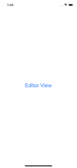
EditorView is a custom view implemented in a different file, and it is supposed to be implementing all the functionality necessary to create and edit notes. Nothing of all that is actually happening here though; EditorView simply shows a text like so:
|
1 2 3 4 5 6 7 8 |
var body: some View { Text(“Editor View”) .font(.title) .foregroundColor(.blue) } |
All other example views that will be presented next have similar content.
Regarding the tabItem(_:) view modifier now, see that there is nothing added so far as content to it. What we have to put in there is the label of the tab item; what we want to display for the current item, including both title and image.
Note: A tab item may display only a title, or just an image. Usually, however, these two go together as you’ll see next.
To display an image for a tab item, we use the Label view. You may specify any custom image, but SF Symbols have been proved to be a quite handy solution, as they are supported both by iOS and macOS. All we have to provide is the icon’s name, and the system will automatically display it.
To present a title along with the image, we can simply use a Text view. Combining that with the image, here’s how we add them both to the tabItem(_:) modifier’s content:
|
1 2 3 4 5 6 7 |
.tabItem { Label(“Editor”, systemImage: “pencil.circle”) Text(“Editor”) } |
In an exactly similar fashion we can add more tab items; each one with a different image and title:
|
1 2 3 4 5 6 7 8 9 10 11 12 13 14 15 16 17 18 19 20 21 22 23 24 25 26 27 28 |
TabView { EditorView(selectedTab: $selectedTab) .tabItem { Label(“Editor”, systemImage: “pencil.circle”) Text(“Editor”) } NotesView() .tabItem { Label(“Notes”, systemImage: “note.text”) Text(“Notes”) } ShareView() .tabItem { Label(“Share”, systemImage: “square.and.arrow.up”) Text(“Share”) } SettingsView() .tabItem { Label(“Settings”, systemImage: “gearshape”) Text(“Settings”) } } |
The above few lines of code result in the following tab bar:
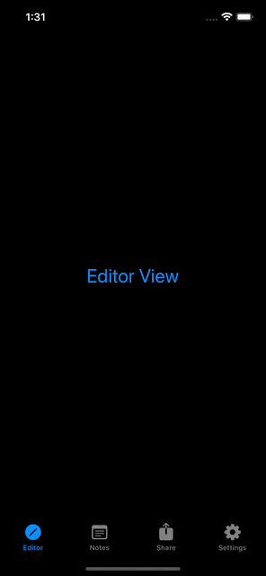
Additional tab items
In the code above, I added four tab items to the Tab view, which show up fine when running the app. As it happens in UIKit as well, Tab view in SwiftUI can display properly up to five tab items. That’s because the appearance of the tab bar is controlled by the system itself (iOS), and not the framework that we use to implement the user interface.
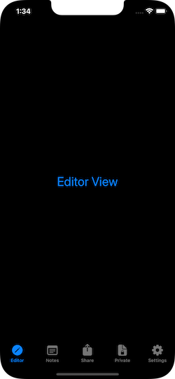
Let’s say that we want to upgrade our app, and add an additional tab item in order to provide a section for private notes only. All we need to do is to include the view that implements the private notes in the Tab view’s content, and apply the tabItem(_:) view modifier to it. Updating the above code leads us to the following, where the new item comes right before settings:
|
1 2 3 4 5 6 7 8 9 10 11 12 13 14 15 16 17 18 19 20 21 22 23 24 25 26 27 28 29 30 31 32 33 34 |
TabView { EditorView() .tabItem { Label(“Editor”, systemImage: “pencil.circle”) Text(“Editor”) } NotesView() .tabItem { Label(“Notes”, systemImage: “note.text”) Text(“Notes”) } ShareView() .tabItem { Label(“Share”, systemImage: “square.and.arrow.up”) Text(“Share”) } PrivateNotesView() .tabItem { Label(“Private”, systemImage: “lock.doc”) Text(“Private”) } SettingsView() .tabItem { Label(“Settings”, systemImage: “gearshape”) Text(“Settings”) } } |
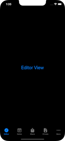
However, what happens if we need to add one more tab item? I just mentioned that iOS displays properly up to five of them.
In case we have more than five tab items in our Tab view, then the system automatically:
- Puts a tab item with the "More…" title as the last one, indicating that there are more items to reveal by tapping on it.
- It gathers and presents all tab items after the fourth into a list.
To see that in action, let’s suppose that in the next major update we are going to integrate a To-Do screen in order to create to-do lists easily. Let’s add a respective item right before the settings once again:
|
1 2 3 4 5 6 7 8 9 10 11 12 13 14 15 16 17 18 |
TabView { … TodoView() .tabItem { Label(“To-Do”, systemImage: “list.bullet”) Text(“To-Do”) } SettingsView() .tabItem { Label(“Settings”, systemImage: “gearshape”) Text(“Settings”) } } |
Here is how the items in the Tab view are being presented right now:
And here’s the list of the remaining items that don’t show up in the tab bar, after having tapped on the More item:
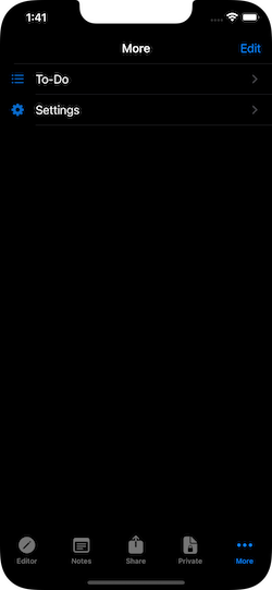
By tapping on the Edit button, users can re-arrange the position of items, and make visible those they use the most.
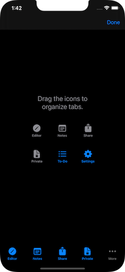
Generally, it’s mostly preferrable to have up to five tab items for gaining the best user experience. However, if you have more -which is not bad by any means-, and as Apple recommends, try to keep in the tab bar those items that users interact with the most. Hide behind the More item those that are being used more rarely and not needed often.
For instance, in this hypothetical scenario we could change the order we implement tab items, making the sharing and setting items those that will be revealed once the More button gets tapped.
Changing the color of tab items
I believe that you will rarely want to keep the default color that the system assigns to the selected tab item. So, once you implement your Tab view and include all tab items, the next thing that you will find useful to do is to change their color.
It’s easy to achieve that, and as it usually happens in SwiftUI when it comes to modify attributes, we do so using a view modifier. Which one we will use though, depends on the iOS versions we want to support.
Since iOS 15 is relatively new at the time of writing this post, chances are that you will probably want to cover iOS 14 as well. In that case, the view modifier we should use is the accentColor(_:). We apply it right after the closing of the Tab view:
|
1 2 3 4 5 6 7 |
TabView { … } .accentColor(.pink) |

However, if you are targeting on iOS 15 and above, then use the tint(_:) view modifier instead:
|
1 2 3 4 5 6 7 |
TabView { … } .tint(.pink) |
Selecting tabs programmatically
The tab bar is a control designed to be used mainly by the app’s users; they decide when to change tab, and which one to activate. However, it’s often needed to change the selected tab item programmatically for various reasons.
Managing to do that is not difficult, and it involves three specific steps:
- The first one is to assign a tag value to each tab item with the
tag(_:)view modifier. The value that we provide it with can be of any type, as long as it conforms to Hashable protocol. The most common and usual approach is to provide integer numbers. - The next step is to declare a property marked with the
@Stateproperty wrapper (or any other source of truth) of the same type as the tag value, with an initial value matching to the tag value of the tab that should be selected on appear. - The last step is to use a different initializer of the Tab view; an initializer that accepts the binding value of the @State property as an argument. The Tab view will automatically select the tab item with the matching tag value.
You can see everything that I just described in code right below:
|
1 2 3 4 5 6 7 8 9 10 11 12 13 14 15 16 17 18 19 20 21 22 23 24 25 26 27 28 29 30 31 32 |
@State private var selectedTab = 0 var body: some View { TabView(selection: $selectedTab) { EditorView(selectedTab: $selectedTab) .tabItem { … } .tag(0) // Tag can be any value that conforms to hashable protocol. NotesView() .tabItem { … } .tag(1) ShareView() .tabItem { … } .tag(2) SettingsView() .tabItem { … } .tag(5) } } |
Notice that we pass the binding value of the selectedTab property as argument to the Tab view. That means that when the user switches tabs, selectedTab will be updated with the tag value of each tab item.
The above was the necessary preparation in order to be able to change tab items programmatically. To actually do so, simply assign the tag value of the new item to the value of the selectedTab property whenever that’s necessary.
As an example, suppose that we want to switch to Notes tab automatically right after the user finishes editing a note. Also, let’s assume that we receive a notification regarding that event. Right when the notification arrives, we can switch to the tab item with tag value 1, which matches to Notes tab:
|
1 2 3 4 5 6 7 8 9 |
TabView(selection: $selectedTab) { … } .onReceive(NotificationCenter.default.publisher(for: .didSaveNote, object: nil), perform: { _ in selectedTab = 1 }) |
As an additional tip, you may optionally define an enum in order to represent the various tag values. Then, instead of integer numbers, provide the raw value of each case to the respective tab item. This ensures that you’ll never confuse or mistype the tag values of the tabs. The following code snippet demonstrates that:
|
1 2 3 4 5 6 7 8 9 10 11 12 13 14 15 16 17 18 19 20 21 22 23 24 25 26 27 28 29 30 31 32 33 34 35 36 37 38 39 |
enum TabItems: Int { case editor, notes, share, settings } @State private var selectedTab = TabItems.editor.rawValue var body: some View { TabView(selection: $selectedTab) { EditorView(selectedTab: $selectedTab) .tabItem { … } .tag(TabItems.editor.rawValue) NotesView() .tabItem { … } .tag(TabItems.notes.rawValue) ShareView() .tabItem { … } .tag(TabItems.share.rawValue) SettingsView() .tabItem { … } .tag(TabItems.settings.rawValue) } .onReceive(NotificationCenter.default.publisher(for: .didSaveNote, object: nil), perform: { _ in selectedTab = TabItems.notes.rawValue }) } |
A different tab view style
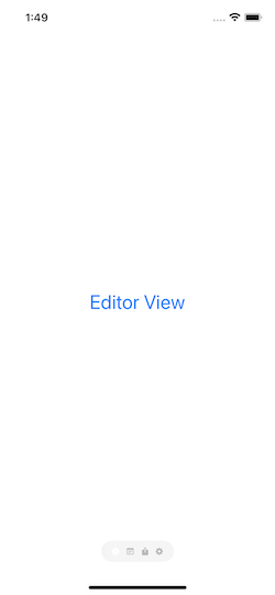
The default style of the Tab view is a bar at the bottom side of the screen, with the tab items being laid out one after another. It’s possible, however, to change that and end up with a totally different style; scrolling pages horizontally, where each page matches to the view behind each tab item.
To switch to that style, we can apply the tabViewStyle(_:) view modifier to the Tab view, providing an instance of the PageTabViewStyle() as argument:
|
1 2 3 4 5 6 7 |
TabView { … } .tabViewStyle(PageTabViewStyle()) |
The above results to the following:

See that the tab item icons act as page indicators. In case we don’t want them visible on the screen, we can turn them off by initializing the PageTabViewStyle instance using a different initializer. In it, we pass the .never value as argument:
|
1 2 3 4 5 6 7 |
TabView { … } .tabViewStyle(PageTabViewStyle(indexDisplayMode: .never)) |
To keep page indicators constantly visible you we can pass the .always value instead. There is also the .automatic option.
As you just saw in the above example, the tab item images are the page indicators. In fact, this is happening because we provided an image to each tab item with the Label view. If we had avoided doing that, and if we had only titles in items, then the default page indicators provided by the system would have been displayed instead.

There is also another noteworthy thing regarding the page style. Notice in the previous screenshot that I am using the dark color scheme. That fact makes the page indicators visible. Switching to the light mode will result to invisible page indicators:
This happens because the color of the indicators does not change according to the selected color scheme; it remains always the same. To fix that, we can force the appearance of a default background color behind the page indicators with the assistance of another view modifier, called indexViewStyle(_:) like so:
|
1 2 3 4 5 6 7 8 |
TabView { … } .tabViewStyle(PageTabViewStyle()) .indexViewStyle(PageIndexViewStyle(backgroundDisplayMode: .always)) |
The result is shown right below:
Conclusion
The content of this post is pretty much everything you need to know in order to work with the Tab view in SwiftUI. It’s undoubtedly straightforward to integrate a tab bar in your apps, as well as to configure and manipulate the displayed tab items. Most probably you’ll always want to change tab items programmatically, but that’s an easy task as you saw previously. And if you don’t like the default look of the Tab view, switch to the paged style and present content in an alternative way. I hope you liked this post; stay tuned for more content that’s about to come. Thank you for reading!