Note: There is a video tutorial on SerialCoder.dev and on YouTube on this topic too.
Xcode makes available a variety of buttons to use when developing macOS applications. However, none of the predefined button styles leaves much room for customization. For that reason, in this short post I’m going to show how to customize NSButton colors and corner radius; including background, text and highlight colors.
As you’ll see pretty soon, all configurable properties that I’ll present next will become available in the Interface Builder too. By doing so, it will be possible to customize buttons graphically straight in a storyboard or a XIB file; no need for further configuration in code.
After having said all the above, let’s see some code. We’ll start by subclassing the NSButton class as shown next:
|
1 2 3 4 5 |
class RoundedColoredButton: NSButton { } |
Initially, we’ll declare the properties we’d like to configure, and we’ll give them some initial values. We’ll mark all of them with the @IBInspectable attribute, so they become available in Interface Builder too.
|
1 2 3 4 5 6 |
@IBInspectable var bgColor: NSColor = .darkGray @IBInspectable var foreColor: NSColor = .white @IBInspectable var highlightColor: NSColor = .black @IBInspectable var cornerRadius: CGFloat = 8 |
Next, we’ll implement a custom method which will be doing three things:
- It will be setting the background color of the button. Note that we’ll do that conditionally; if the button is highlighted, then we’ll apply the
highlightColorthat we declared above. Otherwise we’ll use thebgColor. - It will be specifying the text color. This is not as straightforward as it sounds; it’s necessary to create an attributed string that will be using the provided text color, and have the button to use that as a title.
- It will be setting the corner radius of the button.
Both background colors and the corner radius will be applied to the button’s layer. Note that NSButton has a backing layer on by default, so it’s not necessary to start with the wantsLayer = true statement.
Here’s that new method:
|
1 2 3 4 5 6 7 8 9 10 11 12 13 14 15 16 17 18 19 20 21 |
func configure() { // Set the proper background color depending on // whether the button is highlighted or not. if !isHighlighted { self.layer?.backgroundColor = bgColor.cgColor } else { self.layer?.backgroundColor = highlightColor.cgColor } // Create an attributed string using the // provided title color, and use that attributed // string as title. let attributedString = NSAttributedString(string: title, attributes: [NSAttributedString.Key.foregroundColor: foreColor]) self.attributedTitle = attributedString // Set the corner radius. self.layer?.cornerRadius = cornerRadius } |
Finally, let’s override the draw(_:) method of the NSButton class:
|
1 2 3 4 5 6 |
override func draw(_ dirtyRect: NSRect) { super.draw(dirtyRect) configure() } |
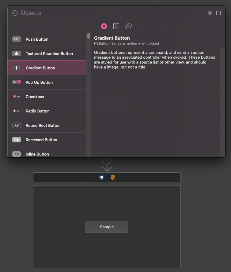
That was the only code we had to write! To use the above, open a storyboard or a XIB file, and add a button to a view. Preferably, add a gradient button so you can set its height as well if you want so.
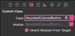
With the button selected, open the Identity inspector and set the RoundedColoredButton as its custom class.
Then, switch to the Attributes inspector where you will find the custom properties we specified as @IBInspectable in the class.
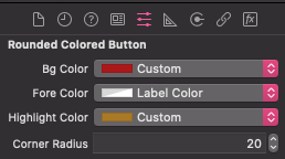
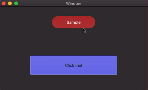
Choose and set any values you want, and finally run the app. Any buttons that you customized using the new properties illustrated right above will be lying over there ready to try them out.
Note: In case you’re wondering why there is no live rendering in Interface Builder, that’s because the RoundedColoredButton class is not marked with the @IBDesignable attribute. I avoided it on purpose for a single reason; NSButton does not render live like other views do, and no solution or workaround currently seems to exist for that. Nevertheless, it’s not that important as we want custom buttons to look properly at runtime. Having them presented nicely in IB is a convenience that we’re just missing.
I hope you found that short post valuable! If you want so, add more configurable properties to the custom button implementation as shown in this post, and make it work suitably to your needs.
Thanks for reading and take care!
Find this post on Medium too!