Picker view is what we would be calling a multi-tool, or the Swiss knife of programming when creating user interfaces with SwiftUI. And that’s because the same view can get various appearances, depending on the style that we assign to it and how we want it to appear.
It’s important to know in advance that picker view is quite dependent on the target platform that is about to be rendered. There are different picker variations for iOS, macOS and watchOS systems. In this post I’m focusing on the picker view on macOS, where I’m gathering together in one place the various available styles currently exist.
Note: If you are interested in reading about the SwiftUI picker in iOS, then check out this post.
Initializing a picker
In the following snippet you can see the initialization of a picker view, without applying any style yet:
|
1 2 3 4 5 |
Picker(“Default Picker”, selection: $selection) { pickerContent() } |
In this initializer, the first argument is a custom text that will be used by the picker as label. If it’s not desirable to have one, we can simply pass an empty string.
The important one, however, is the selection argument. It expects the binding value of a state property that indicates the selected item of the picker at any given moment. It has to be a binding value, because the picker updates it every time the user makes a different selection. In this case it’s the following:
|
1 2 3 |
@State private var selection = “One” |
The default selection refers to the first item in this sample collection:
|
1 2 3 |
let pickerValues = [“One”, “Two”, “Three”] |
Inside the initializer’s closure we add the content of the picker view, or in other words, all the possible values we want to make available and choose from. We can enumerate them one by one, usually by using Text views, or we can do so in a loop; that’s useful in case where picker values exist in a collection, just like it happens with the pickerValues array in this example. The iteration takes place in a ForEach loop, and you can see how it works in the following snippet; it’s the implementation of the pickerContent() method shown above:
|
1 2 3 4 5 6 7 8 |
@ViewBuilder func pickerContent() -> some View { ForEach(pickerValues, id: \.self) { Text($0) } } |
The Default picker style
On macOS, and if we don’t specify a specific style, the picker by default is displayed as a popup menu that contains all available values, and showing the selected one:
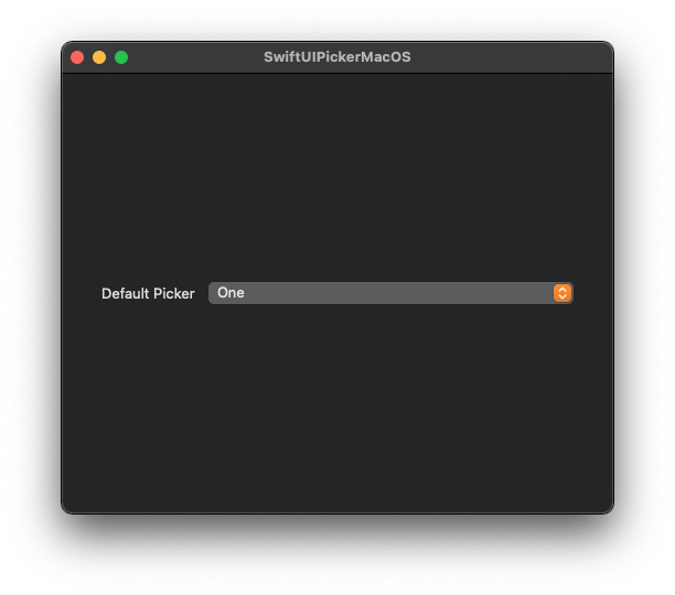
We can achieve the exact same result if we specify the DefaultPickerStyle() style. As it happens with many SwiftUI views, there is a view modifier that allows us to set a style to the picker, called pickerStyle(_:):
|
1 2 3 4 5 6 |
Picker(“Default Picker”, selection: $selection) { pickerContent() } .pickerStyle(DefaultPickerStyle()) |
Alternatively, we may provide the .automatic value as argument, which also assigns the default appearance to the picker for the given platform.
|
1 2 3 4 5 6 |
Picker(“Default Picker”, selection: $selection) { pickerContent() } .pickerStyle(.automatic) |
The Menu picker style
Even though the picker will show up as a popup menu on macOS, in a different platform it will have another appearance. For example, on iOS it’s going to be a wheel. This is what the default (or automatic) style does; it makes the picker adapt to the platform that the app is running on.
However, we can override that and have the picker always appear as a menu. All it takes is to set the respective style like so:
|
1 2 3 4 5 6 |
Picker(“Menu Picker”, selection: $selection) { pickerContent() } .pickerStyle(MenuPickerStyle()) |
Instead of initializing a MenuPickerStyle() instance, we can also provide the .menu value and keep things simpler:
|
1 2 3 4 5 6 |
Picker(“Menu Picker”, selection: $selection) { pickerContent() } .pickerStyle(.menu) |
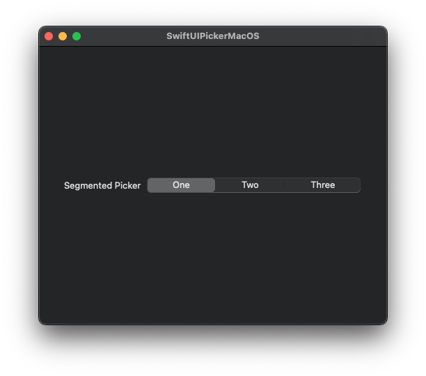
The Segmented picker style
A picker style that might be familiar from iOS is the segmented style. A picker that adopts this style presents available options as tabs, where only one is selected at any given time. It’s a nice style to resort to if there are three to five options that users should choose from.
To make the picker get the segmented appearance, just pass a SegmentedPickerStyle instance as argument to the pickerStyle(_:) view modifier:
|
1 2 3 4 5 6 |
Picker(“Segmented Picker”, selection: $selection) { pickerContent() } .pickerStyle(SegmentedPickerStyle()) |
We may provide the .segmented value as well in order to keep things simpler:
|
1 2 3 4 5 6 |
Picker(“Segmented Picker”, selection: $selection) { pickerContent() } .pickerStyle(.segmented) |
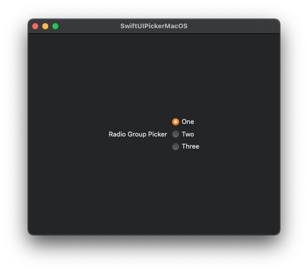
The Radio Group picker style
I personally find this style quite interesting, as it allows to create a picker that presents its options as a group of radio buttons with no effort at all. In contrast to AppKit where a radio button is a standalone control, here it’s just a picker with a specific style.
To create such a picker we have to set an instance of the RadioGroupPickerStyle as the argument of the pickerStyle(_:) modifier:
|
1 2 3 4 5 6 |
Picker(“Radio Group Picker”, selection: $selection) { pickerContent() } .pickerStyle(RadioGroupPickerStyle()) |
Alternatively, we can specify the .radioGroup value as the argument of the modifier:
|
1 2 3 4 5 6 |
Picker(“Radio Group Picker”, selection: $selection) { pickerContent() } .pickerStyle(.radioGroup) |
Both of the above two result to a group of radio buttons displayed vertically one after the other:
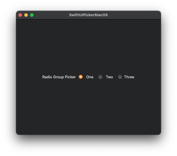
Although vertical is the default display for the radio buttons, we can change that and display them horizontally. To achieve that, there is an additional view modifier to use, named horizontalRadioGroupLayout(). Note though that most probably we’ll need to explicitly set a width for the buttons; it seems that the default buttons’ width is too small and values are getting truncated.
Here’s all that in code:
|
1 2 3 4 5 6 7 |
Picker(“Radio Group Picker”, selection: $selection) { pickerContent() .frame(width: 40) } .pickerStyle(.radioGroup) |
There is another style that’s similar to radio group, called inline. Similarly as above, it creates a group of radio buttons which we can also layout horizontally. According to the documentation, the inline picker style is suitable in order to use the picker inline along with other views in the same container. To apply that style, provide either an InlinePickerStyle or the .inline value to the pickerStyle(_:) modifier:
|
1 2 3 4 5 6 |
Picker(“Inline Picker”, selection: $selection) { pickerContent() } .pickerStyle(.inline) |
Putting everything together
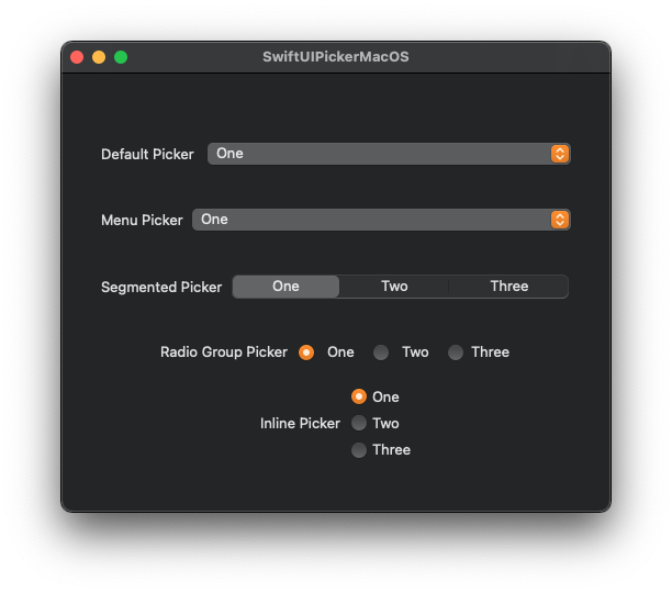
The above are all the available picker styles for the SwiftUI Picker view on macOS at the time of writing this post. After having presented them one by one, let’s gather them all in one single code snippet:
|
1 2 3 4 5 6 7 8 9 10 11 12 13 14 15 16 17 18 19 20 21 22 23 24 25 26 27 28 29 30 31 32 33 34 35 36 37 38 39 40 41 42 43 44 45 46 47 48 49 50 51 52 53 54 55 56 57 58 59 60 61 |
struct ContentView: View { let pickerValues = [“One”, “Two”, “Three”] @State private var selection = “One” var body: some View { VStack { VStack { // Default picker. Picker(“Default Picker “, selection: $selection) { pickerContent() } .padding() // Menu picker style. Picker(“Menu Picker”, selection: $selection) { pickerContent() } .pickerStyle(.menu) .padding() // Segmented picker style. Picker(“Segmented Picker”, selection: $selection) { pickerContent() } .pickerStyle(.segmented) .padding() // Radio Group picker style. Picker(“Radio Group Picker”, selection: $selection) { pickerContent() .frame(width: 40) } .pickerStyle(.radioGroup) .horizontalRadioGroupLayout() .padding() // Inline picker style. Picker(“Inline Picker”, selection: $selection) { pickerContent() } .pickerStyle(.inline) }.padding(.horizontal, 20) } .frame(width: 500, height: 400) } @ViewBuilder func pickerContent() -> some View { ForEach(pickerValues, id: \.self) { Text($0) } } } |
Overview
Depending on where and how you want to place and use a Picker view, there is specific range of available styles to choose from. Unfortunately, there is still no way to define a custom picker style, as opposed to other views, such as buttons. In any case, make your decision appropriately having the user experience in mind, and following Apple’s rules of course. For example, if you have a large list of options to display to users, then don’t use the segmented or radio group styles. The menu style is the most suitable one. No matter what, working with the Picker in SwiftUI hides no difficulties, so all you have to do is just to get the hang of it.
Thank you for reading!