Toggle view in SwiftUI is the equivalent of UISwitch in UIKit; a quite common and simple view that provides on-off functionality. But contrarily to UISwitch, we can highly customize the appearance of a toggle view in SwiftUI and create unique controls tailored to each app’s user interface. In this post I’ll present all that, starting from simple use cases and then focusing on how to implement a custom toggle style.
Using the toggle view
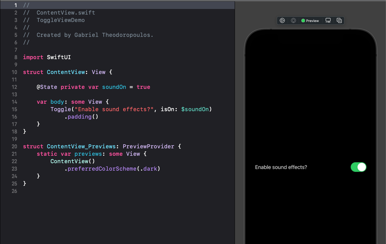
The simplest way to present a toggle view is with a title and a binding to a boolean property that indicates whether the toggle should be turned on or off:
|
1 2 3 |
Toggle(“Enable sound effects?”, isOn: $soundOn) |
soundOn is a state property declared in the view:
|
1 2 3 |
@State private var soundOn = true |
We can customize toggle’s label with a different initializer. Note, however, that customization regards the label only, meaning the title before the switch control, but not the switch itself. Read next about how to change the switch.
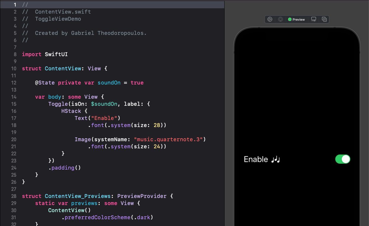
As a toggle’s label we can use any SwiftUI view or combination of them. It can be a text with custom font and color, it can be an image, a combination of the two, or something else.
The following example creates a toggle that uses an HStack as the toggle’s label. Inside the HStack there is a text and an image displaying an SF Symbol, both with increased font size:
|
1 2 3 4 5 6 7 8 9 10 11 |
Toggle(isOn: $soundOn, label: { HStack { Text(“Enable”) .font(.system(size: 28)) Image(systemName: “music.quarternote.3”) .font(.system(size: 24)) } }) |
It’s also a quick task to change the toggle’s tint color. We do so by applying the toggleStyle() view modifier on toggle, passing an instance of the SwitchToggleStyle system-provided style and the desired color as its argument:
|
1 2 3 4 5 6 |
Toggle(isOn: $soundOn, label: { … }) .toggleStyle(SwitchToggleStyle(tint: .pink)) |
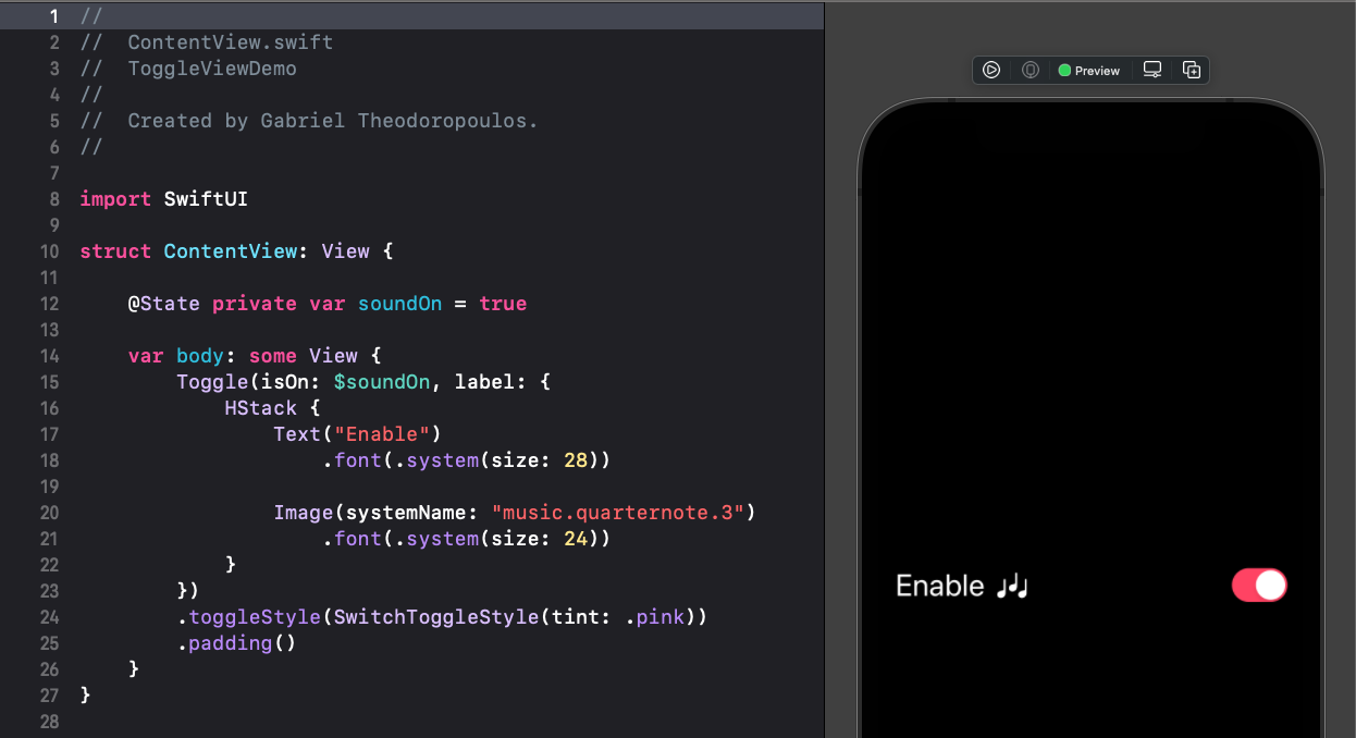
Keep in mind that changing tint color is available in iOS 14 and above.
Besides all that, it’s often necessary to perform extra actions when changing a toggle’s value. We can do so by using the onChange(of:perform:) view modifier with the toggle view:
|
1 2 3 4 5 6 |
Toggle(“Toggle Sound FX”, isOn: $soundOn) .onChange(of: soundOn, perform: { value in // Perform further actions on toggle’s value change! }) |
The above will be called every time we change the toggle’s state, and the value parameter of the closure will be containing the current value of soundOn. The only downside, if it can be considered such as, is that this solution works in iOS 14 and above.
Creating custom toggle styles
Although creating a custom label or changing the tint color of the toggle is fast, tweaking the actual switch control requires one additional step. That is to create a custom toggle style. There we can become as much creative as we want, and come up with a totally different view that maintains the toggle’s functionality but not its default appearance.
In order to create a custom toggle style it’s necessary to define a new type, a structure more specifically, that will be conforming to the ToggleStyle protocol. That protocol has one requirement; to implement a method called makeBody(configuration:). In that method we can create and return any SwiftUI view we want.
To demonstrate how all that works, let’s define the following custom toggle style:
|
1 2 3 4 5 6 7 |
struct CustomToggleStyle: ToggleStyle { func makeBody(configuration: Configuration) -> some View { } } |
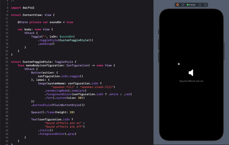
From the body of the above method we’ll return a VStack which in turn will be containing the following:
- A button that will be used to toggle the current state, displaying an image with different foreground color, based on the
isOnvalue of the toggle. - A text that will be describing the current state of the toggle.
- A spacer to give some space between the two.
Here is the entire implementation of all that, including all necessary view modifiers:
|
1 2 3 4 5 6 7 8 9 10 11 12 13 14 15 16 17 18 19 20 21 22 23 24 25 26 |
struct CustomToggleStyle: ToggleStyle { func makeBody(configuration: Configuration) -> some View { VStack { Button(action: { configuration.isOn.toggle() }, label: { Image(systemName: configuration.isOn ? “speaker.fill” : “speaker.slash.fill”) .renderingMode(.template) .foregroundColor(configuration.isOn ? .white : .red) .font(.system(size: 50)) }) .buttonStyle(PlainButtonStyle()) Spacer().frame(height: 20) Text(configuration.isOn ? “Sound effects are on” : “Sound effects are off”) .italic() .foregroundColor(.gray) } } } |
See that we access the isOn state of the toggle through the configuration parameter of the method. We change its value in the button’s action closure, and we read it a couple of times in order to customize the appearance of both the image and the text.
To use the custom style all we have to do is to create an instance of it and pass it as argument to the toggleStyle() view modifier. Note that it will override any title or label the toggle might have once we apply it:
|
1 2 3 4 |
Toggle(“”, isOn: $soundOn) .toggleStyle(CustomToggleStyle()) |
Here is the result:
Using a button in a custom toggle style is not mandatory. In fact, we can use any SwiftUI view, and apply a tap gesture in order to interact with it and update the isOn state.
Summary
Using the toggle view in SwiftUI is not hard, especially if the default switch control is suitable to the interface you are building. For greater flexibility, consider creating a custom toggle style, and let your creativity go wild. In any case, I hope you found something new to learn here today. Thanks for reading!