TabView is one of the most important container views in SwiftUI, as it allows us to present content in tabs and pages. It’s also the go-to view for creating tab-based applications. WWDC 2024 revealed significant advancements for the tab view, which all together simplify, but also empower the way we work with it and enable new appearances. These updates are available in iOS 18 and later and that’s the only downside to it, but other than that TabView is now an even more powerful view, especially for apps running on iPadOS and macOS.
This is the first of a two-parts tutorial where we’ll get to meet what’s new in TabView. However, you can always read about the old-good way on how to work with the TabView in SwiftUI and how to present content in pages using TabView if you are interested in these topics.
Meet the Tab view
The first and foremost advancement in the TabView container is the Tab view. It’s the brand new tool to use in order to create a tab item. Up until now we’ve had the tabItem view modifier for this job, but now things are getting simpler. There are various initializers available to use when creating a Tab instance, but a title, an image and the tab contents are what you’ll need to initialize it with most of the times.
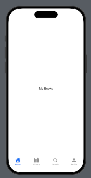
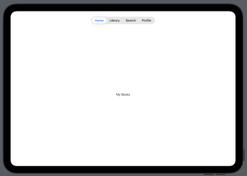
To get a first taste of the Tab view inside a TabView, suppose we have been working on an app to use in a library. In this hypothetical app there are four tabs, Home, Books, Search, and Profile. Using this new view we can easily bring the tabbed content to life as shown next:
|
1 2 3 4 5 6 7 8 9 10 11 12 13 14 15 16 17 18 19 |
TabView { Tab(“Home”, systemImage: “house”) { Text(“My Books”) } Tab(“Library”, systemImage: “books.vertical”) { Text(“All Books”) } Tab(“Search”, systemImage: “magnifyingglass”) { Text(“Search Books”) } Tab(“Profile”, systemImage: “person”) { Text(“My Profile”) } } |
See that all we have to do is to provide a title, the name of a system image (SF Symbol) and the content in the closure of each Tab view. There is no more need to use the tabItem view modifier or perform any additional effort in order to create a tab item. Of course, tabItem is not difficult to use by any means either, but the Tab view gathers everything in one place and its syntax is in accordance to other views in SwiftUI.
Note: For simplicity, the content of each tab is a Text view, but in actual applications you replace them with real and meaningful custom views.
It’s important to underline here that each operating system displays the tab view differently. On iOS, for instance, it remains the all-time classic bottom tab bar, while on iPadOS it appears at the top of the screen, floating over the content.


Navigating among tabs programmatically
We often need to go from one tab to another without direct user interaction, but just because of another action that initiated such an event. For example, say that there is a button in the first tab that navigates users to a random book in the library instantly. To demonstrate that, let’s update the first tab accordingly:
|
1 2 3 4 5 6 7 8 9 10 11 |
Tab(“Home”, systemImage: “house”) { VStack { Text(“My Books”) Button(“Pick a random book”) { } .buttonStyle(.borderedProminent) } } |
To make programmatic navigation possible, there are three distinct easy steps to perform:
1 – Keep the selected tab to a state property
At first, we need to store the selected tab. We manage that by declaring a local state property to the view like the following:
|
1 2 3 |
@State private var selectedTab = 0 |
You can represent the selected tab using any kind of values you want, even custom enums, as long as they conform to Hashable protocol. We keep things simple here with integer values: zero (0) indicates the first tab and we’ll go up to 3 for the last one.
2 – Initialize TabView passing the binding value of the selected tab
The next step is to update the initializer of the TabView and pass as argument the binding value of the state property that keeps the selected tab:
|
1 2 3 4 5 |
TabView(selection: $selectedTab) { // … TabView content … } |
3 – Update the initialization of the Tab views
The first two steps are not new, as they are necessary even when using the old TabView APIs. The new part comes now, as we have to use a different Tab initializer that has an additional parameter named value.
As argument to this parameter we must assign a unique value that will make each tab programmatically distinguishable among all. If you have ever used the tag view modifier in the past, then consider this as its equivalent, with the only difference being that we provide the unique value in the initializer and not in a modifier.
That said, let’s update all Tab views as shown next with the value argument:
|
1 2 3 4 5 6 7 8 9 10 11 12 13 14 15 16 17 18 19 |
TabView(selection: $selectedTab) { Tab(“Home”, systemImage: “house”, value: 0) { … } Tab(“Library”, systemImage: “books.vertical”, value: 1) { … } Tab(“Search”, systemImage: “magnifyingglass”, value: 2) { … } Tab(“Profile”, systemImage: “person”, value: 3) { … } } |
With all the above in place, we can go ahead and update the button in the first tab:
|
1 2 3 4 5 |
Button(“Pick a random book”) { selectedTab = 1 } |
By setting the value 1 to selectedTab, the app will instantly navigate to the second tab every time the button gets tapped.
The new sidebarAdaptable style
What really caught the attention in WWDC 2024 regarding the tab view is a new style named sidebarAdaptable. This is an addition to the already existing styles, and it has a unique effect when used on iPadOS; it allows to switch between the default tab bar at the top and a sidebar.
Let’s consider again the initial example we met in this post, with the new sidebarAdaptable style applied to the TabView right after its closing curly bracket:
|
1 2 3 4 5 6 7 8 9 10 11 12 13 14 15 16 17 18 19 20 21 |
TabView { Tab(“Home”, systemImage: “house”) { Text(“My Books”) } Tab(“Library”, systemImage: “books.vertical”) { Text(“All Books”) } Tab(“Search”, systemImage: “magnifyingglass”) { Text(“Search Books”) } Tab(“Profile”, systemImage: “person”) { Text(“My Profile”) } } // Apply the sidebarAdaptable style .tabViewStyle(.sidebarAdaptable) |
As said, the above behavior works on iPadOS only. Other systems handle this style differently; iOS keeps the default bottom tab bar, while macOS presents always a sidebar.
Creating tab sections
Along with the sidebarAdaptable style that allows to display tabs in a sidebar, another useful advancement came to make TabView even better. That is the capability to create sections and group tabs together in them.
To demonstrate that using the example of this post, we’ll create a section called Account that will have two tabs; the existing Profile and a new Settings tab. All other tabs will remain as they are, even though it would be perfectly fine to nest them under another section too.
|
1 2 3 4 5 6 7 8 9 10 11 12 13 14 15 16 17 18 19 20 21 22 23 24 25 26 27 |
TabView { Tab(“Home”, systemImage: “house”) { Text(“My Books”) } Tab(“Library”, systemImage: “books.vertical”) { Text(“All Books”) } Tab(“Search”, systemImage: “magnifyingglass”) { Text(“Search Books”) } // The Account tab section. TabSection(“Account”) { Tab(“Profile”, systemImage: “person”) { Text(“My Profile”) } Tab(“Settings”, systemImage: “gearshape”) { Text(“Settings”) } } } .tabViewStyle(.sidebarAdaptable) |
We create a tab section using the TabSection container view and we append all necessary tabs into its closure. When switching from the sidebar back to tab bar, tab sections appear there too but without their inner tabs. When selecting a section in that state, the content of the last selected child tab item is shown to the screen.
Even though it looks quite tempting to have many tabs organized in multiple sections, you should mind iOS and the horizontally compact size on iPadOS. In these cases, all tabs are going to be visible without being grouped into sections, so you will end up with a cluttered tab bar having items not fitting in it.
Of course, there is a way to work around that by displaying different tab items on each occasion, but how far we can go depends on their number and existing sections. In addition to that, we can enable users to re-arrange items, drag and drop tabs and more.
All these are quite interesting, and you can read about them on the second part of this two-part tutorial.
Summary
This post describes the fundamental knowledge you need to have in order to work with the new tools made available for the TabView container in SwiftUI. Working with the new Tab view, changing tabs programmatically, and applying the new impressive sidebarAdaptable style seem handy and easy. It’s also really great to have tab sections. But the story does not end here, and in the second part of this tutorial we’ll dig a bit deeper, so you can provide a better user experience by displaying different tab items suitable for each system, but also by providing customization options.
Thank you for reading!